Pinterest is an image and content sharing platform that offers creative inspiration and helpful tools to organize a diverse array of content. Users commonly use Pinterest to gather ideas for art, design, fashion, event planning, recipes, and more.
A problem to explore
As an avid Pinterest user, I’ve noticed that its content tends to lack context or credibility. Users often leave comments with questions that go unanswered.
This is an issue because users might not get the most out of their experience. Without context, they can’t deepen their understanding of what they are seeing and may miss out on similar content that they would enjoy.
Project goals
Confirm the existence of the problem for users, and learn how it impacts their use of Pinterest.
Based on user research, develop a new feature that addresses the problem and integrates seamlessly into the existing experience.
Project info
My role
Sole designer, independent project
Tools
Figma, Figjam, Maze
Phase 1
Discovering the problem
User research
Learning from real Pinterest users
My research goals were to learn about 1) how people use Pinterest generally, and 2) their experiences looking for context about pins.
Research questions
General Pinterest use
What do people tend to use Pinterest for?
What are some patterns in the ways people use Pinterest?
What do users find challenging or frustrating about Pinterest?
Learning more about content
How often do users want to know more information about a pin?
What kinds of information do users want to know about pins?
How do users generally seek that information?
What is their subjective experience of seeking out that information?
The study was structured as:
Interview: Explore Pinterest users' habits and experiences with the platform
Usability test: Users demonstrate how they would seek out more information about content on the existing Pinterest site
Research method
Participants
5 Pinterest users
Format
Moderated, remote
Duration
15-30 minutes
Exploring the results
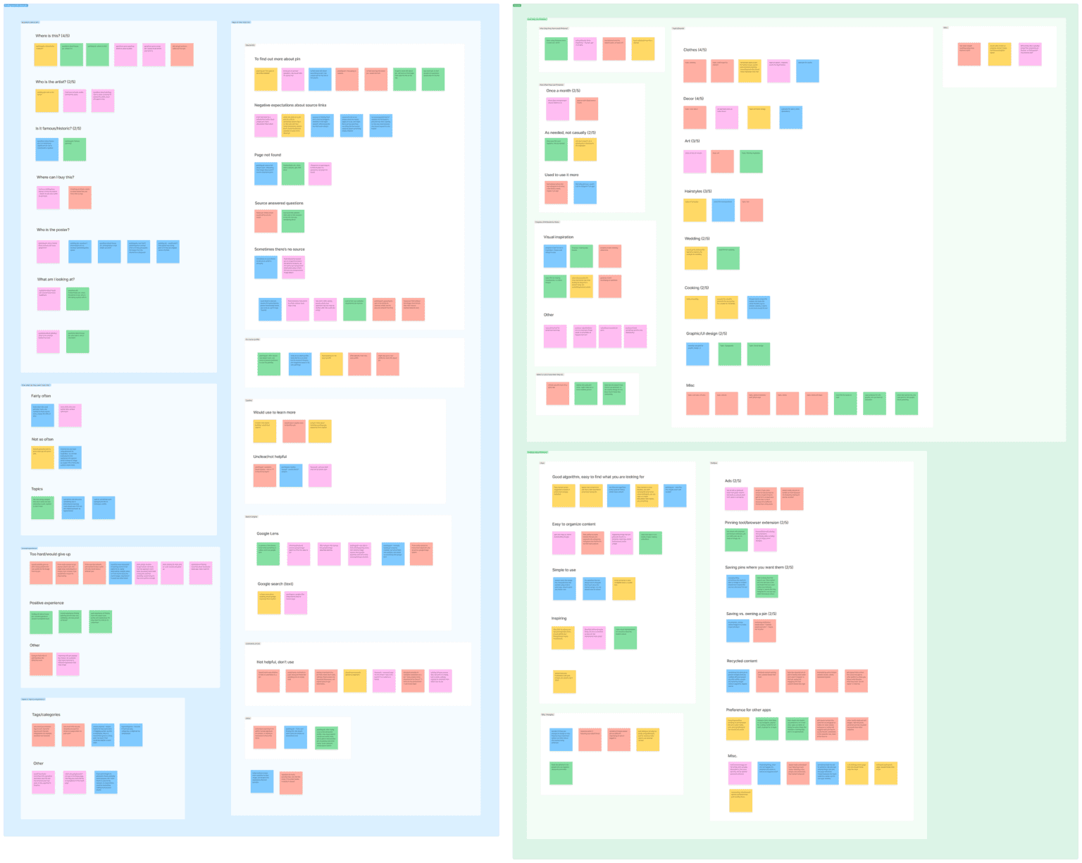
After completing five interviews, I arranged the content of my conversations into an affinity map. The map revealed a lot about how users interact with Pinterest in their daily lives.
Unsurprisingly, all 5 participants said they use Pinterest for visual inspiration and/or as a tool to organize content. Other findings included:
The most popular topics mentioned were clothes (4/5 users) and decor (4/5 users).
5/5 had used Pinterest for at least several years, but 3/5 use it less now than they used to.
3/5 use other apps more often than Pinterest, because those apps serve specific needs better.
When it came to the central problem I was exploring, I arrived at two key takeaways:
Key takeaway #1
It really is hard to learn more about content on Pinterest.
5/5 users clicked the source link to learn more about a pin, but 3/5 expected the experience to be unhelpful or annoying.
Overall, users said they search for more information about a pin occasionally, rather than often. But I wondered how this might change if the information was easy to find.
Key takeaway #2
Users will leave Pinterest to find out what they're looking at.
5/5 users would consider looking up a pin using Google Lens or text search. Like the source link, this takes the user to an external site, which is undesirable from a business perspective.
Only 1/5 users tried using Pinterest’s built-in visual search, suggesting that they either don’t know about the tool, or don’t expect it to be helpful.
Competitor analysis
Now that I understood the problem I would be solving, I needed to learn about how existing products tackle similar issues. I found that competitors fell into two categories.
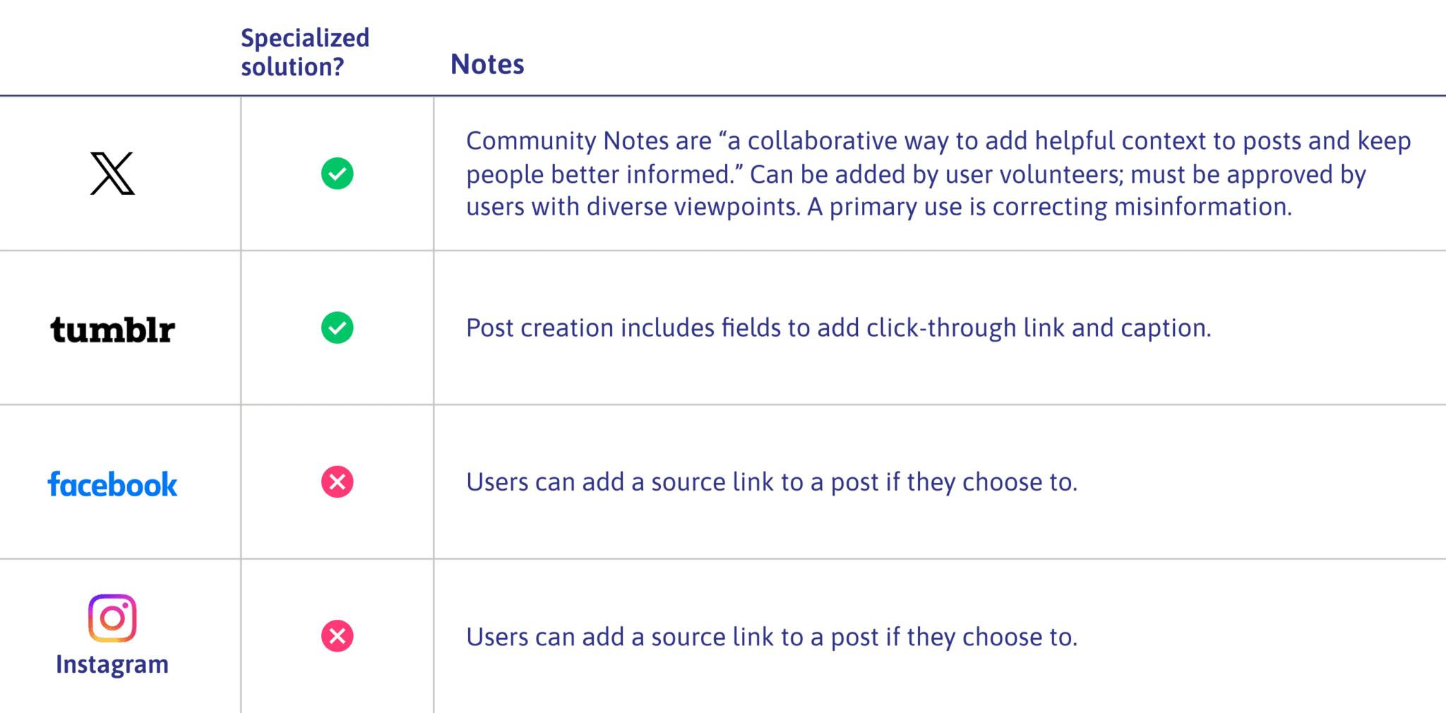
1. Social media platforms
Aside from X’s user-driven Community Notes, other social media platforms didn’t offer many solutions to identifying or explaining content.
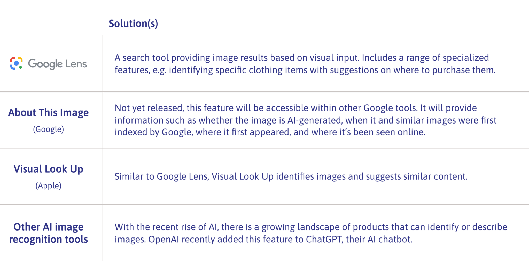
2. Visual ID tools
Meanwhile, I found a range of rapidly developing products using AI to identify or explain images.
I anticipated exploring the realms of user input and AI image recognition further when I reached the idea generation stage.
Phase 2
Defining the problem
Adopting the user's perspective
Two point of view (POV) statements embody the main issues uncovered in my user interviews. Corresponding “how might we” questions would guide my thinking about potential solutions.
POV
Users seeking information about a pin often find the experience difficult, give up unsatisfied, or don’t try due to low expectations of the outcome.
How might we
…help Pinterest users more easily find the information they seek about a pin?
POV
Users seeking information about a pin often leave the Pinterest site to visit a source link or use a tool such as Google Lens. This disrupts the continuity of the user experience.
How might we
…help Pinterest users find the information they seek without having to leave the Pinterest site?
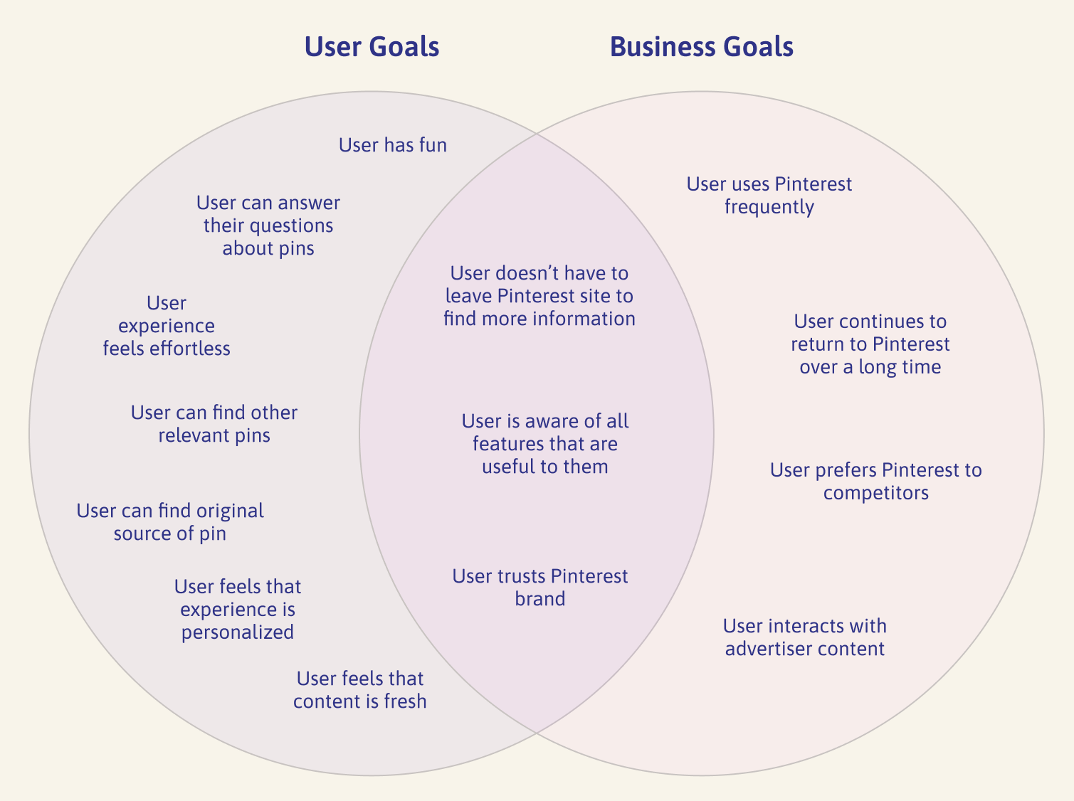
Considering the goals at play
I took time to more thoroughly consider Pinterest’s potential business goals, and how they might overlap with those of the user.
Phase 3
Developing the solution
Defining the new feature
At this point, I reflected back on my work so far. To come up with targeted solutions, I would need to consider:
User interview results
Competitor analysis
Business and user goals
“How might we?” questions
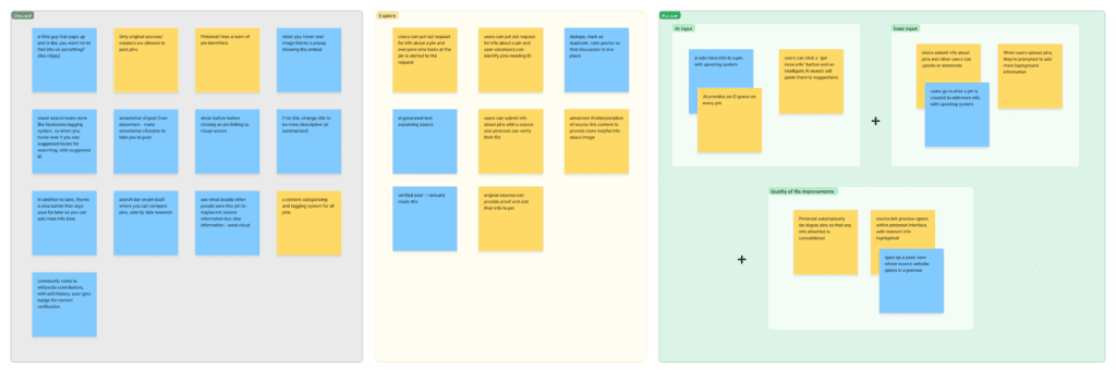
Brainstorming potential solutions
I began by generating as many ideas as I could on sticky notes in FigJam. Next, I assessed them in three stages, ending with a set of three concepts that I planned to incorporate into the new feature:
I referred back to my user research to flesh out the details of the proposed feature.
Initial feature overview
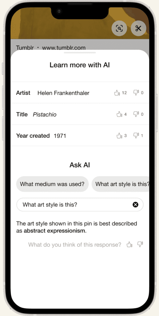
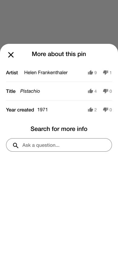
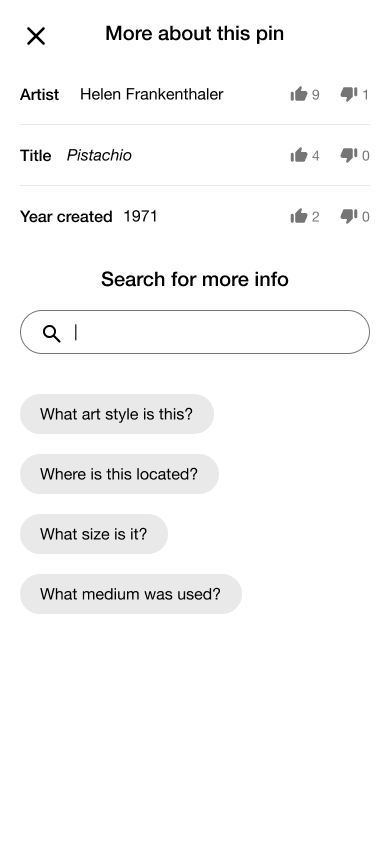
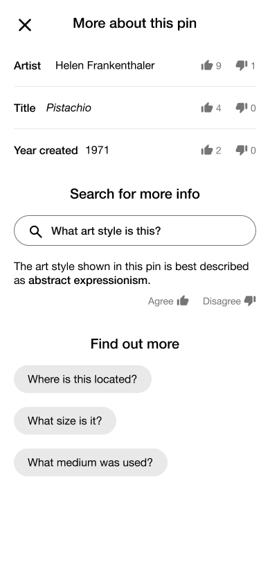
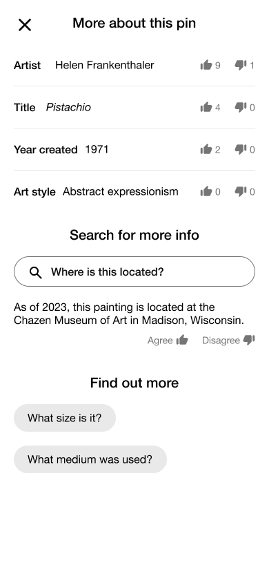
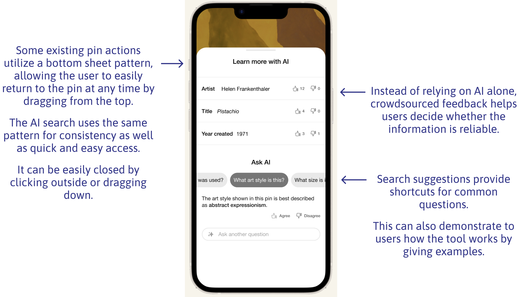
AI info search
Users can learn more about pins from an AI search from within the (existing) Pinterest Lens feature. Results can be generated by asking questions, eg. “where is this?”
This eliminates the need to spend time digging through source links or using reverse image search, common frustrations in my user research. It also keeps them from having to leave the Pinterest site.
Crowdsourced feedback
Users can see answers to previous users’ AI searches and agree or disagree. This provides a human check on potentially fallible AI answers. It also offers an outlet for feedback that may previously have landed in unhelpful comment threads.
Automated AI description
A brief description is auto-generated for pins that have been identified via AI image search and reach a certain upvote threshold. This replaces source link excerpts, which users reported to be frequently confusing and irrelevant.
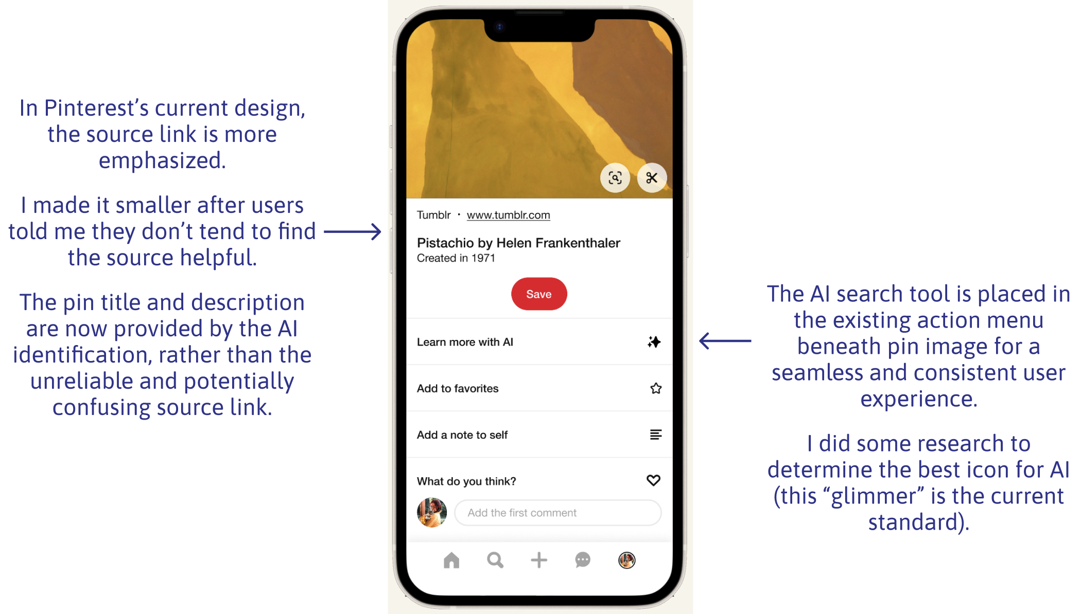
Embedded source link preview
When users click a source link on a pin, a preview will open in an overlay, with relevant information highlighted. This keeps users from having to leave the Pinterest site/app and reduces the effort involved in locating relevant information.
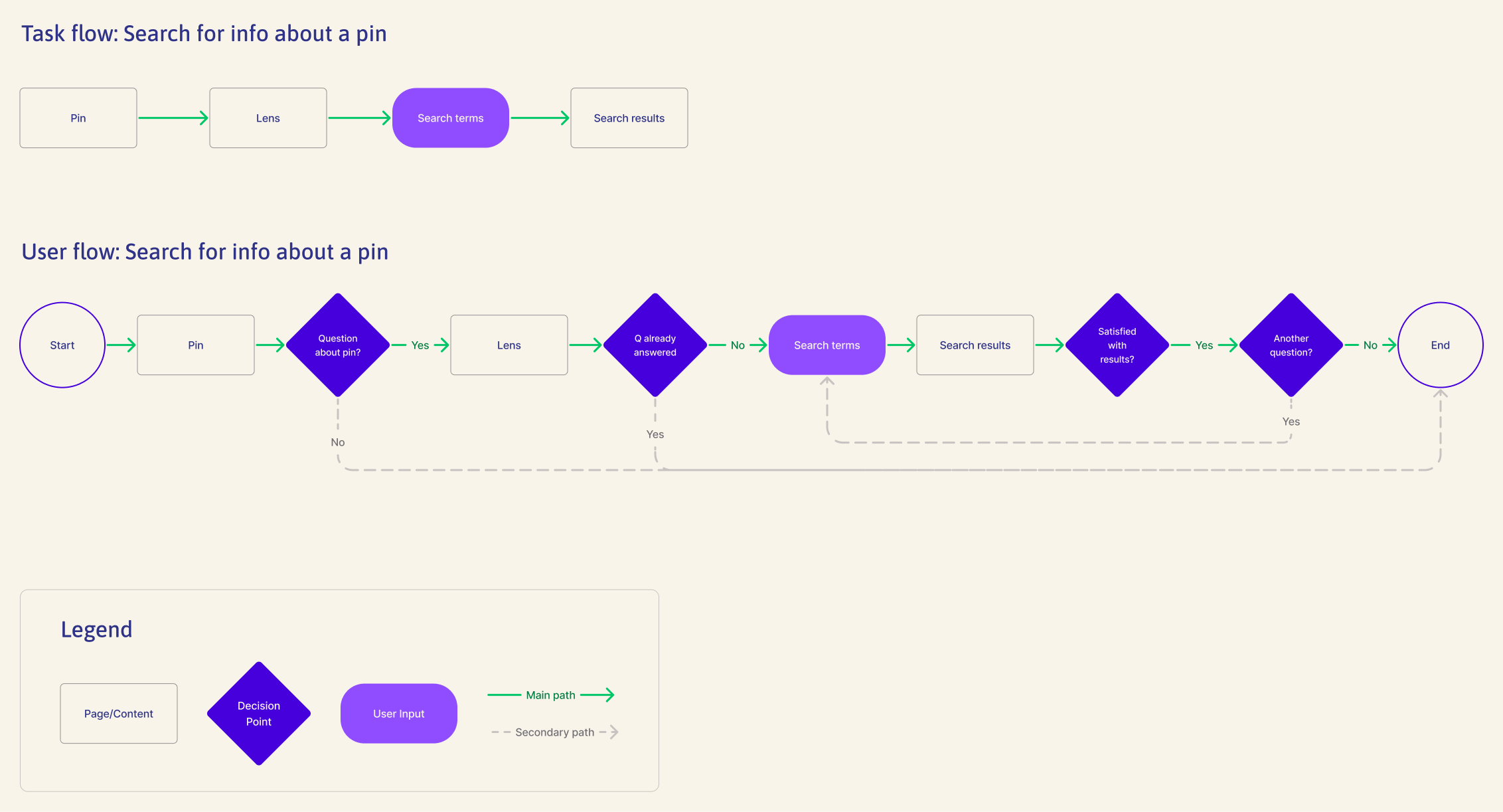
Envisioning the user's path
Creating user and task flows for the feature helped me think through the user’s path in depth.
Refining the feature
I originally planned to include an embedded source link preview in my design, but I realized that it would fall into a different task flow. I decided to take a more focused approach and pursue a single unified feature—the AI search tool.
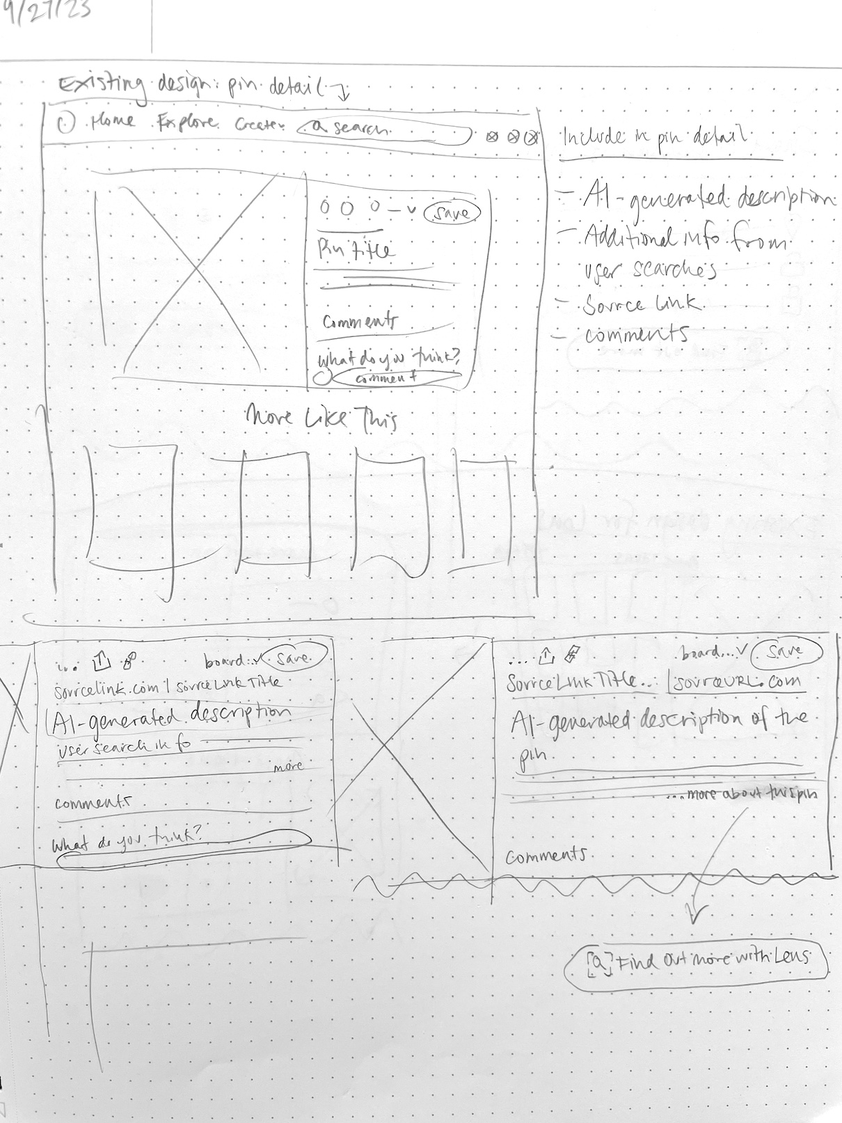
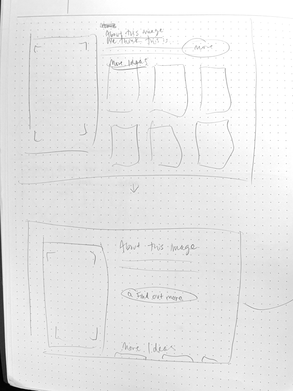
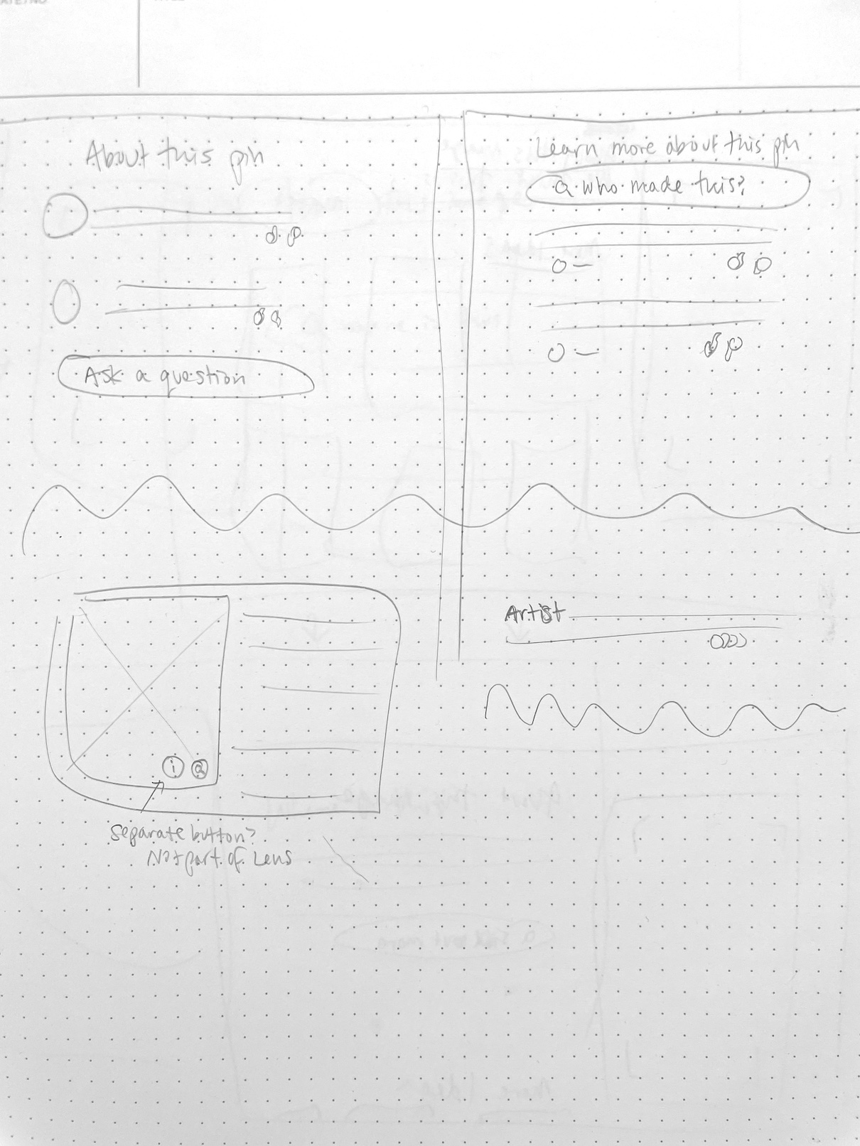
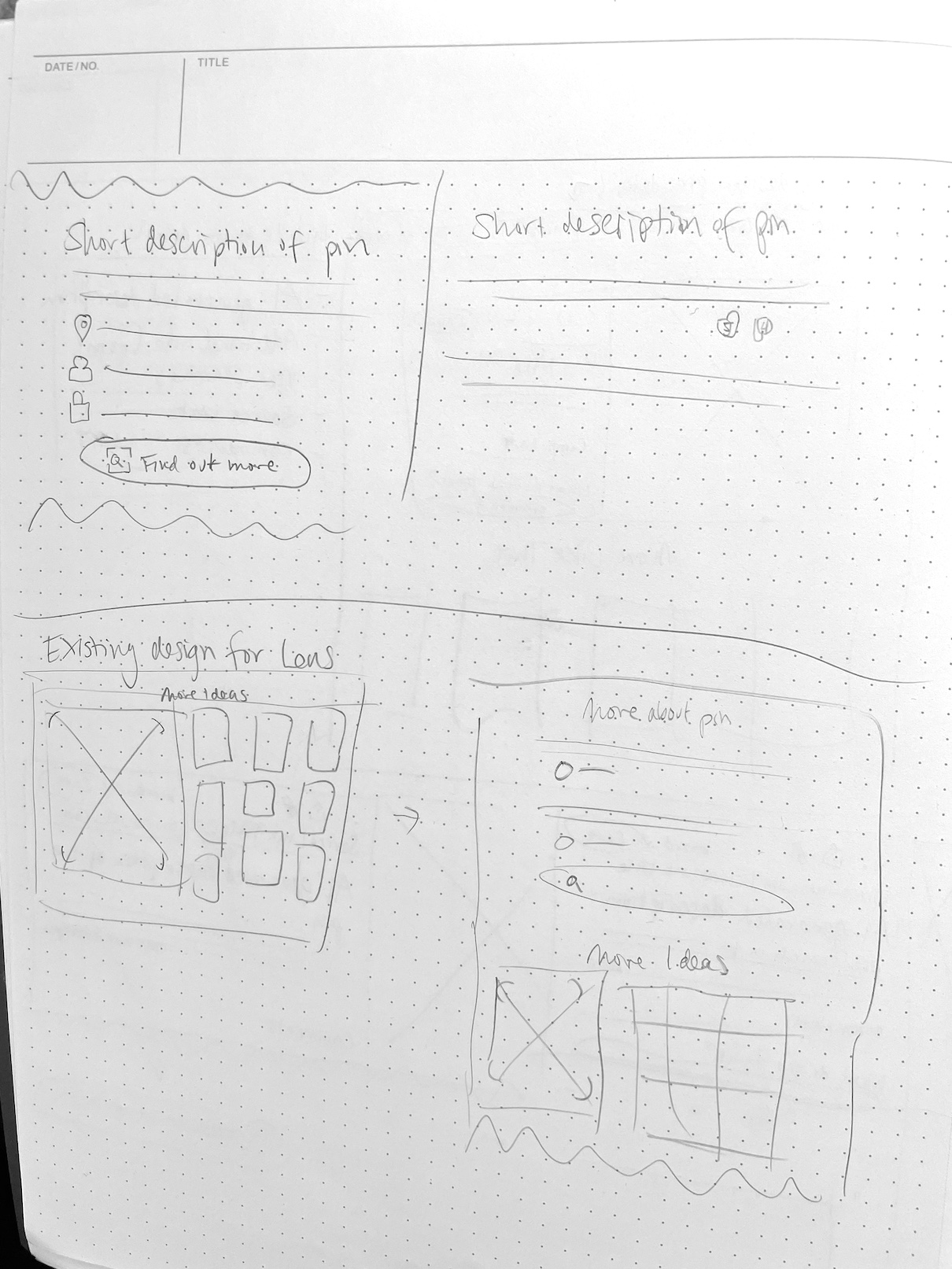
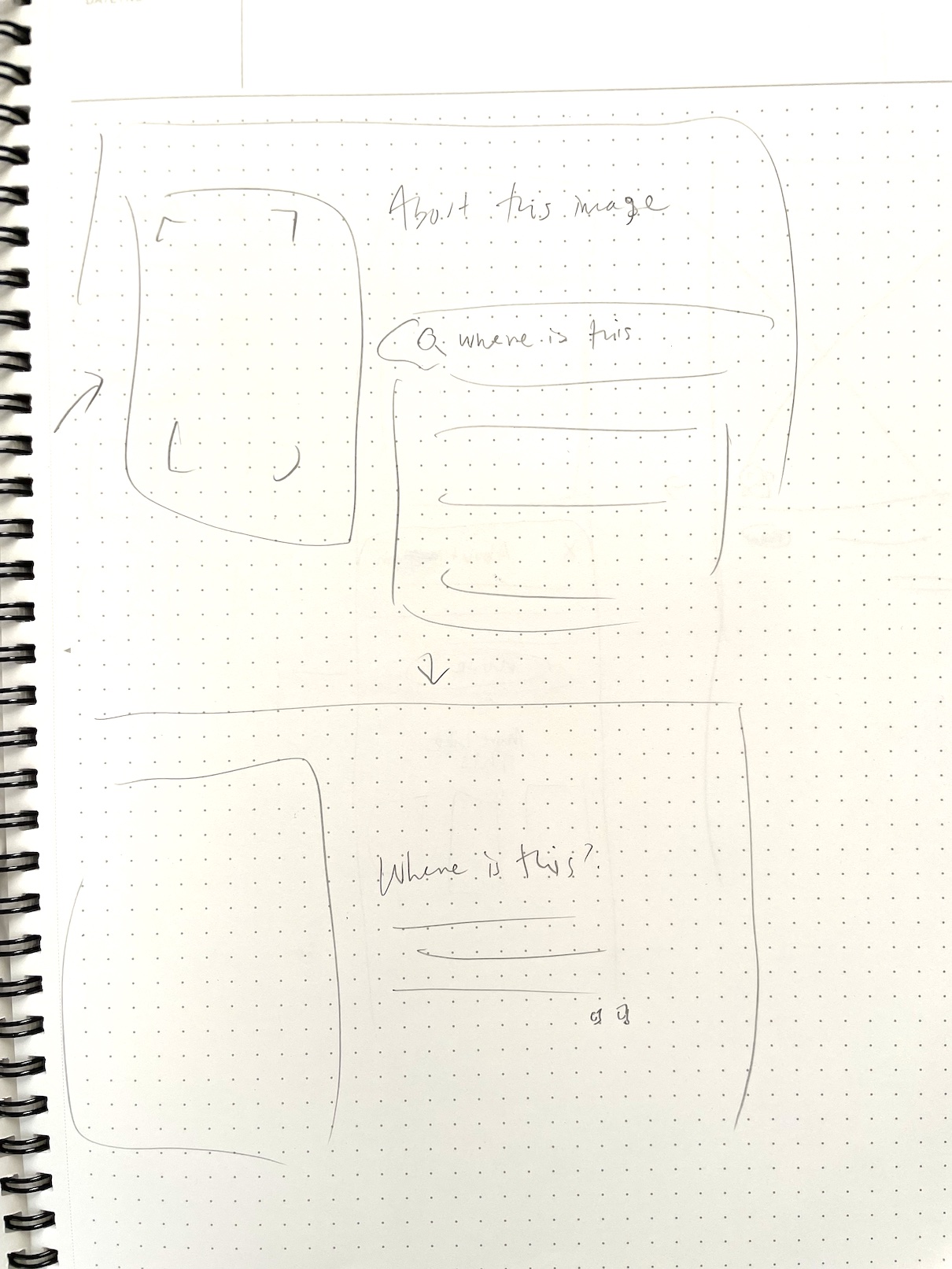
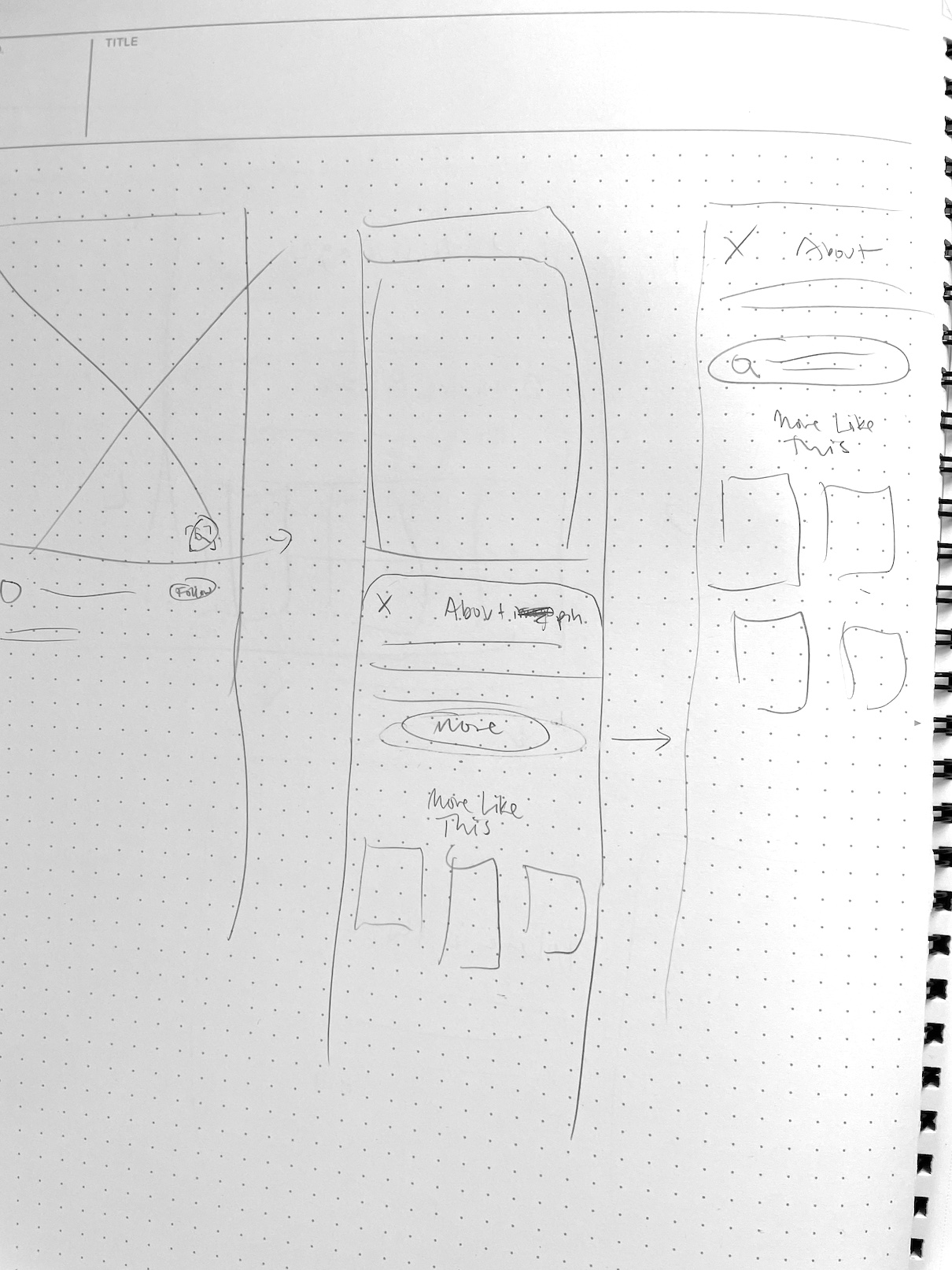
Ideating on paper
Sketching helped me test out ways to seamlessly incorporate the AI search feature into Pinterest’s existing interface.
I explored ideas for both desktop and mobile, but decided to design for mobile after learning that 80% of people use Pinterest via the mobile app.
Going digital
Transitioning my sketches into mid-fidelity wireframes helped me figure out which ideas would work best in practice.
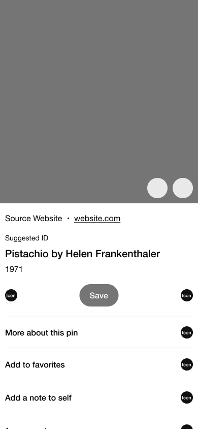
Building a polished prototype
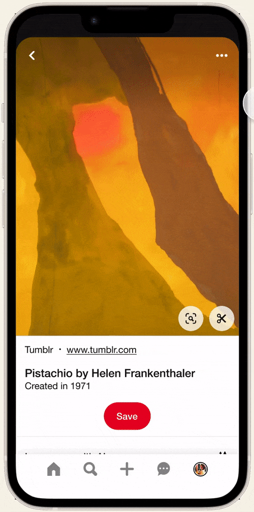
Having defined the layout and interaction patterns for the feature, I refined the details of my wireframes and brought them together them in a working prototype.
At this stage, I reworked the text and iconography to more clearly label the tool as AI, so users would have an appropriate mental model when using it.
All of my UI decisions were guided by Pinterest’s real-life design system, called Gestalt. This included design patterns, colors, typography, and iconography.
Key design decisions
Phase 4
Delivering the solution
Usability testing
How does the AI search work for Pinterest users?
My goal was to find out if my solution would address the issues I had surfaced in user interviews. I designed a study comprising:
Usability test: Participants were shown a pin with a piece of art. They were asked to show how they might find out what style of art it was, and then to give feedback on the answer.
Questionnaire: Participants were asked to complete rating scales and open-ended questions to reflect on their experience with the usability test.
I wanted to find out if the new feature would be clear to users, if they would find it useful, and how they would feel when using it.
Research method
Participants
16 Pinterest users
Format
Unmoderated, online
Tools
Figma prototype, Maze
Positive feedback—plus an unexpected concern
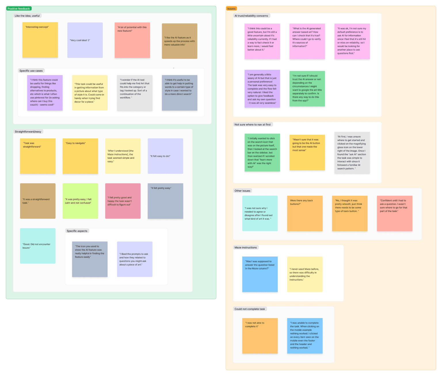
Exploring the results with affinity mapping, I was happy to find that the task was fairly easy overall (rated 4.5/5) and that users saw potential utility in the feature (also rated 4.5/5).
3/16 testers initially clicked something other than the “Learn More with AI” button. This was not unexpected, because the prompt given had been open-ended.
2. Can I trust this tool?
3/16 testers expressed concern about the reliability of AI-based tools. Their questions echoed some of the public sentiment about AI, so I knew this was an issue that needed to be addressed.
“What is the AI generated answer based on? How can I check that it’s true?”
– Usability test participant
Building trust through transparency
The risk of misinformation with AI is real, so it would be unrealistic to promise accurate responses. Instead, I chose to acknowledge users’ legitimate concerns by:
1. Adding a disclaimer
Rather than asking for users’ feedback in terms of agreement, I added the more open-ended prompt, “What do you think of this response?” This encourages users to feel comfortable providing feedback even if they don’t know for sure whether the information is correct.
2. Adjusting language around feedback
This text appears when users first open the AI search tool, explaining that information provided may not be accurate. There is also a link to learn more.
Final prototype
My updated prototype incorporates the new disclaimer and adjustment to the feedback language.
There are several next steps I might pursue as part of a team working toward the release of this feature. These include:
Additional usability testing to ensure that the design is well validated before putting the feature into production
Thorough documentation so the development team has everything they need to implement it
Collect usage data after rollout (or a beta release) to gain insight into the feature's performance, catch any issues, and suggest areas for improvement
What I learned
Usability is more than just ease of use
I expected that testing might uncover an aspect of the design causing confusion or difficulty. In reality, the biggest issue was around trust of AI tools. I could have addressed this more proactively if I had broadened my understanding of what usability can mean.
Designing for a rapidly changing technology
While I was in the middle of this project, ChatGPT released a new image description feature which hadn’t been available a week before, when I was first researching AI solutions. A lesson in the importance of staying informed about a changing landscape.
Working with a design system
This was my first time working from a design system. It provided helpful structure and reduced the time I spent on UI decisions. On the other hand, I learned to consult the design system and not make assumptions.