We know moving is challenging - but when we're done, what comes next?
For this project, I wanted to explore the period of time after moving to a new neighborhood. I was curious about:
How we settle into new routines
How we engage with our new neighborhood
Our hopes and our fears
My goal was to identify a need that people experience in this unique period of time.
Project info
My role
Sole designer, independent project
Tools
Figma, Figjam, Inkscape
Phase 1
Discovering the problem
Scouting the product landscape
I started by researching existing products that users might turn to after moving to a new neighborhood. I wanted to know:
What tools exist for this population?
What are gaps in the market?
In what ways are the available products similar or different from one another?
I explored four products, each offering different ways for users to engage with local events, social circles, and businesses. I noted that none were specifically tailored to neighborhood newcomers.
Seeking out real experiences
I held open-ended user interviews to learn from people who had moved recently. My goal was to uncover the challenges they faced up to 6 months post-move.
I interviewed 5 people who had moved to a new neighborhood in the last 3 years. They were all in their 20s or 30s, living in major metropolitan areas of the US.
Key Research questions
What challenges do people face in the period of time after a move?
In what ways are people impacted by these challenges?
How do these challenges change over time, from the move to 6 months out?
Where do people currently turn for help with the challenges of this experience?
Do they find their current solutions to be helpful? Why or why not?
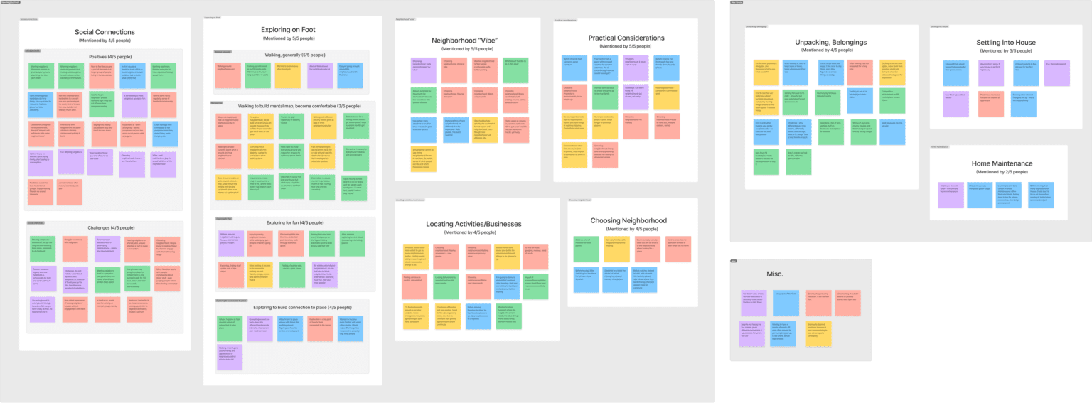
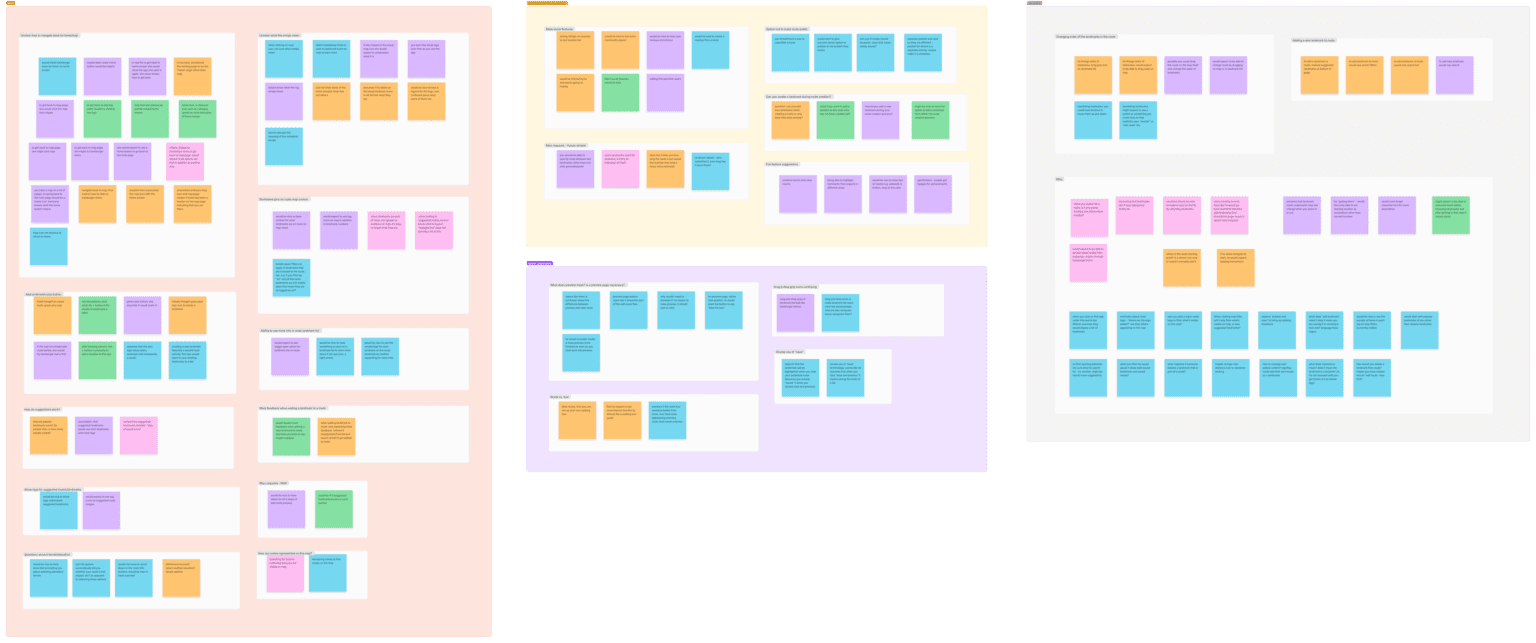
Pulling out the key themes
After finishing the interviews, I organized them into an affinity map.
People named rewarding social aspects of moving to a new place, such as making new friends and feeling like part of a community. They also brought up challenges like shyness and feeling like an outsider.
Key Theme #2
Exploring on foot
People emphasized the many benefits of exploring a new place on foot, including fun, exercise, finding interesting sights, gaining confidence by building a mental map of the area, and deepening emotional connections to place.
Phase 2
Defining the problem
Creating personas
I adapted each key theme from my interviews into a persona: “Andrew” hopes to get to know his neighborhood by exploring on foot, while “Kelly” seeks social connections. Additional details from my interviews add depth to each persona.
Click an image to expand
These personas serve to:
Distill the most prominent goals, needs, and pain points expressed in user interviews
Represent the demographics of the user group
Help with decision-making in development of the product
Exploring potential solutions
I brainstormed over 40 ideas to address the needs of my personas. Then I narrowed the list down to the two that most directly addressed personas’ needs, and would be feasible to build.
Idea 1
"Block Party"
A way for neighbors to indicate their level of interest in meeting others.
Who it's for
Someone who’s new to their neighborhood and wants to connect socially with close neighbors—in a way that will be welcomed. (Persona: Kelly)
How it works
It shows users what kinds of connections their neighbors are (or aren’t) looking for, so they won’t have to worry about how their outreach will be received.
Idea 2
"Neighborhood Adventure"
A game where you fill in a personalized map by visiting different places in your neighborhood.
Who it's for
Someone who just moved to new neighborhood, wants to deepen their emotional connections to their new area, and enjoys exploring on foot. (Persona: Andrew)
How it works
Offers a fun, structured way to explore one’s area and track favorite discoveries, and incentivizes exploring by revealing the map as you explore.
I opted to move forward with Idea 2: “Neighborhood Adventure.” Why?
User interest: Exploring on foot was mentioned in 5/5 user interviews
Competitor analysis: I felt there was less competition in this area, offering an opportunity for a unique product.
Phase 3
Developing the solution
Considering business and user goals
Before continuing, I paused to brainstorm the business and user goals I would be considering.
Defining the feature set
I knew that I wanted to design a product that would help users explore on foot and deepen their connection with their neighborhood.
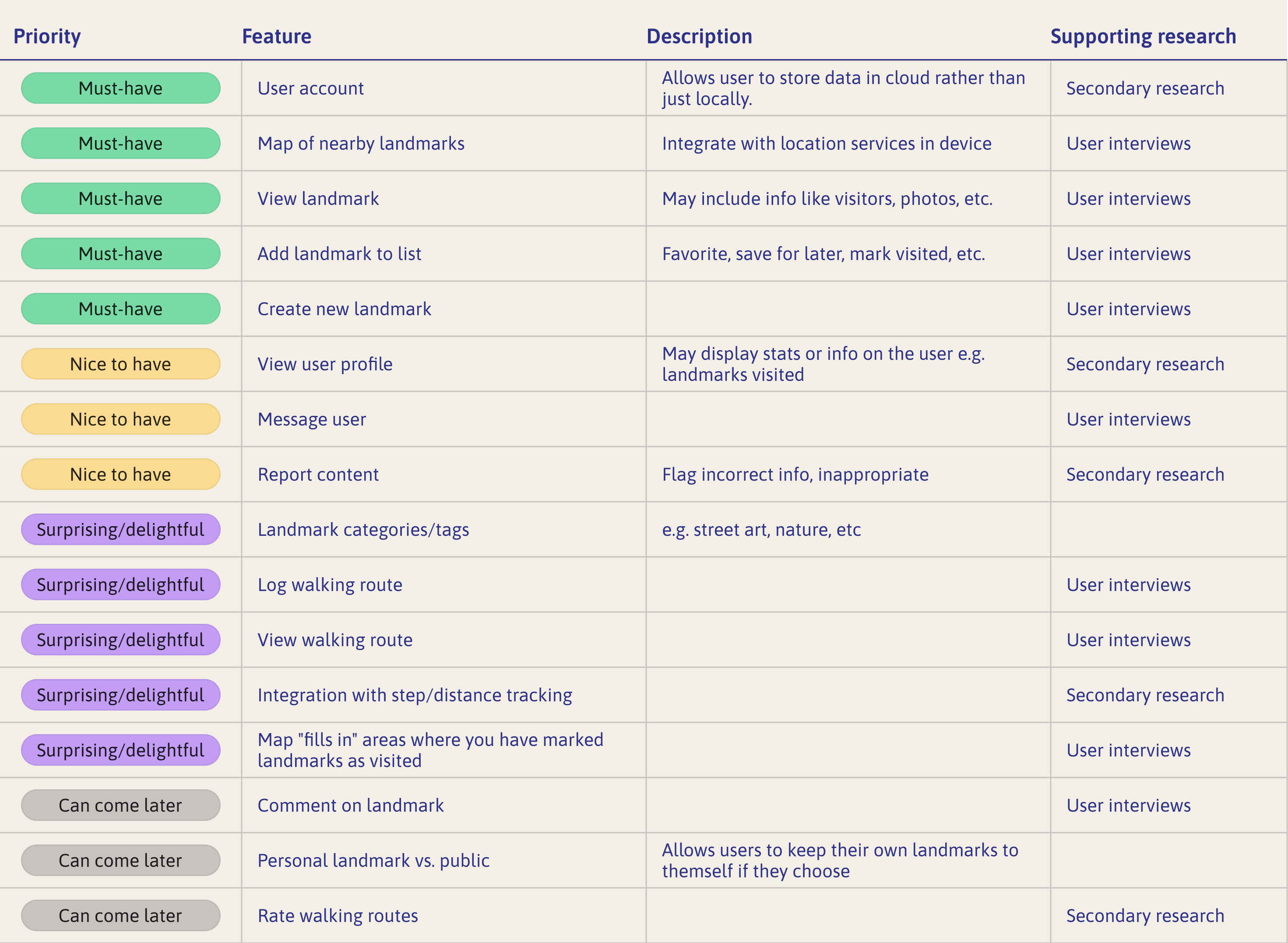
I developed a list of potential features, then organized them by priority. What would meet the needs of my personas while being achievable in an MVP release?
Now, I’d narrowed down to a few key features to pursue.
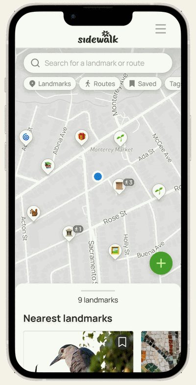
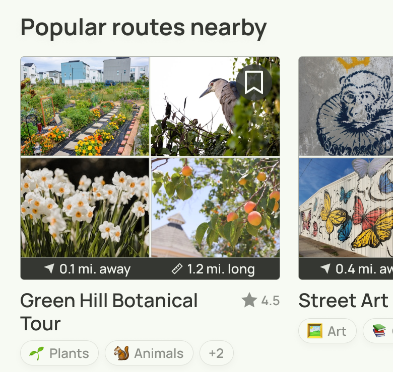
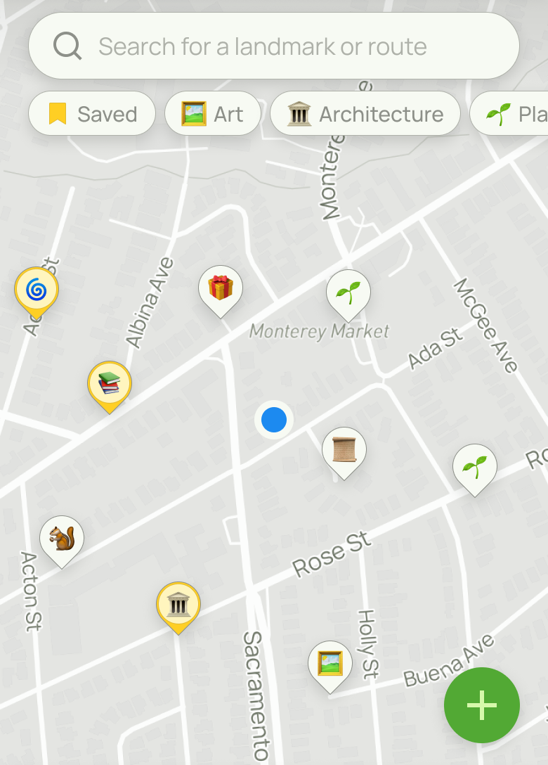
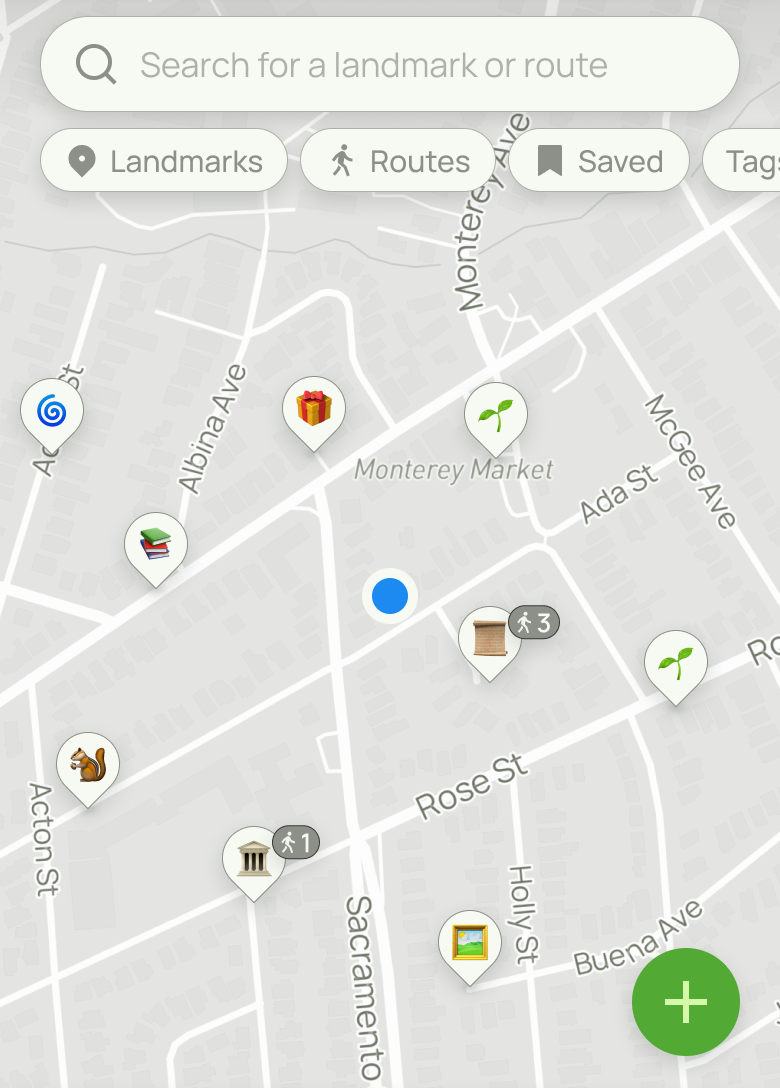
Key features
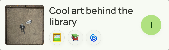
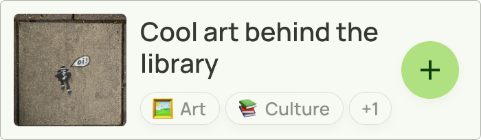
Landmarks
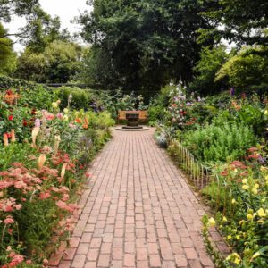
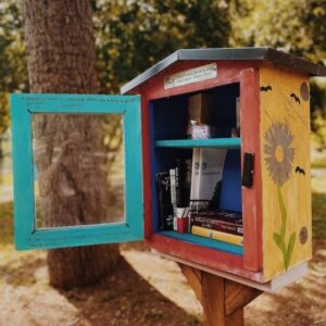
Interesting, non-commercial, hyper-local
Examples: Little free library, public art piece
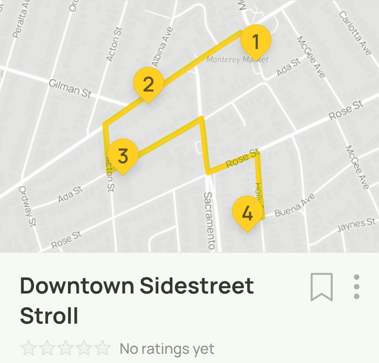
Routes
A sequence of landmarks creating a walking path
User account
Log-in required
Users can save favorite landmarks and routes
Social features
User profiles
User ratings
More social features suggested post-MVP
Confirming information architecture via card sorting
I didn’t want to rely on assumptions about how users would navigate the product, so I conducted a card sort study.
I had 5 participants complete the 36-topic exercise using Optimal Sort. The results pointed to three main categories of content: landmarks, routes and account.
Card sort results
"Landmarks" (4/5 users)
All 4 included:
Mark landmark as visited
Save landmark for later
Add landmark to favorites
View landmark photos
"Account" (4/5 users)
All 4 included:
Account Settings
Create Account
"Routes" (3/5 participants)
All 3 included:
Mark route as completed
Save route for later
Add route to favorites
Nearby routes
Popular routes
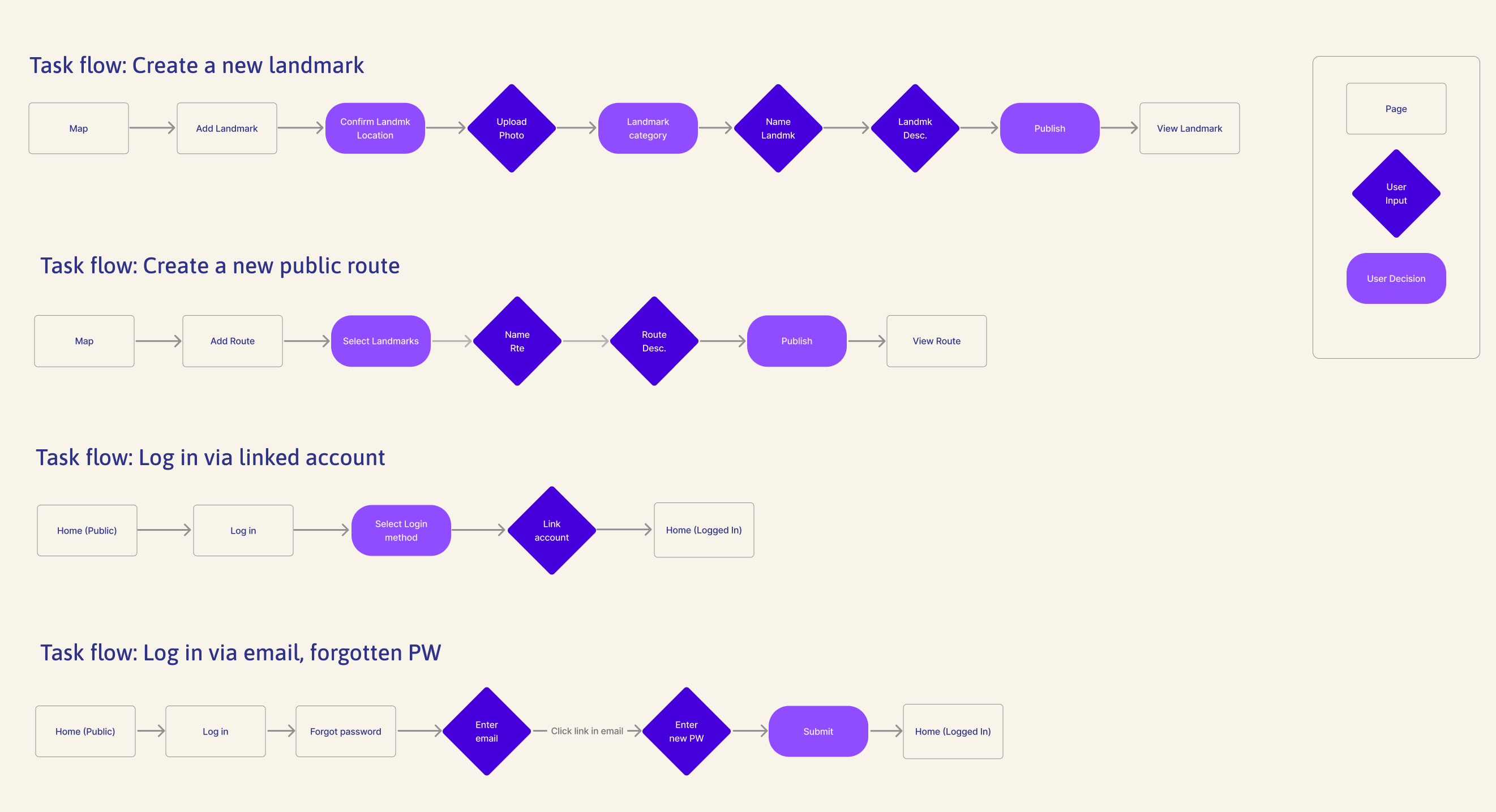
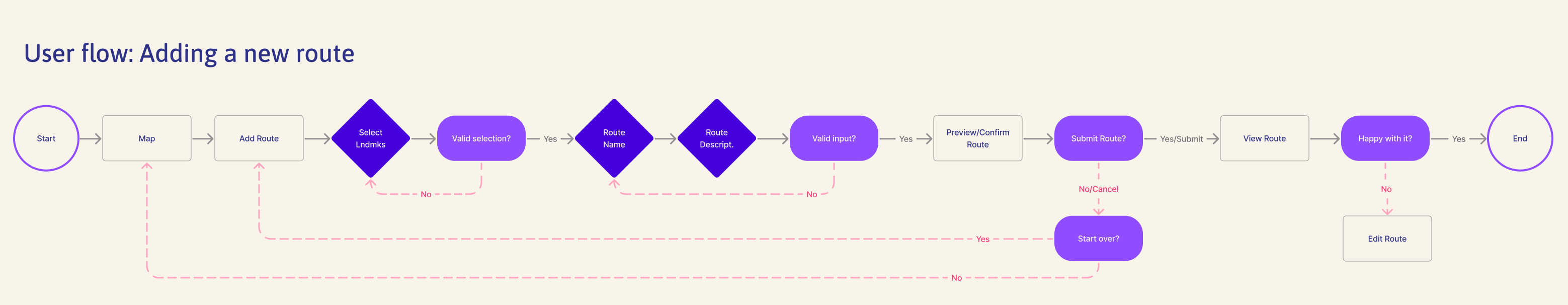
Developing user and task flows
Mapping out essential processes
I started by exploring flows for different tasks within the product.
Diving deep on a single user flow
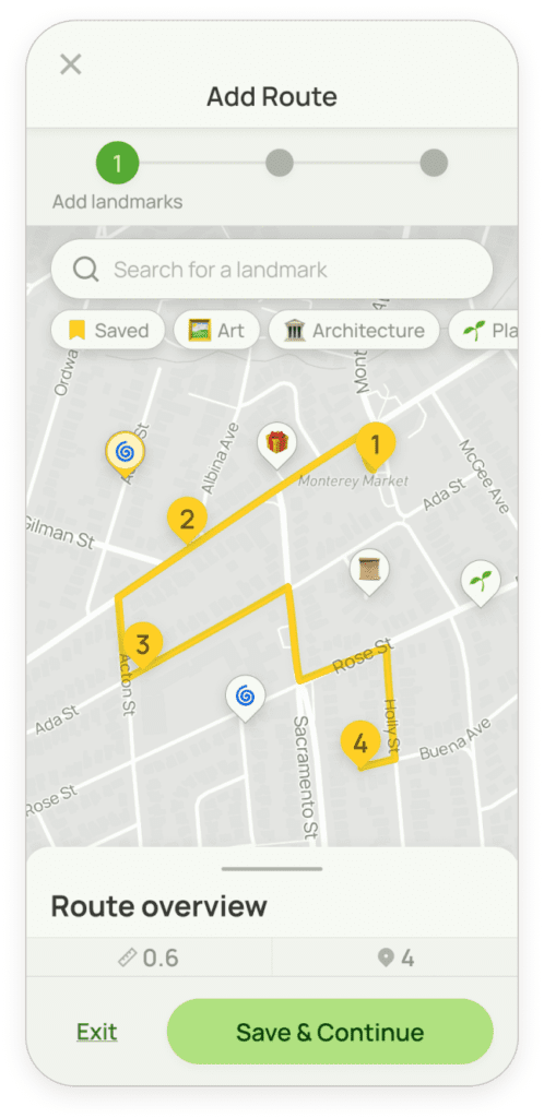
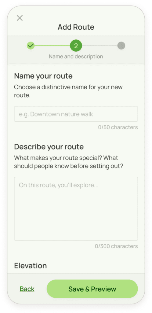
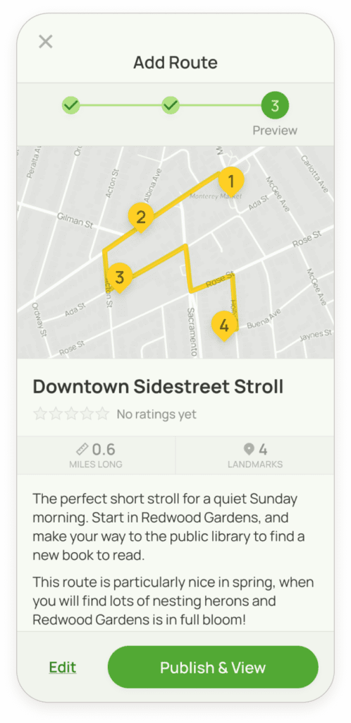
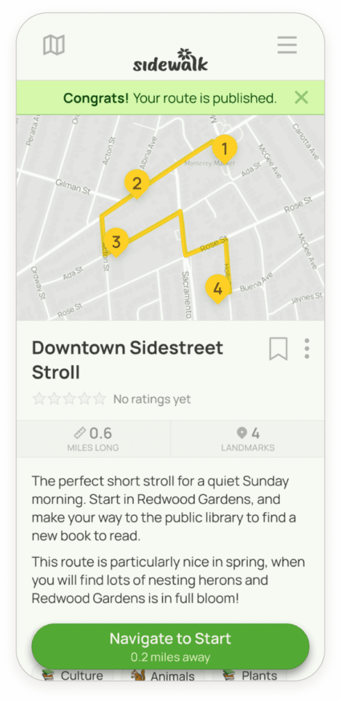
For this project, I would be moving forward with the design process for a single user flow. I selected the flow for creating a new walking route made up of pre-existing landmarks.
Choosing a flow to design
The “add route” flow is:
Potentially complex
Multiple key features (landmarks, routes, map)
Multiple user decision points
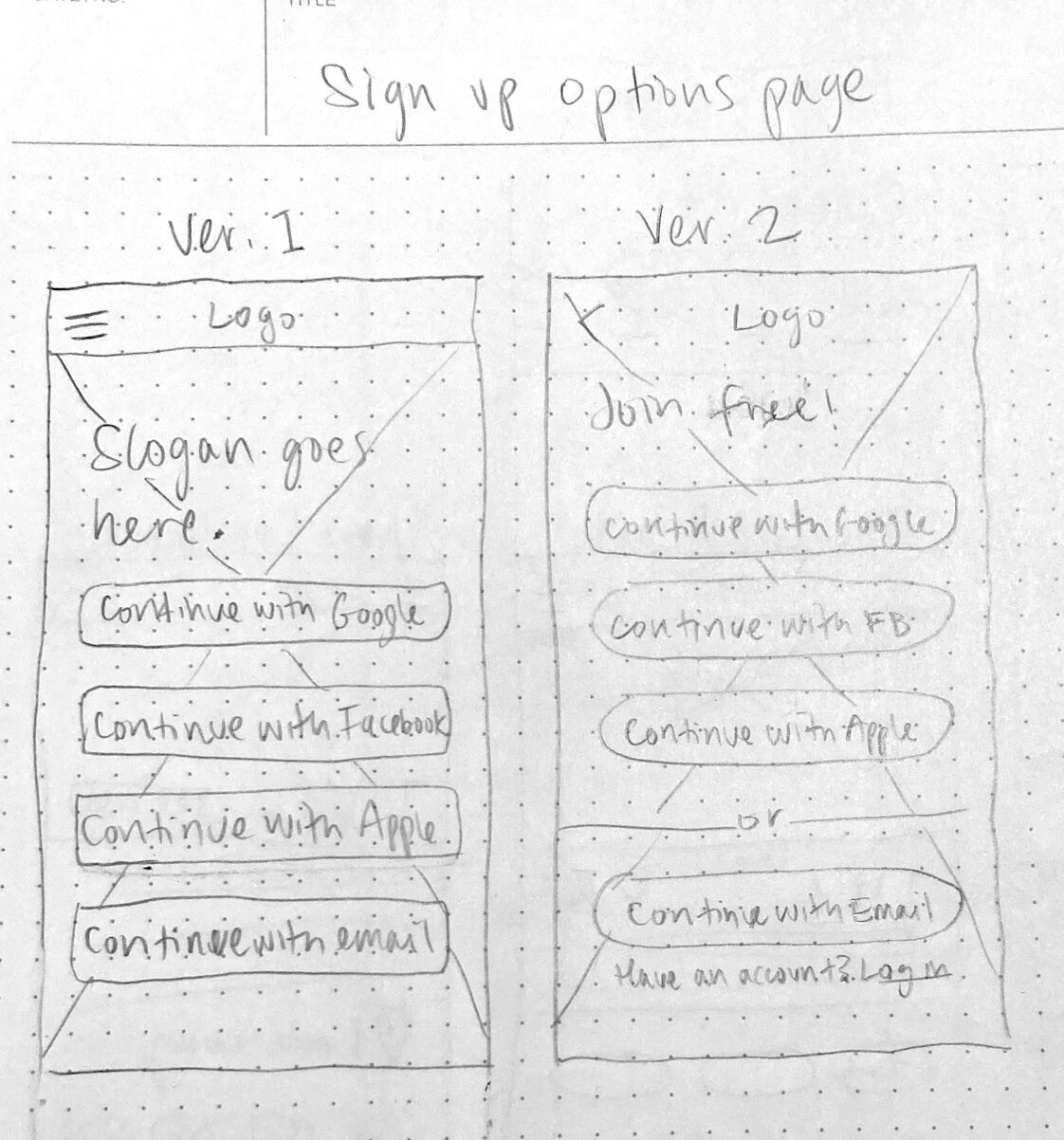
Sketches
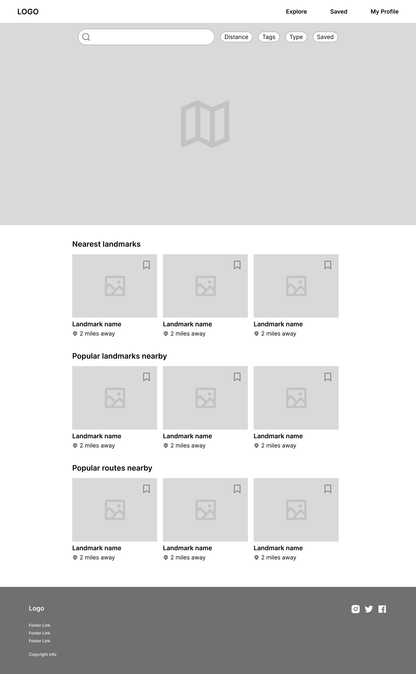
I began the design process by sketching to generate a range of ideas. I focused on the mobile site first, because users would interact with the product while out exploring the world.
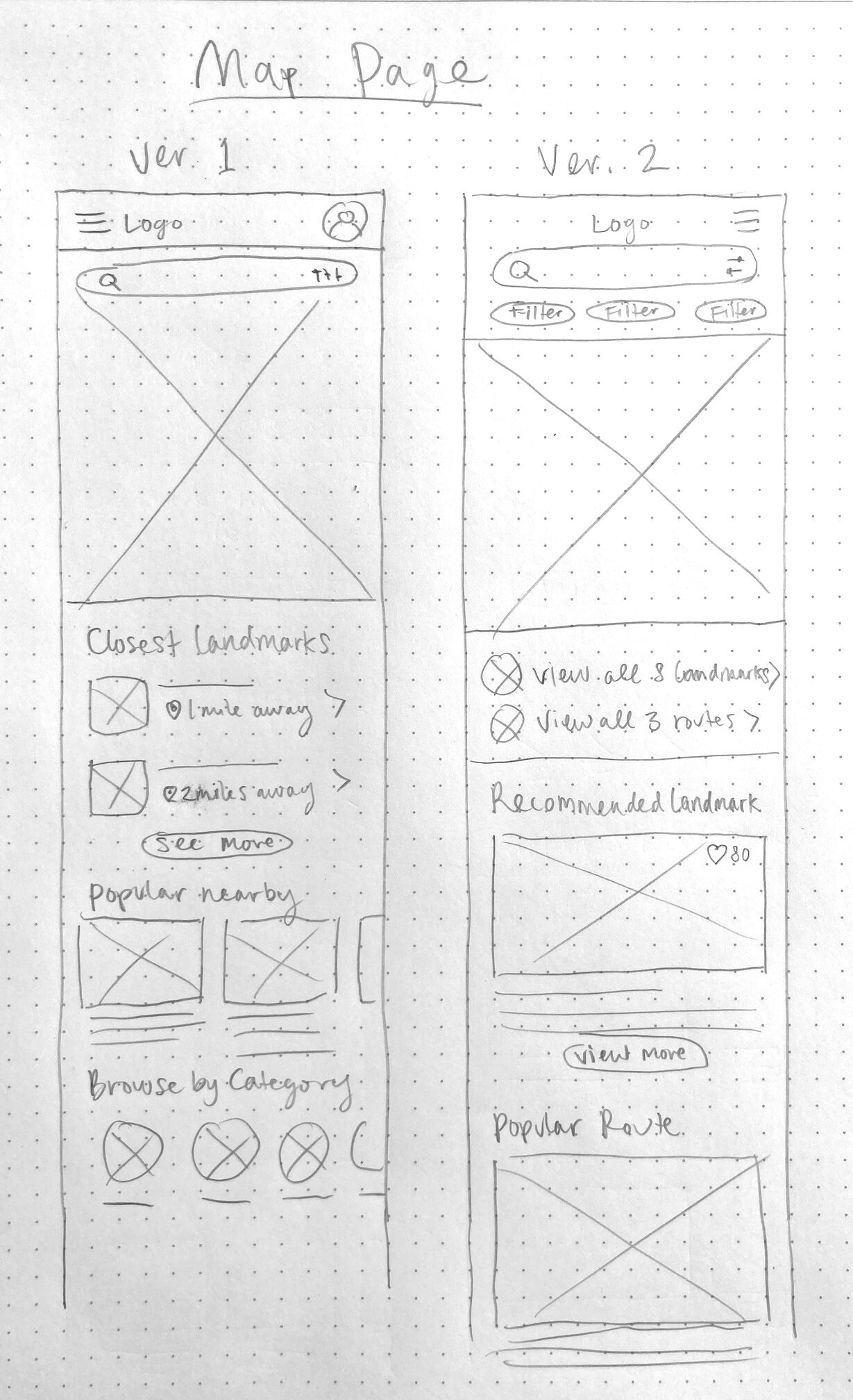
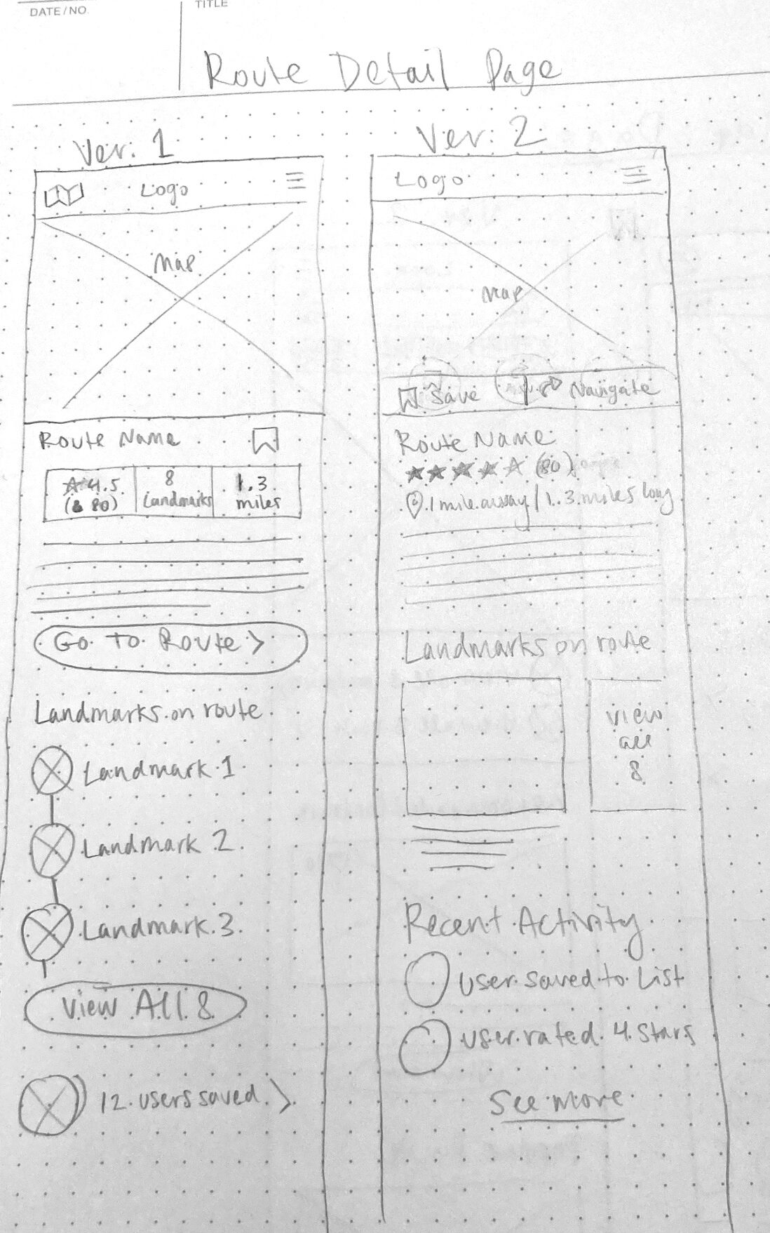
Mid-fidelity wireframes
My next step was to choose which aspects of my sketches to move forward with. I considered the sketches through the lens of business and user goals, aiming to prioritize key actions and ease of use.
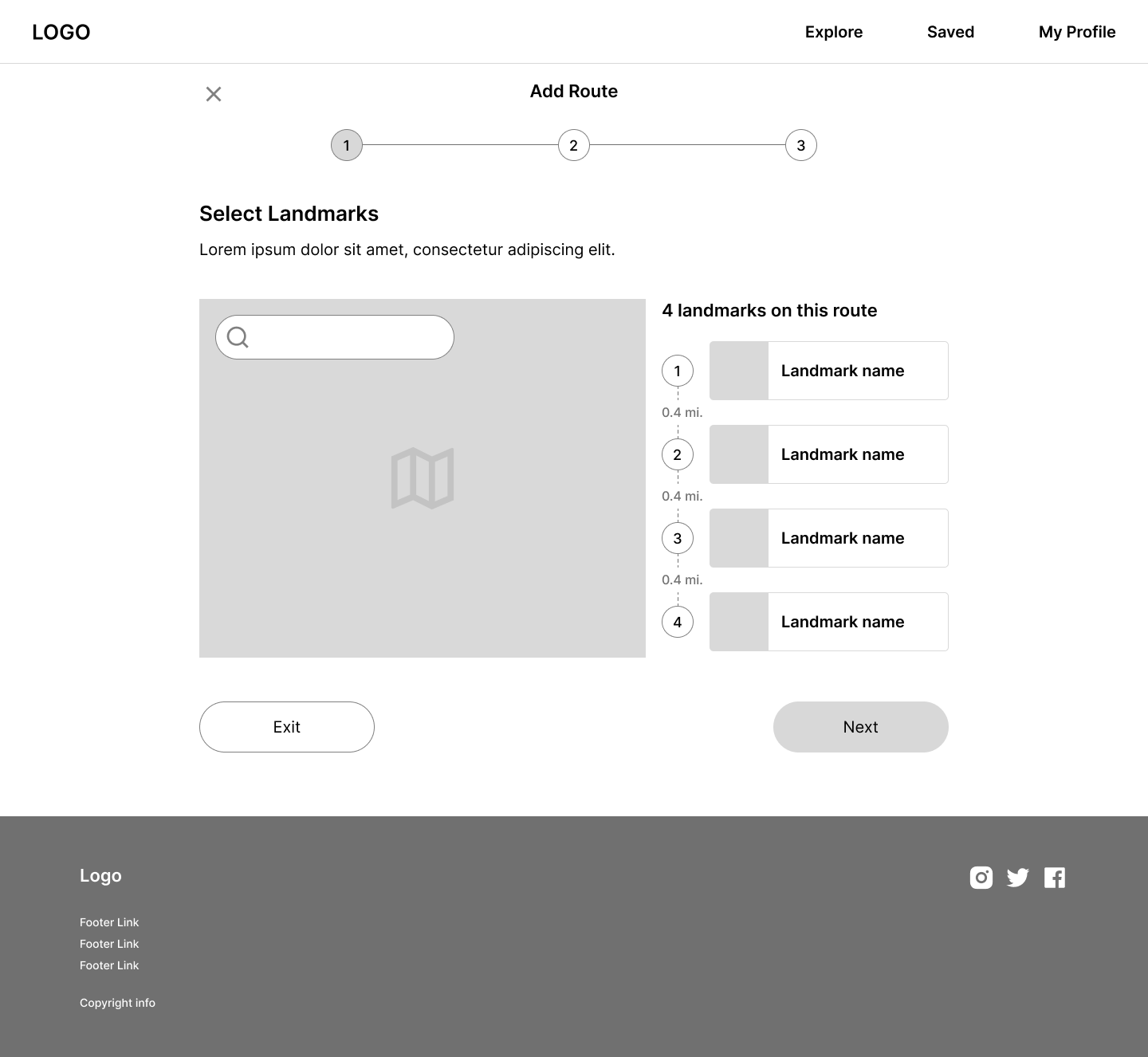
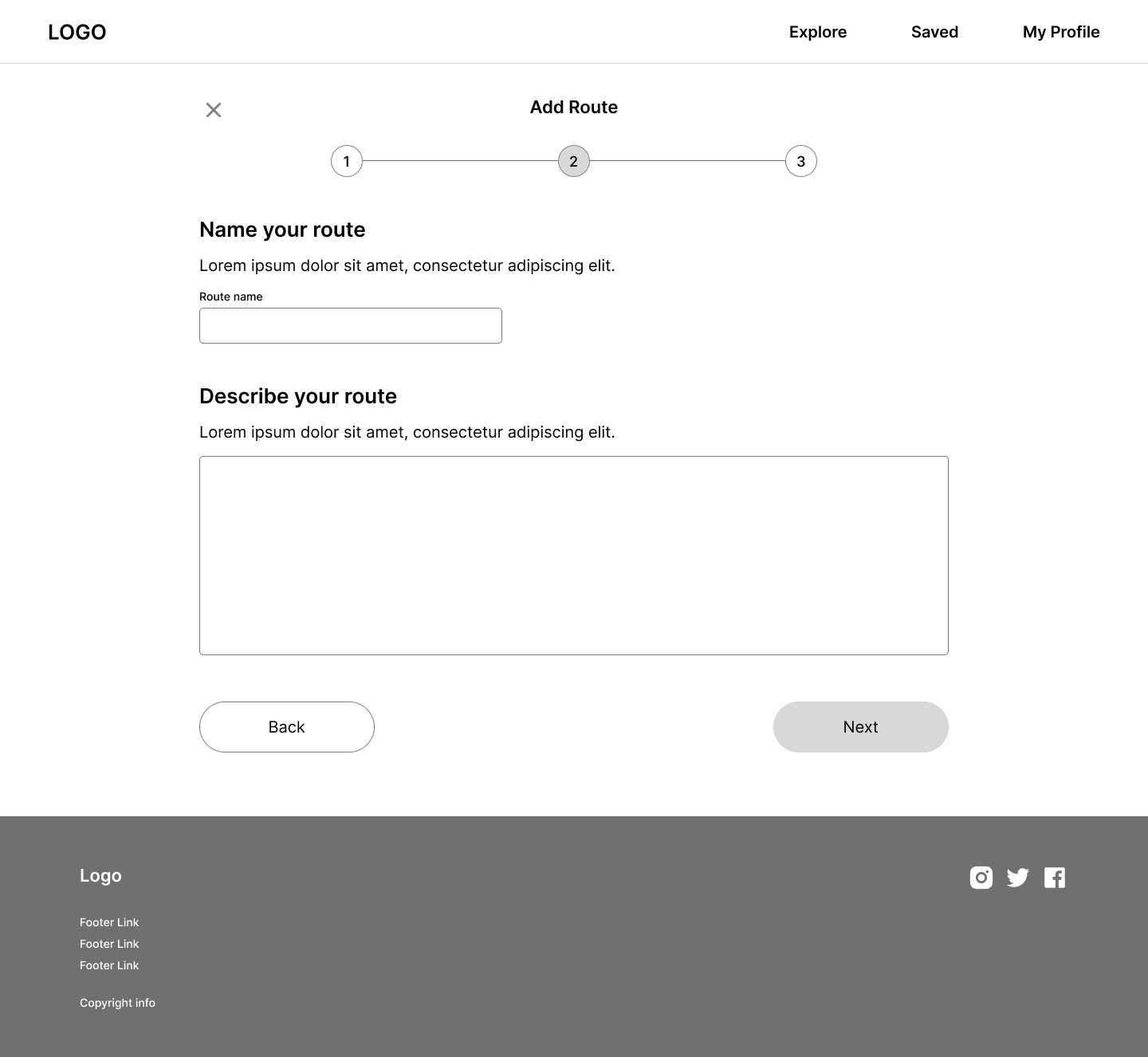
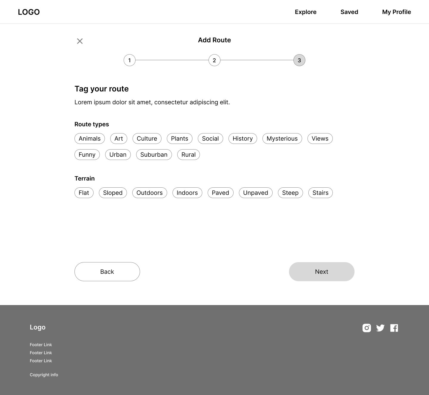
Then, I developed a set of mid-fidelity wireframes, focusing on the key screens for the “Add Route” flow.
I then adapted the mobile designs for a desktop browser.
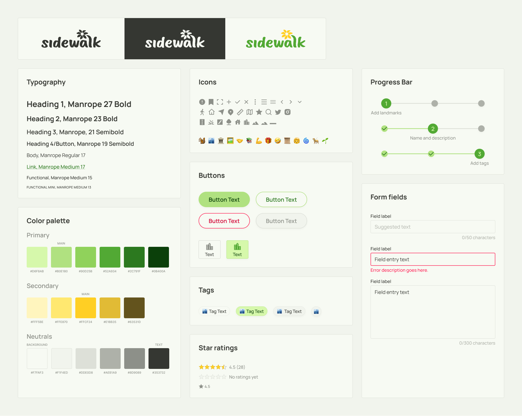
Building a brand identity
Identifying five key brand values gave me a solid foundation to build out the brand identity.
Brand values
Curiosity
Community
Discovery
Outdoors
Local
Guided by these values along with a moodboard I had created, I developed a style tile incorporating an original logo, typography, a color palette, and important UI components.
I chose friendly, rounded UI elements and green and yellow color palette to suggest a welcoming urban outdoors. The brand name, Sidewalk, references both a pedestrian path and an intriguing detour “off to the side.”
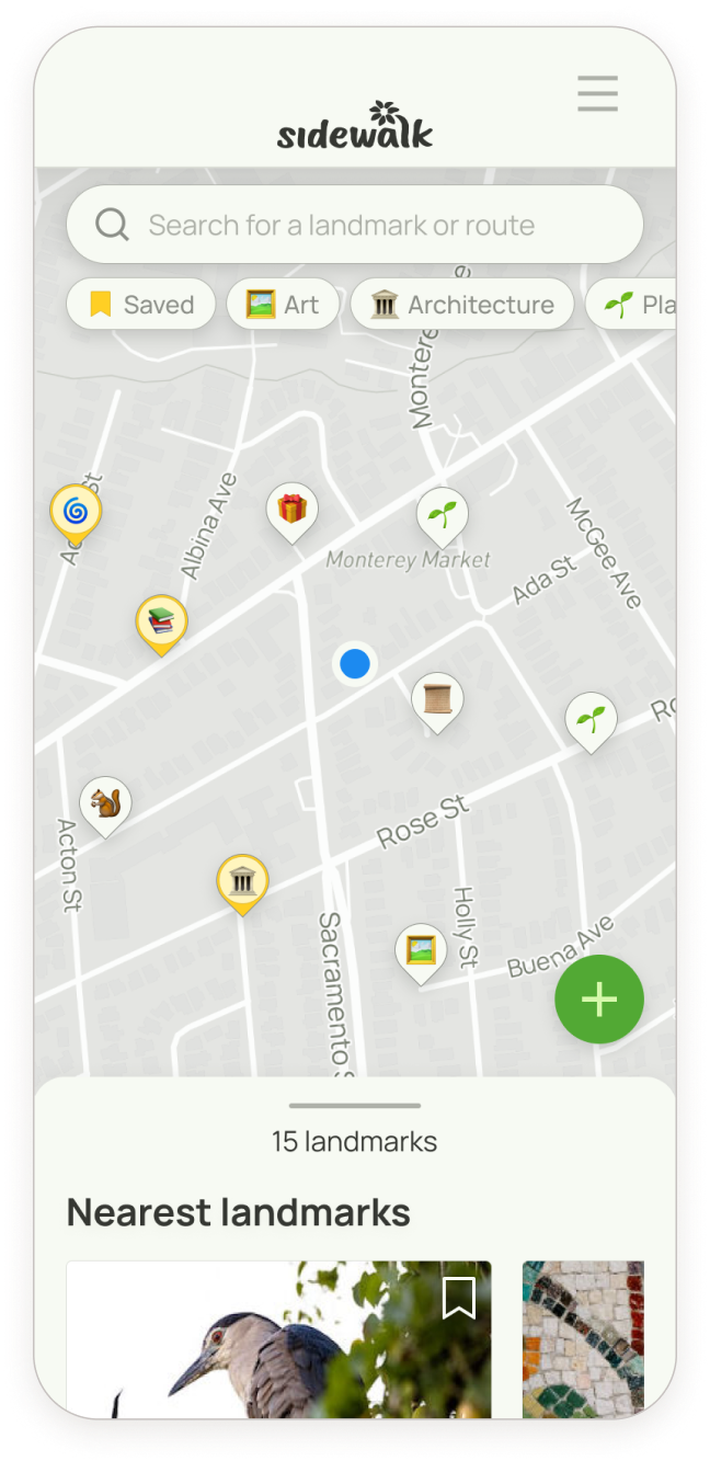
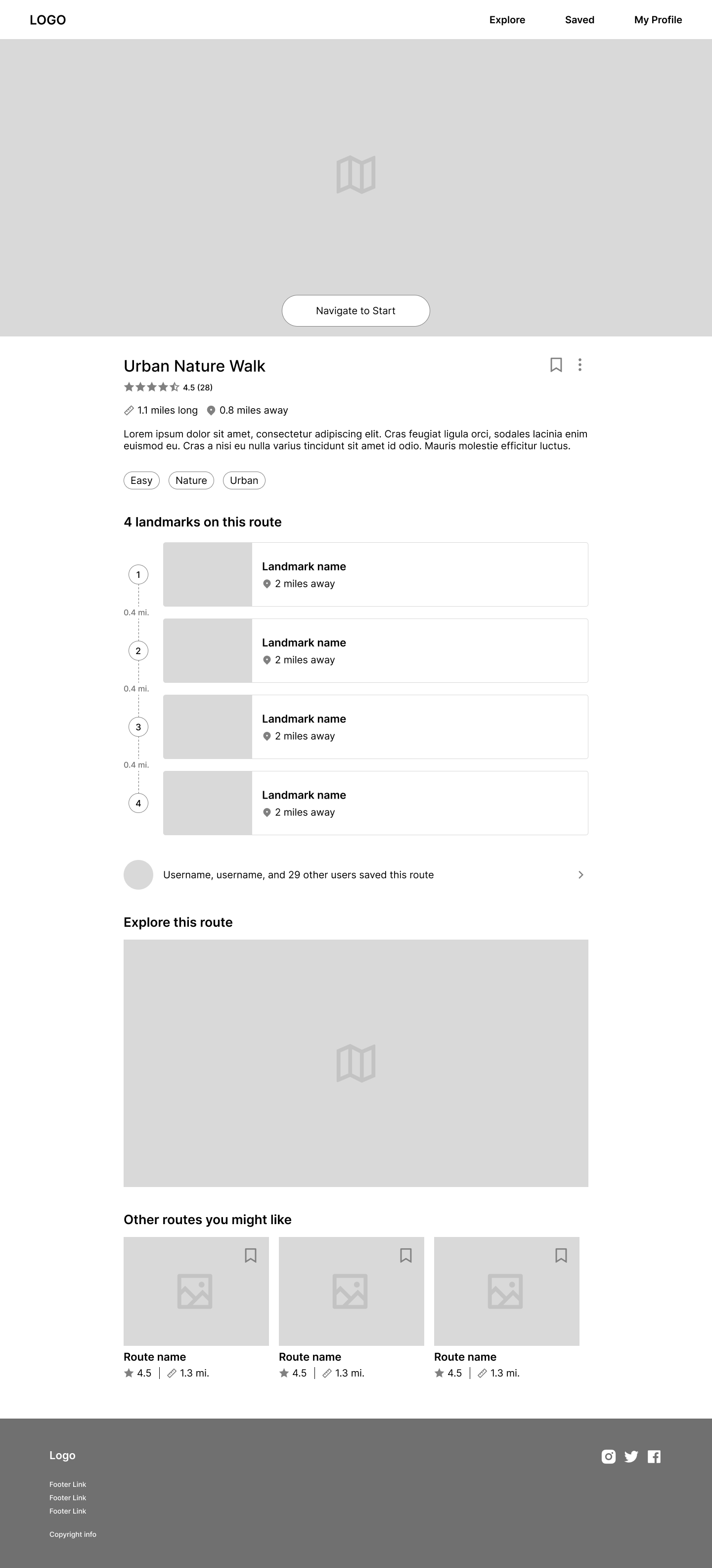
High-fidelity wireframes
Working from my mid-fidelity mobile wireframes, I streamlined the designs and incorporated the new branding and UI.
Key design decisions
Phase 4
Delivering the solution
Usability testing
It was time for users to try out the initial design. I created a research plan to assess users’ experience navigating the “Add Route” flow.
My goal was to understand the user’s subjective experience while creating a new route. I hoped to identify stumbling blocks, along with what worked well.
I ran 5 usability tests using a Figma prototype, some remote and some in-person.
Key research questions
Do users understand the process of adding a route, and what each step is for?
What do users find confusing or frustrating about the design?
What do they find satisfying or enjoyable?
What are users’ pre-existing expectations of this design, and how does their experience align (or not) with their expectations?
Can people envision using this product?
Digging into the results
I used affinity mapping to organize the usability test results by topic, then grouped the topics based on priority.
How complex would it be to resolve this issue in an MVP release?
Success metrics
Assessing areas of success and those needing improvement also helped me prioritize the changes I planned to make.
Errors
Do users make errors?
Users made some errors, though they mostly experienced comprehension issues.
Error correction
Can users easily recover from errors?
Participants did not make errors that they could not recover from (e.g. lost progress)
Subjective experience
Do users report confusion or frustration with their experience?
Users reported overall positive experience, but felt confused at some points.
Appeal
Can research participants envision using this product?
5/5 participants could envision using the product.
Addressing usability issues
Now that I had set my priorities, I was ready to design solutions for each of the issues I had identified.
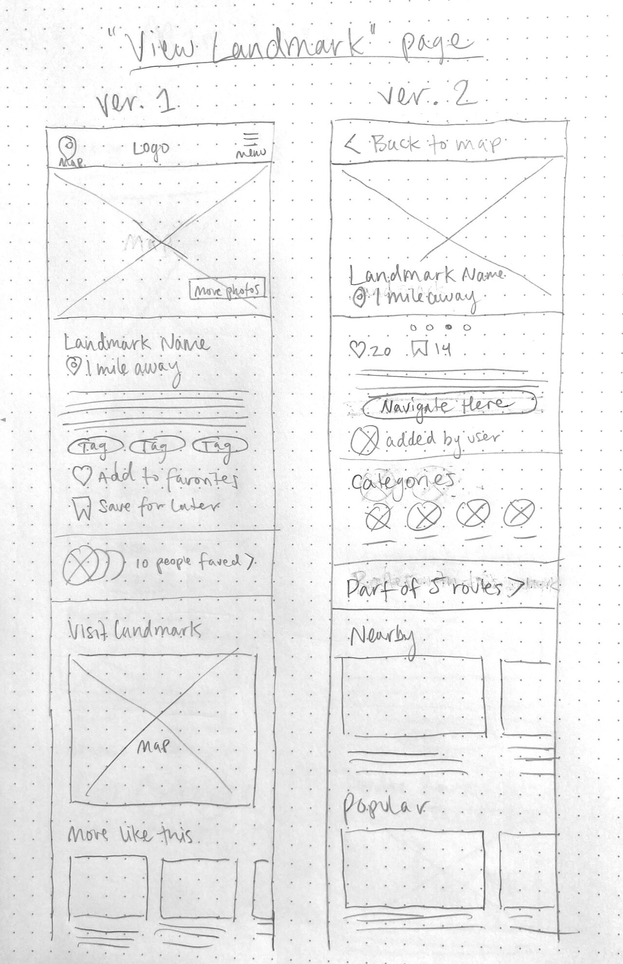
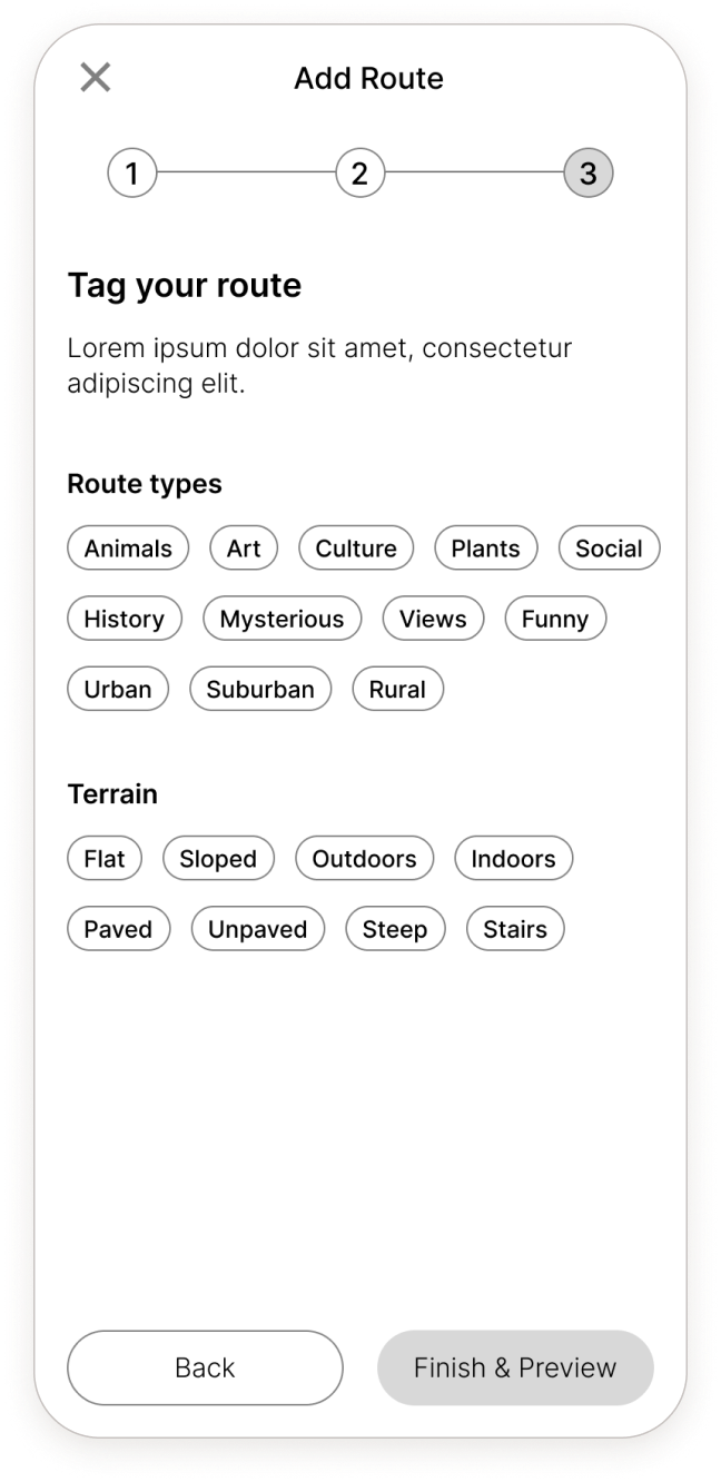
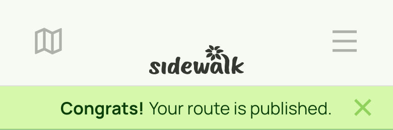
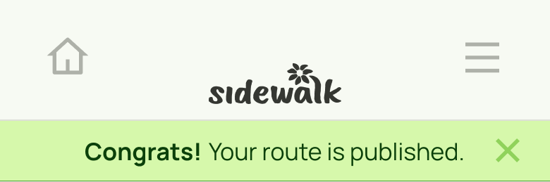
How do I return to the starting screen after I finish creating a route?
(5/5 participants)
Ver. 1
Ver. 2
In the top menu on the route listing page, the icon to return to the home map has been changed from a map icon to a house (home) icon.
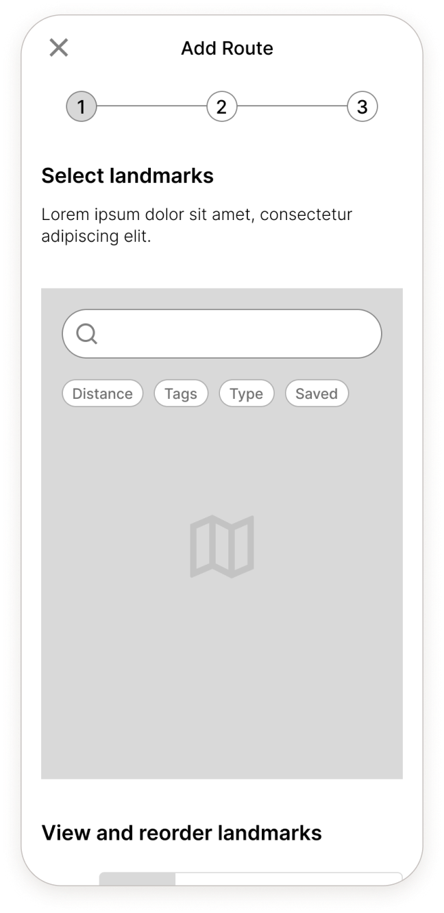
I can’t tell what the tag emojis mean when they’re not associated with text.
(3/5 participants)
Ver. 1
Ver. 2
In search and landmark preview overlay, tags now display with text rather than just emojis.
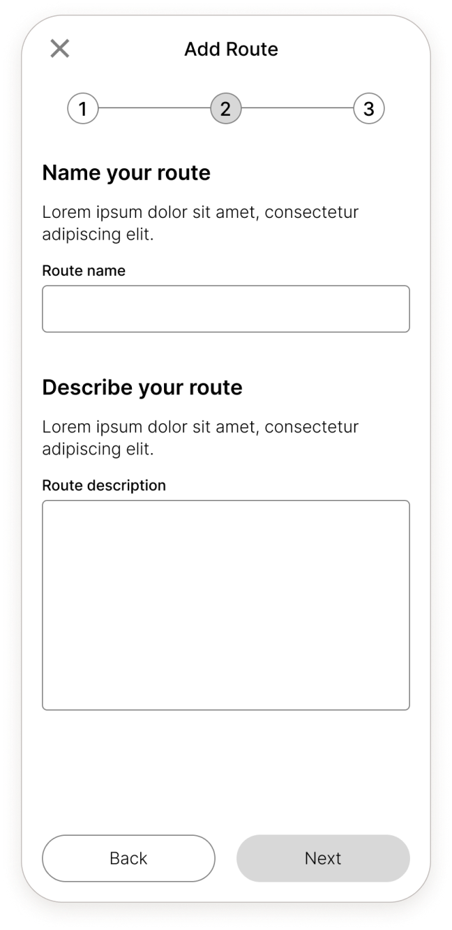
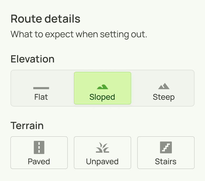
I don’t know how many elevation and terrain options I can select.
(2/5 participants)
Ver. 1
Ver. 2
More context has been added for the route elevation and terrain options, and elevation is now formatted as tabs to indicate that you can only select one option.
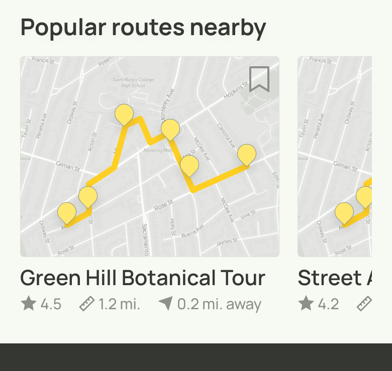
It would be nice to see tags in horizontal lists.
(2/5 participants)
Ver. 1
Ver. 2
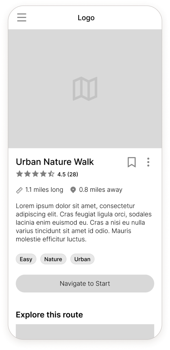
Tags are now displayed for horizontal list items. Route previews now display as photos instead of pins to provide more information.
The route pins don’t give me enough information.
(2/5 participants)
Ver. 1
Ver. 2
Landmark pins in a route now show tag emoji (like other pins). They now have a badge, and sequence is indicated with letters instead of numbers (so as not to suggest a count of multiple landmarks).
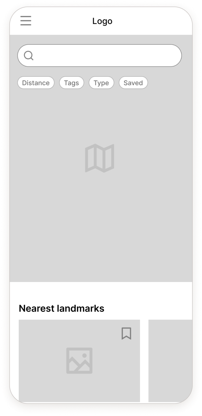
How do I view routes on the home map?
(2/5 participants)
Ver. 1
Ver. 2
On the home map, any landmark pin that serves as the start of a route/routes now has a badge. The map view can also be filtered to display landmarks or routes.
Updated wireframes and prototype
The updated version of Sidewalk incorporates the changes based on the usability test results. You can take a look below.
Sidewalk was conceived as an independent design case study. If it were developed for release, my next steps would involve:
1. Completing the design process for all MVP features
In this project, I focused on the flow for adding a new route. I would need to design additional flows including account creation, login, and adding a new landmark.
2. Design handoff
I would work closely with a developer, making sure that they have all of the information they would need.
What I learned
Sidewalk was my first end-to-end product design, so I learned a lot. Some lessons:
The designer's mental model might be different from the user's.
Users were confused by the map icon used to return to the home map screen—something I had taken for granted. If I hadn’t designed it, I might’ve been confused too.
Visual design choices that look good on paper may not work in practice.
I went through a few iterations of Sidewalk’s color scheme. I even created a component library using one palette, but once implemented, it no longer fit.
An initial concept can evolve.
An early idea involved populating a map as the user explores, but I had to confront the fact that it would be complex to implement. Still, it was an important step in Sidewalk’s evolution.


