When I adopted my cat, it took some time for us both to adjust and fall into a happy routine.
I figured that I might not be the only person to struggle after bringing home a new pet, so I decided to learn about others’ experiences and pinpoint some common hurdles.
In my initial research, I discovered that the cost of vet care can be an unwelcome surprise for many new pet owners. This discovery prompted me to design an app that new pet owners can turn to for support and information.
Project goals
Develop a deep understanding of the needs of new pet owners
Identify and solve for a common problem area
Complete an end-to-end product design process including discovery, research, design, and testing
Project info
My role
Sole designer, independent project
Tools
Figma, Figjam
Phase 1
Discovering the problem
Getting to know pet owners
I knew I wanted to create an app for first-time pet owners, but I needed to identify a problem to tackle.
I planned to interview first-time dog and cat owners with the goal of understanding the key challenges they face. Then I could narrow in on a problem space.
Research questions
In the time shortly before, and up to 1 year after, bringing home their first dog or cat:
What challenges do first-time pet owners face?
What emotions do they feel?
What is unexpected about the experience?
What concrete actions do they take to care for their pet?
Where do they turn for support, and how do they feel about the resources they utilize?
Looking back, what do they wish they had known in advance?
Exploring the results
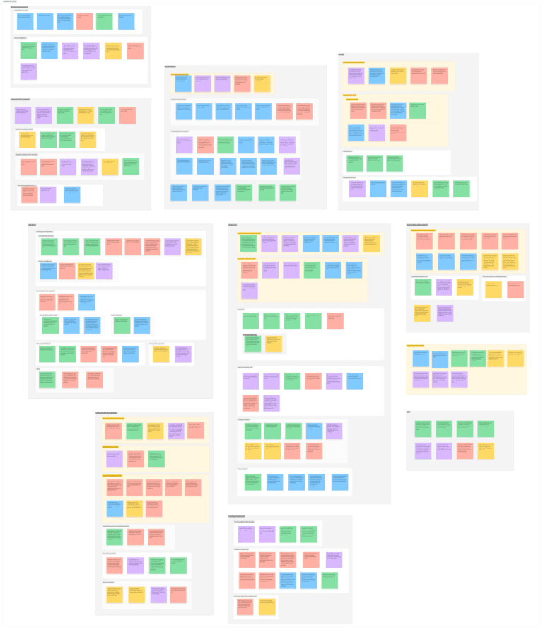
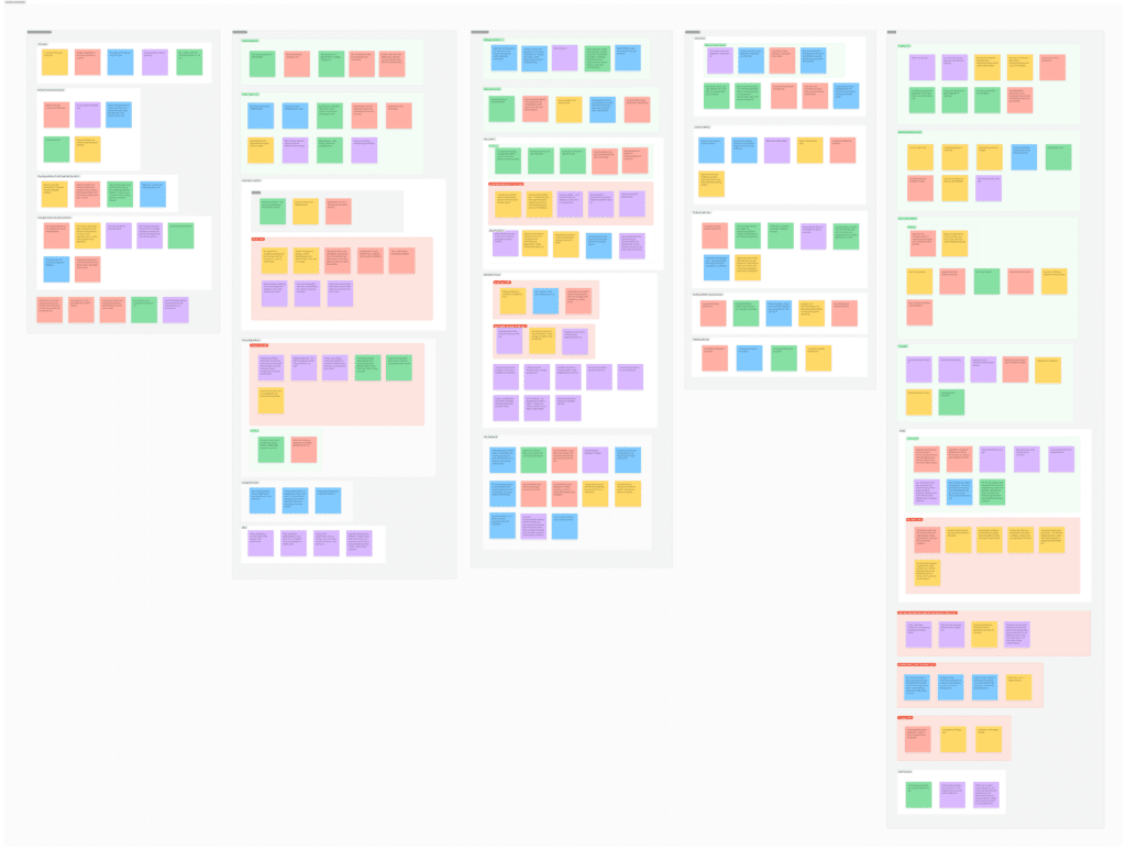
I spoke with 5 people who had gotten their first dog or cat in the past 3 years. An affinity map helped me pick out patterns in the results.
I identified two key challenges faced by new pet owners.
Key problem #1
Unexpected burden of veterinary care
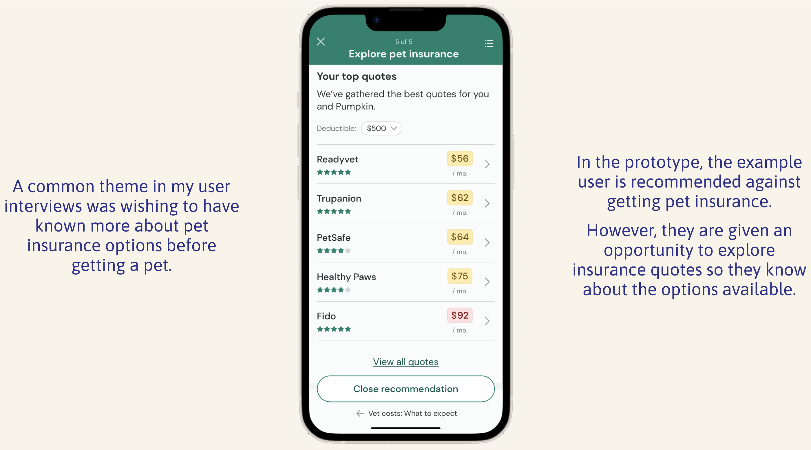
4/5 participants experienced an unexpected veterinary issue during the first 3 years with their pet. 3/5 said they’ve found vet care to be very expensive, and 2/5 wished they’d known more about pet insurance when they got their pet.
Key problem #2
Adapting to lifestyle changes with pets
4/5 participants said getting a pet meant less freedom/spontaneity in their life. 3/5 found it challenging to manage pet care alongside a work schedule, and 3/5 talked about having to adjust their daily routines to meet their pets’ needs.
I would need to select one of these two problems to pursue.
Phase 2
Defining the problem
Choosing a project direction
I considered the two problems I had identified. I noticed that while it wasn’t easy for my interviewees to adapt their lifestyles to pet ownership, the change was expected. On the other hand, the burden of vet care came as more of a shock.
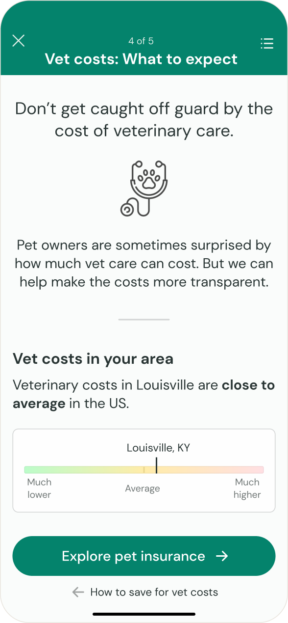
To learn more, I dug into additional research about how vet costs impact pet owners.
Supplementary research findings
I learned that:
Veterinary costs in the US increased by nearly 11% from 2022 to 2023.
Our culture may be treating pets more and more like family, leading owners to invest in more veterinary care.
These rising costs are having a significant financial impact on pet owners, with one study finding that “a vet bill of $999 or less would cause 42% of pet owners to go into debt.”
No wonder the first-time pet owners I spoke with were caught off guard by vet care costs.
My research confirmed that this is a real issue that could benefit from novel solutions. Next, I needed to get specific in my focus.
Articulating the problem
I crafted two point of view statements expressing my users’ concerns to better connect with the problem. Then, I turned the POV statements into questions to guide my thinking.
POV
I’d like to explore ways to help new dog and cat owners feel empowered to handle unexpected veterinary bills, so they can avoid future financial hardship and stress.
How might we
…help new pet owners feel empowered to handle unexpected future veterinary bills?
POV
I’d like to explore ways to help new dog and cat owners learn about available pet insurance options, because they will have fewer choices once health issues arise later on.
How might we
…help new pet owners learn about pet insurance options?
Exploring the problem
Before considering solutions, I dug into the problem from multiple angles.
Understanding the existing market
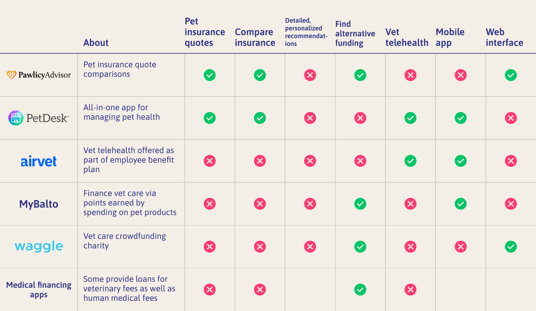
I began seeking out a range of products addressing the problem of paying for vet care. By understanding these products, I’d be able to develop a unique solution.
I noticed some limitations in the product landscape. None of the potential competitors:
Offered a comprehensive analysis of the many factors that can impact vet care costs, or explain these to the user.
Supported users for whom pet insurance isn’t a good fit.
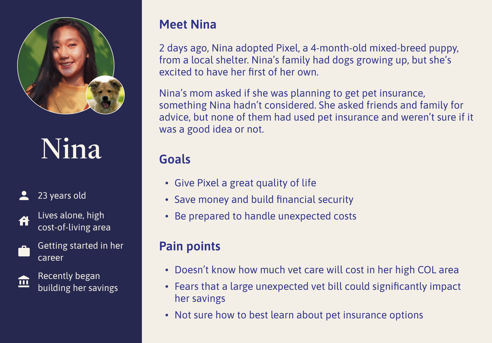
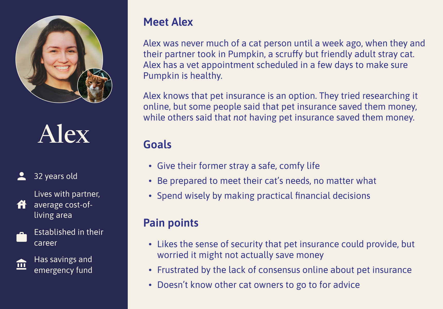
Creating personas
I developed personas with the intention of revisiting them throughout the design process.
Click an image to expand
Getting the most out of personas
I made sure that my personas represented a wide range of user needs. For example, “Nina,” would be likely to save money with pet insurance, while “Alex” might be better off without it. Nina has dog, while Alex has a cat.
By considering the needs of both personas, I would make sure my product served users in a variety of circumstances.
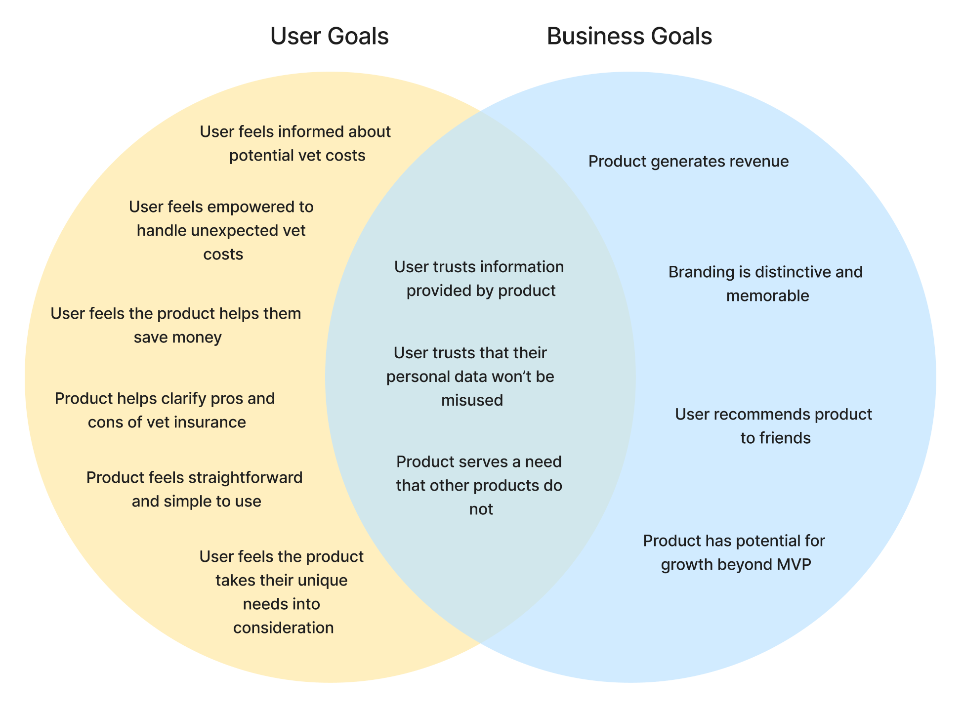
Considering business goals
Up to this point, I had taken a user-focused perspective. I needed to think about business needs as well.
A venn diagram helped me consider where the needs of the business and the user might align or diverge.
Phase 3
Developing the solution
Building a feature set
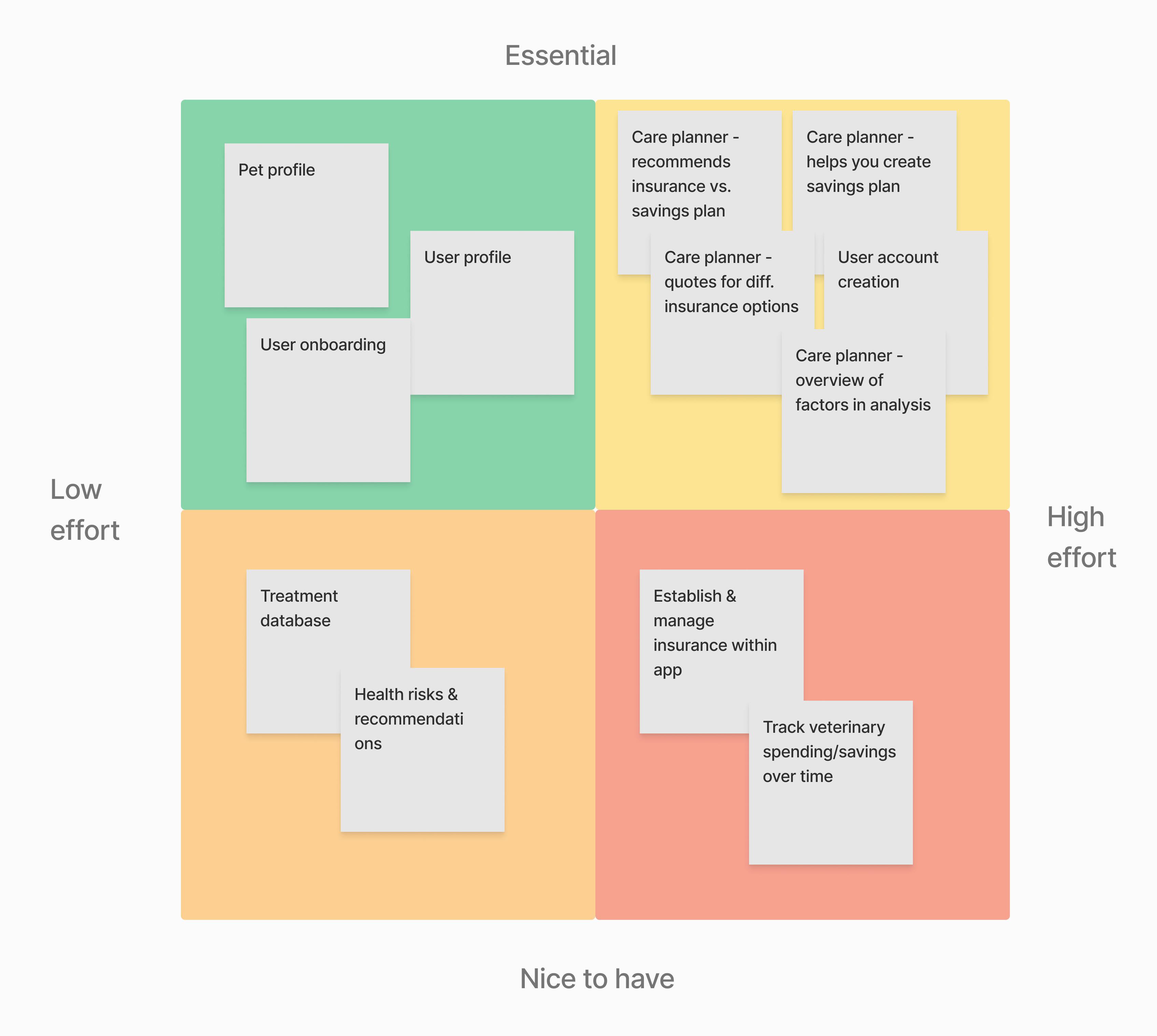
In my competitor analysis, I found a lack of products offering thoughtful, personalized recommendations to help users prepare for potential future vet costs. So I decided to design a product filling this niche.
I brainstormed a list of possible features for this product. Then, I prioritized them based on two axes: necessity and effort to implement.
Using this matrix, I narrowed down the potential features to a set that I planned to pursue in an MVP design.
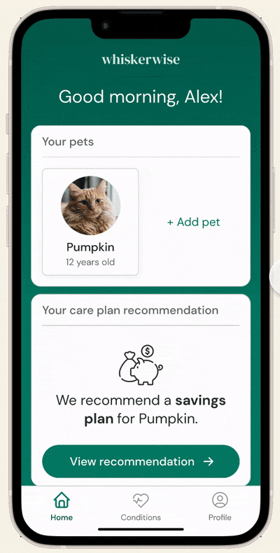
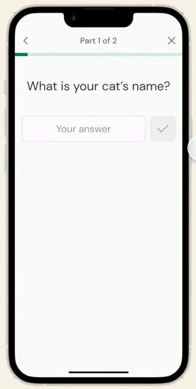
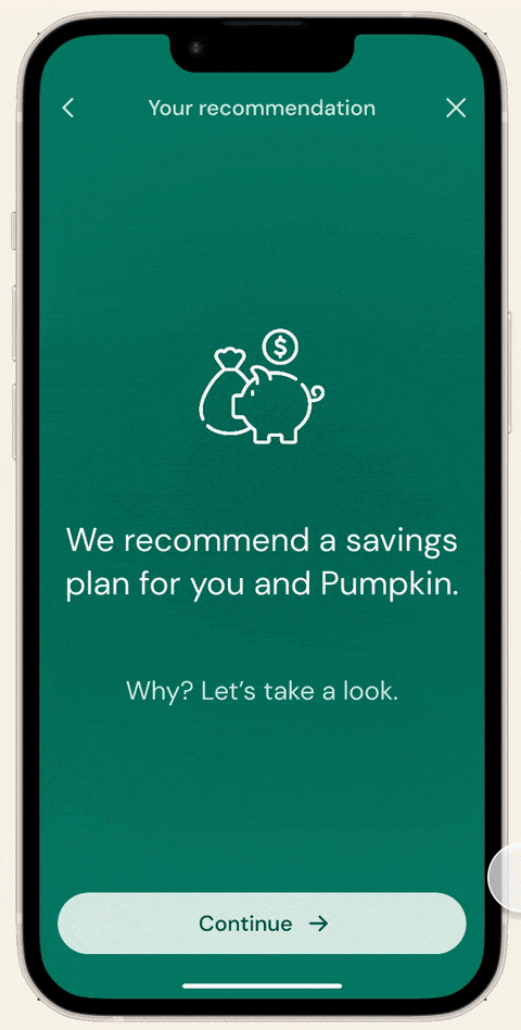
Feature set for MVP release
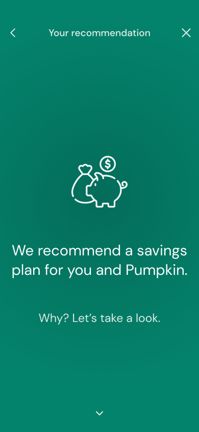
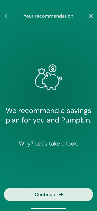
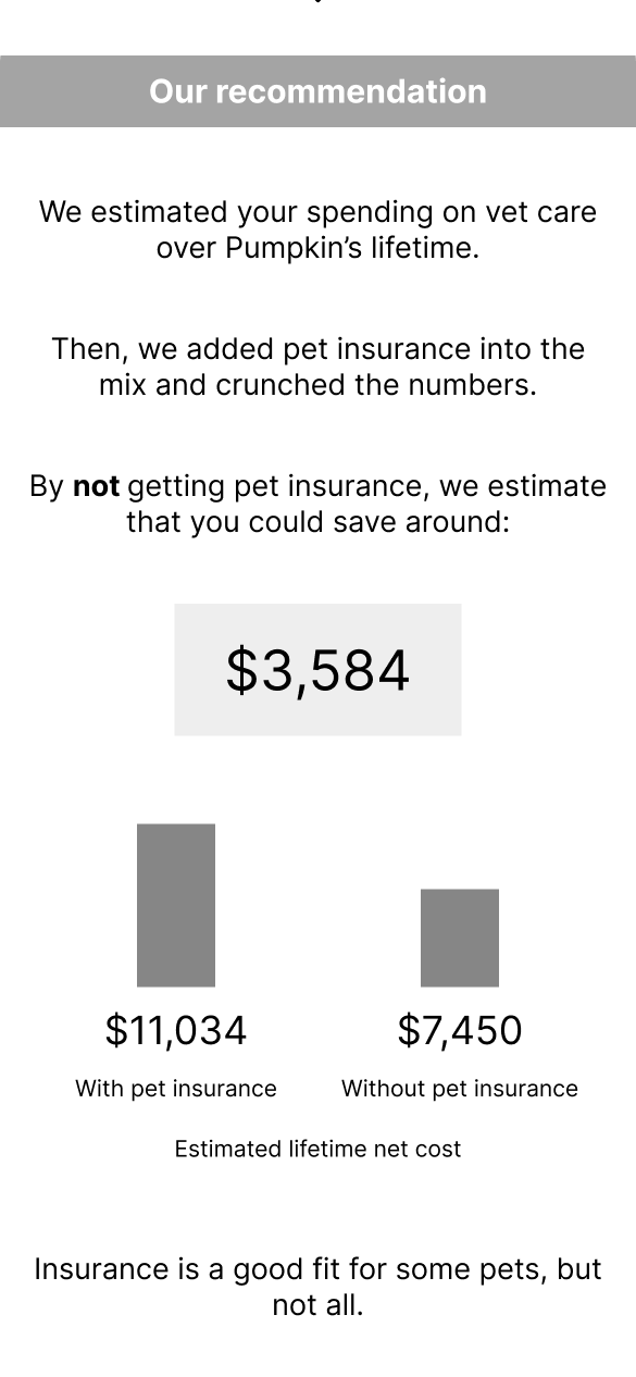
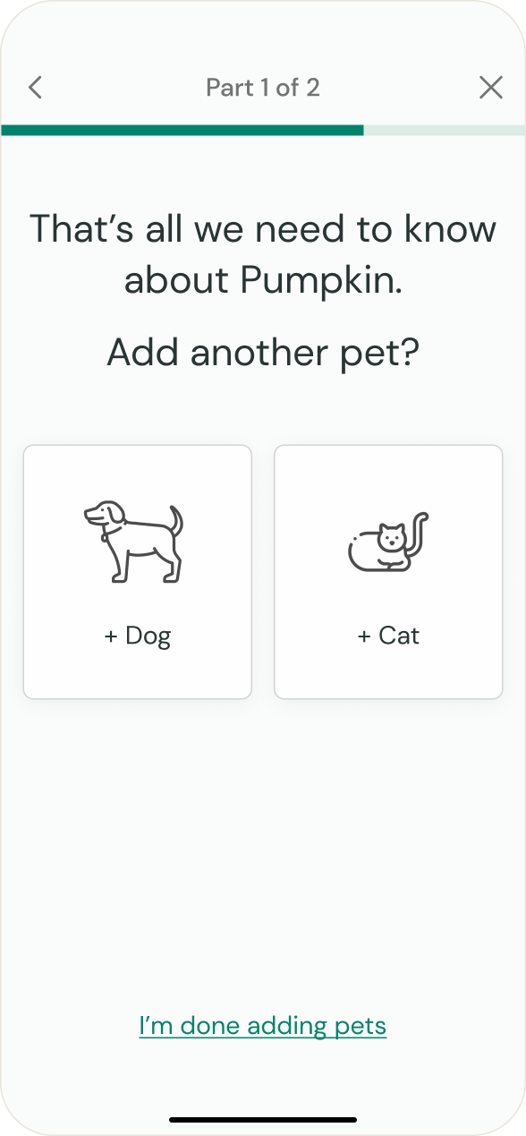
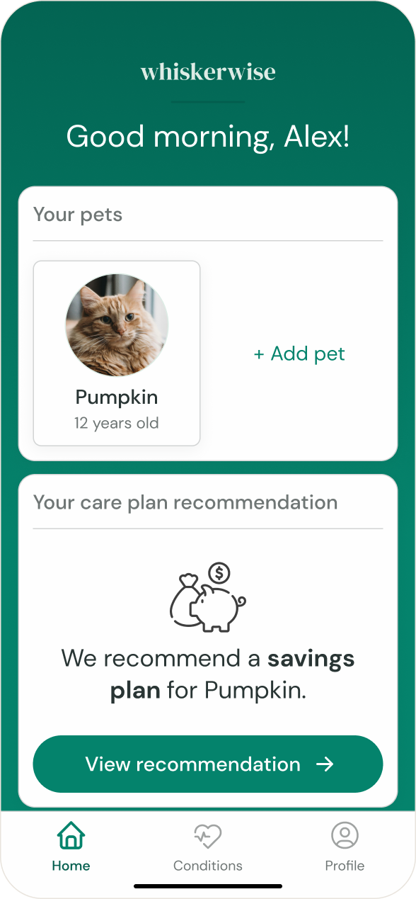
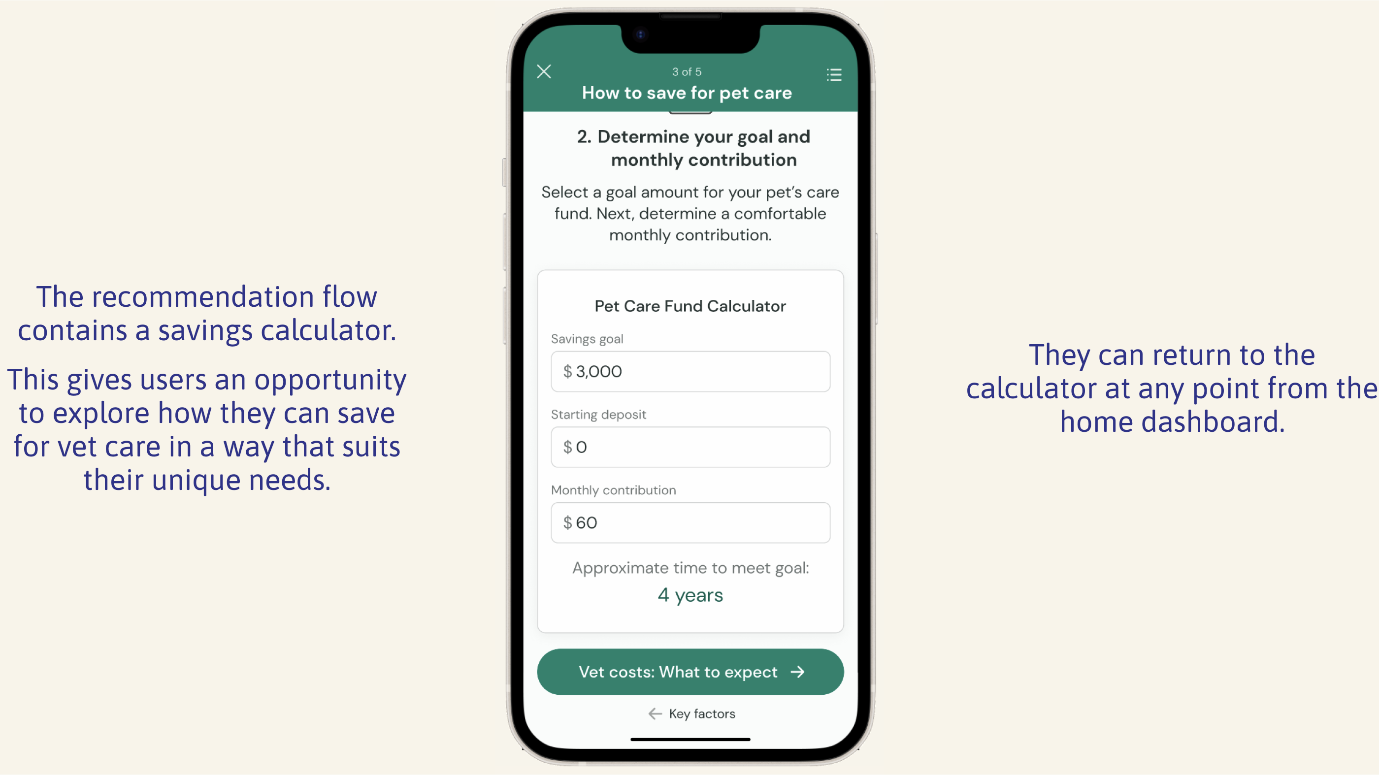
A “care planner” tool that gathers information about the user and their pet, then recommends either pet insurance or a savings plan and offers a detailed, personalized analysis and explanation.
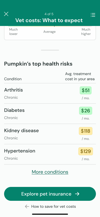
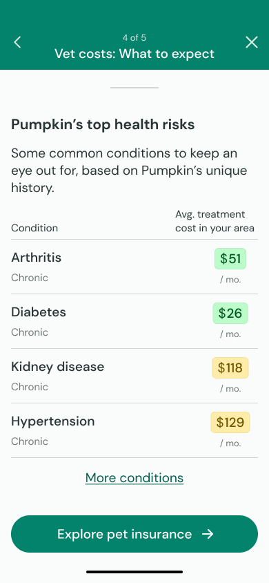
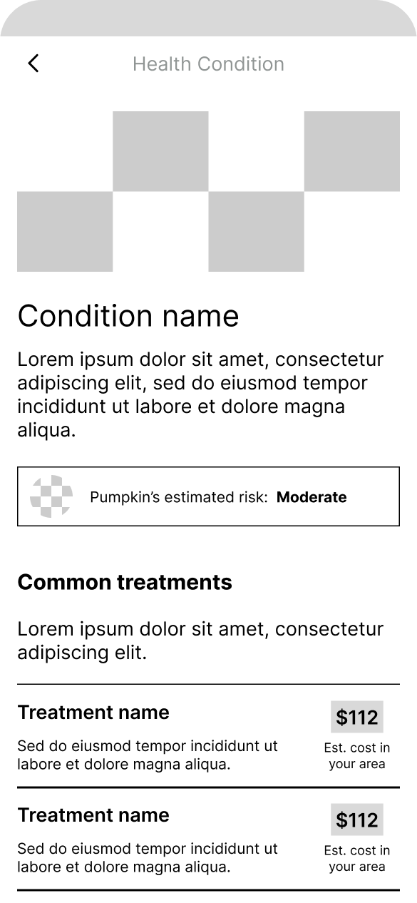
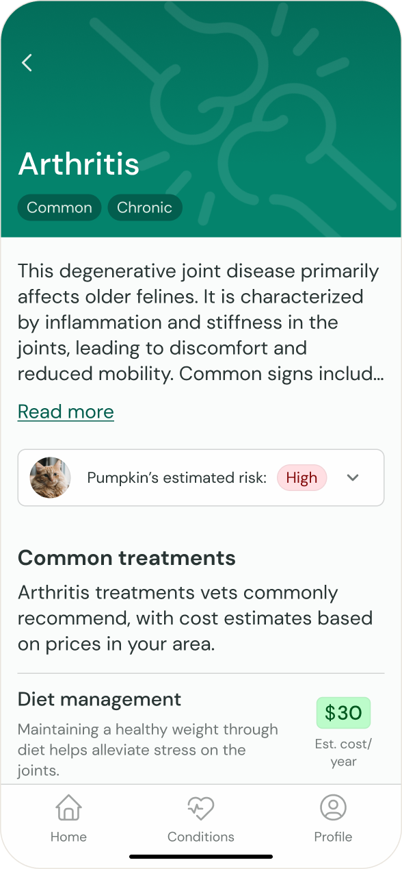
A database of pet health concerns and their average treatment costs in the user’s area, plus estimates of the user’s pet’s health risks.
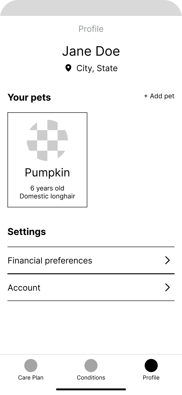
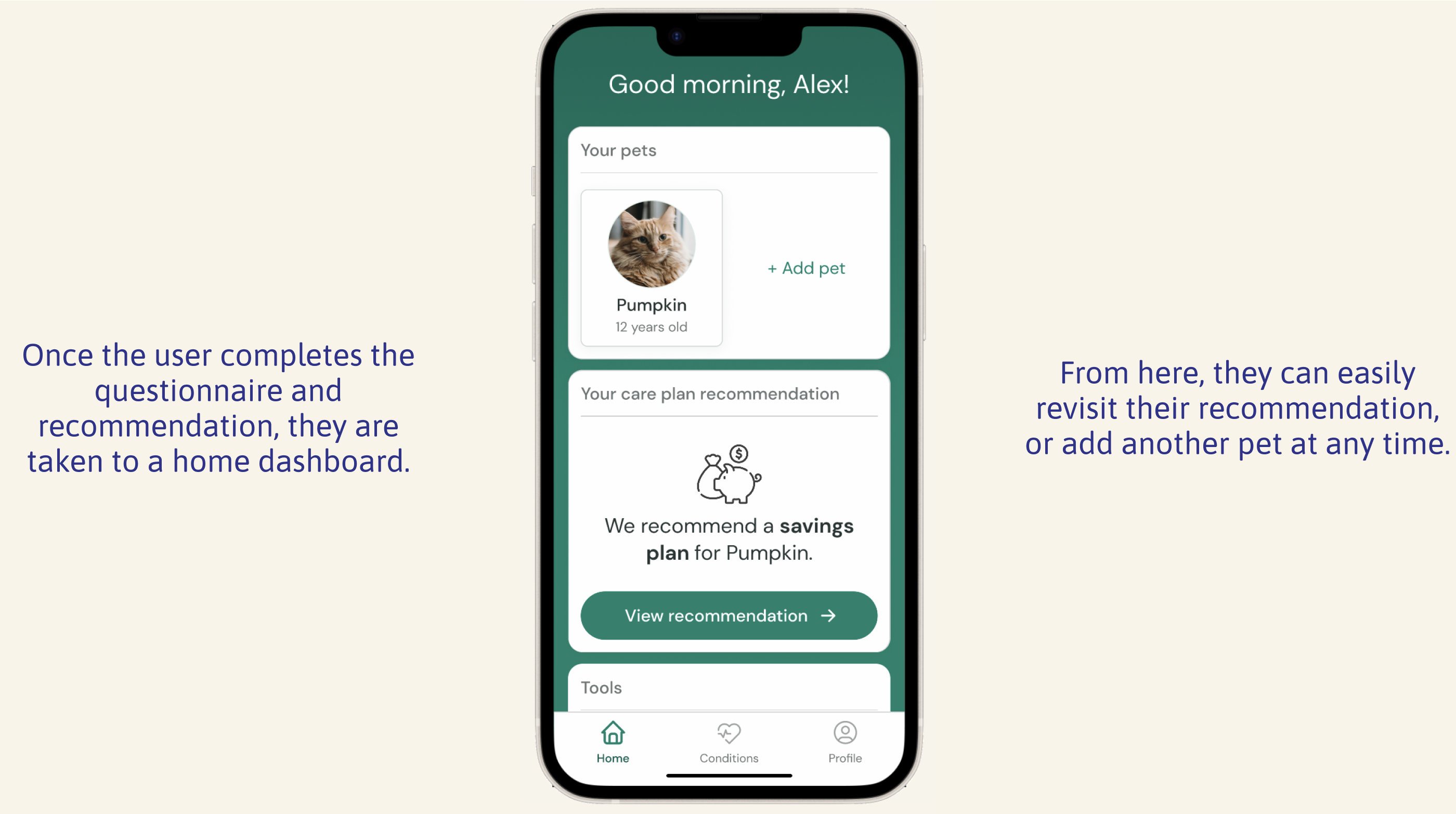
A home dashboard and user profile to help the user easily navigate and manage their account.
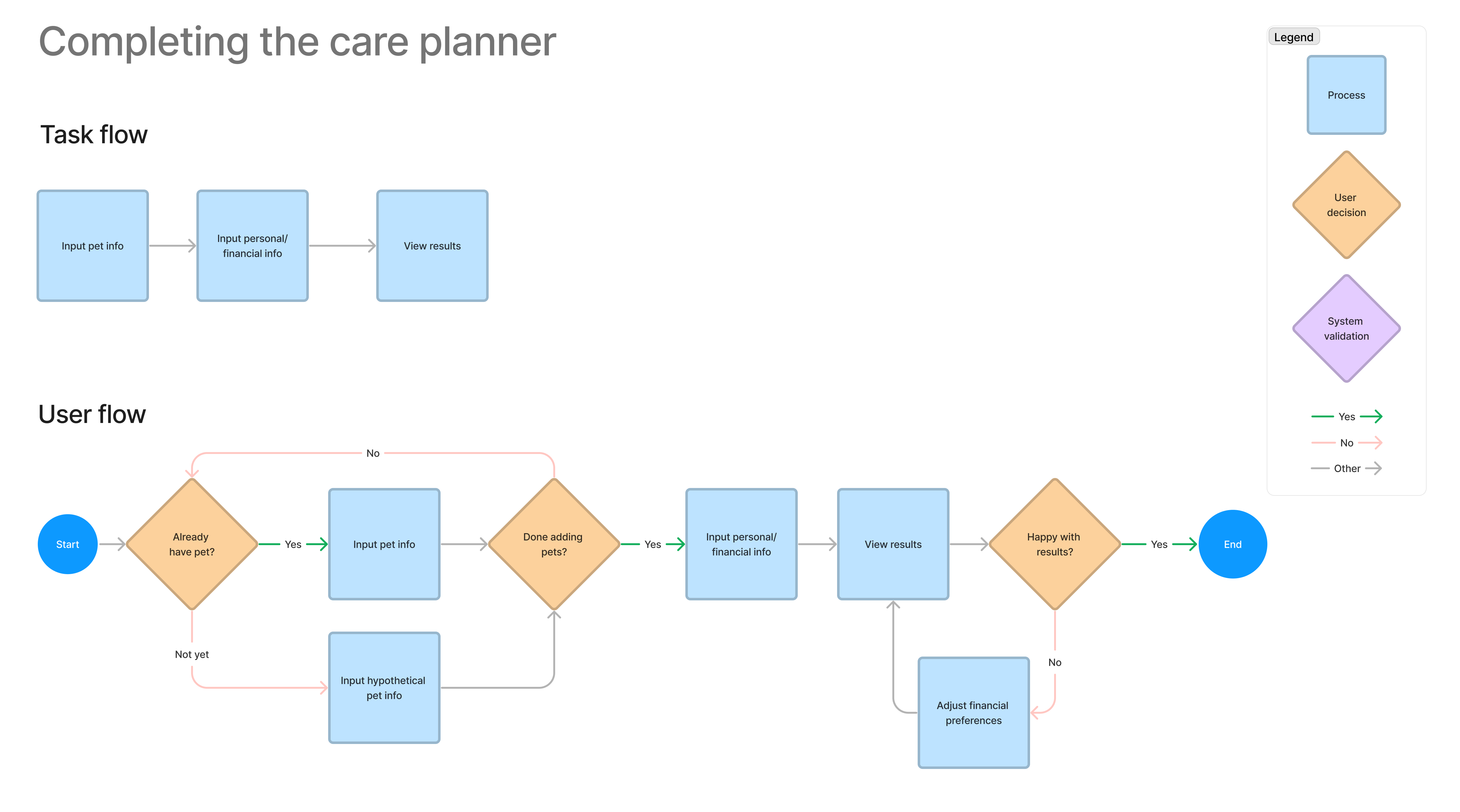
Exploring user interactions
User and task flows
I created user and task flows for the “care planner” and other important features. This helped me take the perspective of a potential user and clarify what screens and interactions I would need to design.
Information architecture
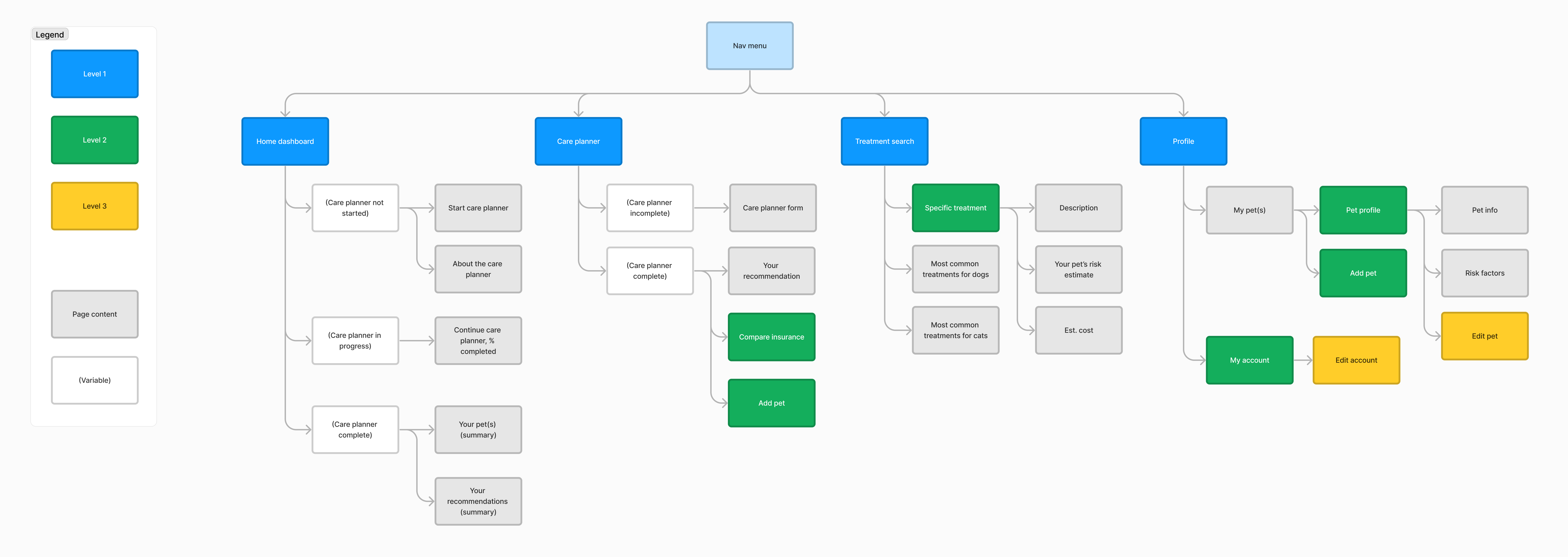
Next, I considered navigation. How would users access the different features of the app?
In a site map diagram, I created a hierarchy of content. I also explored how the app might behave differently based on whether the user had completed the initial questionnaire.
I now had a sense of the structure of my app. I needed to tackle its appearance and function through iterative wireframes.
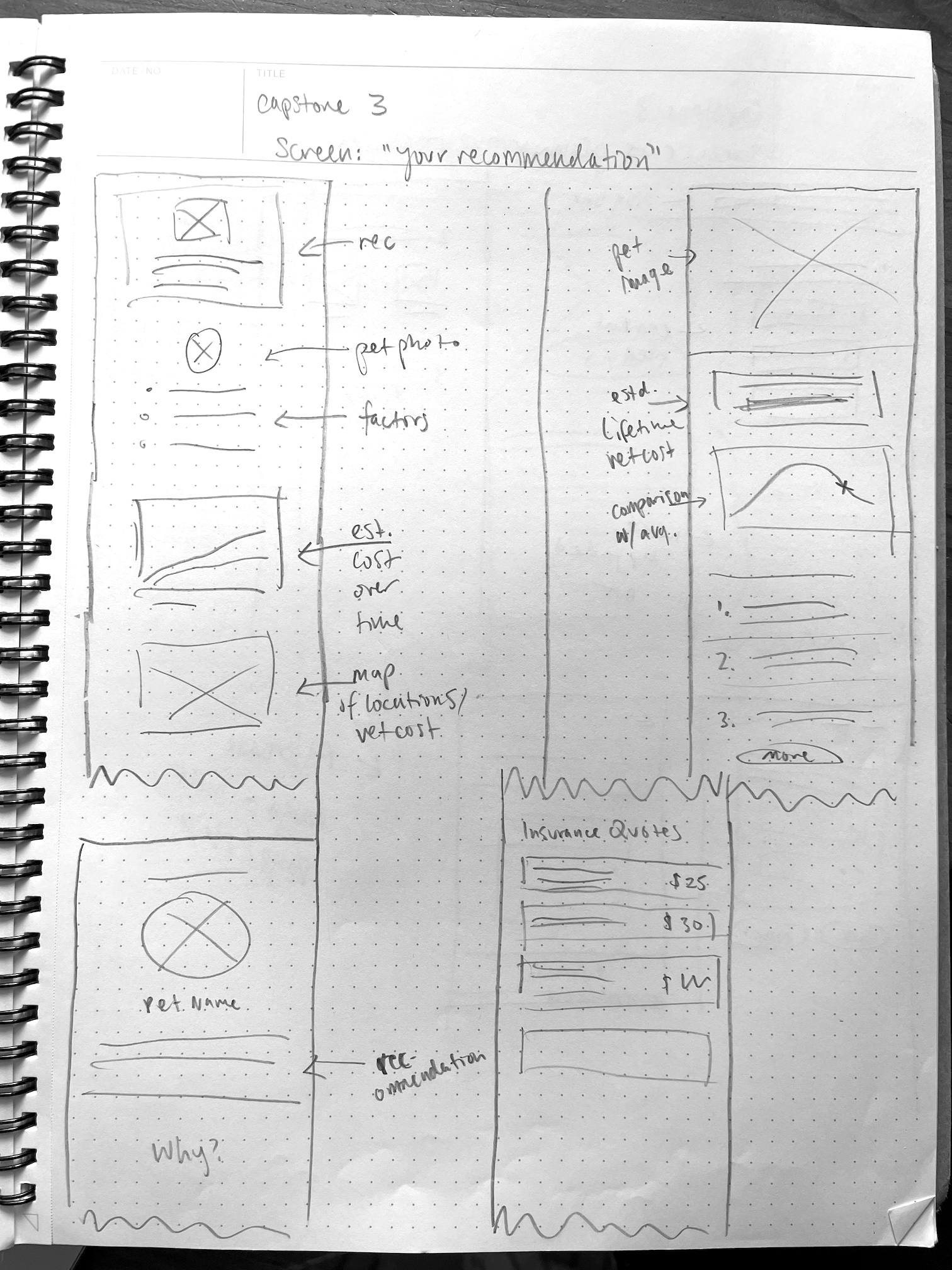
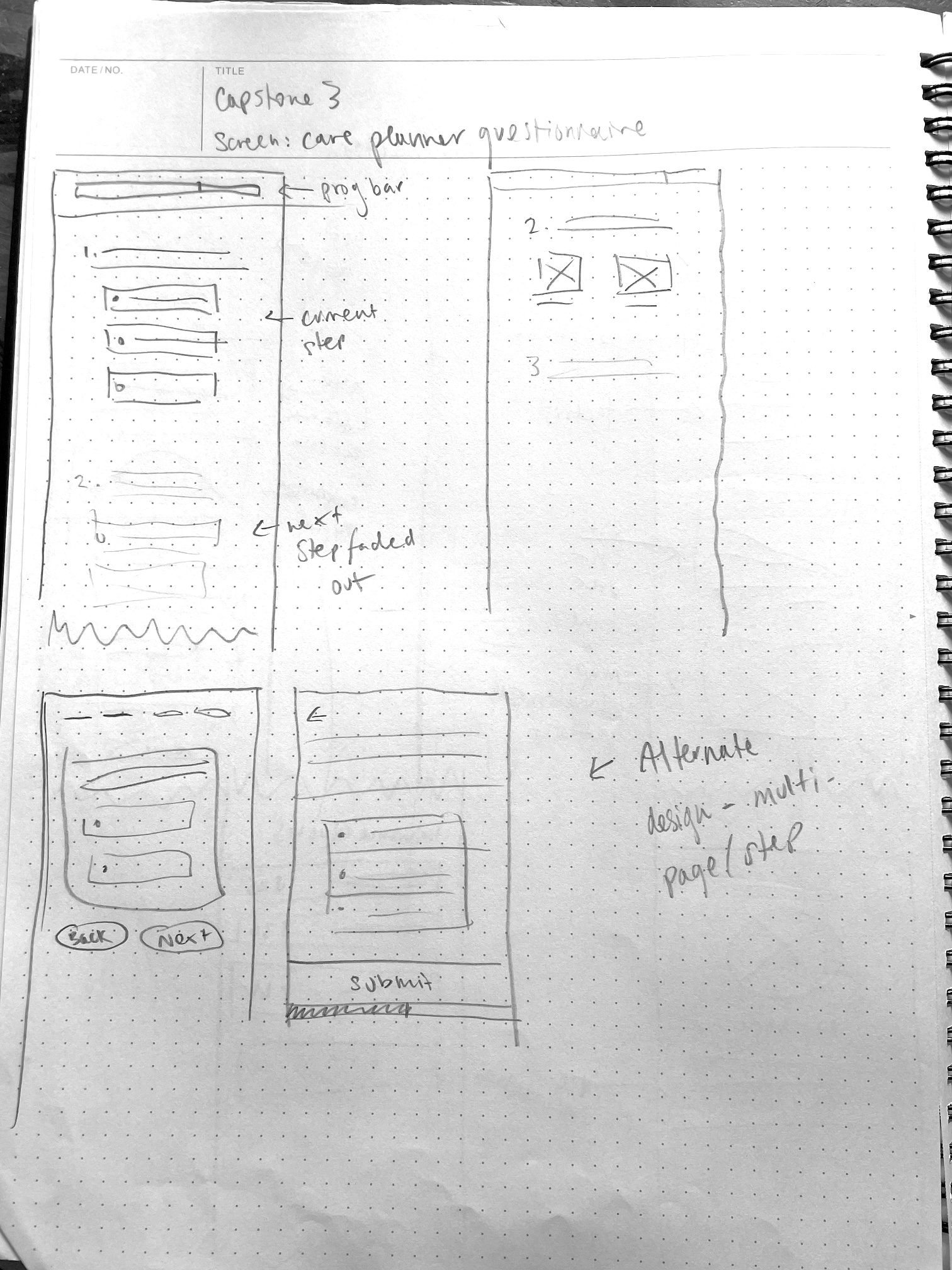
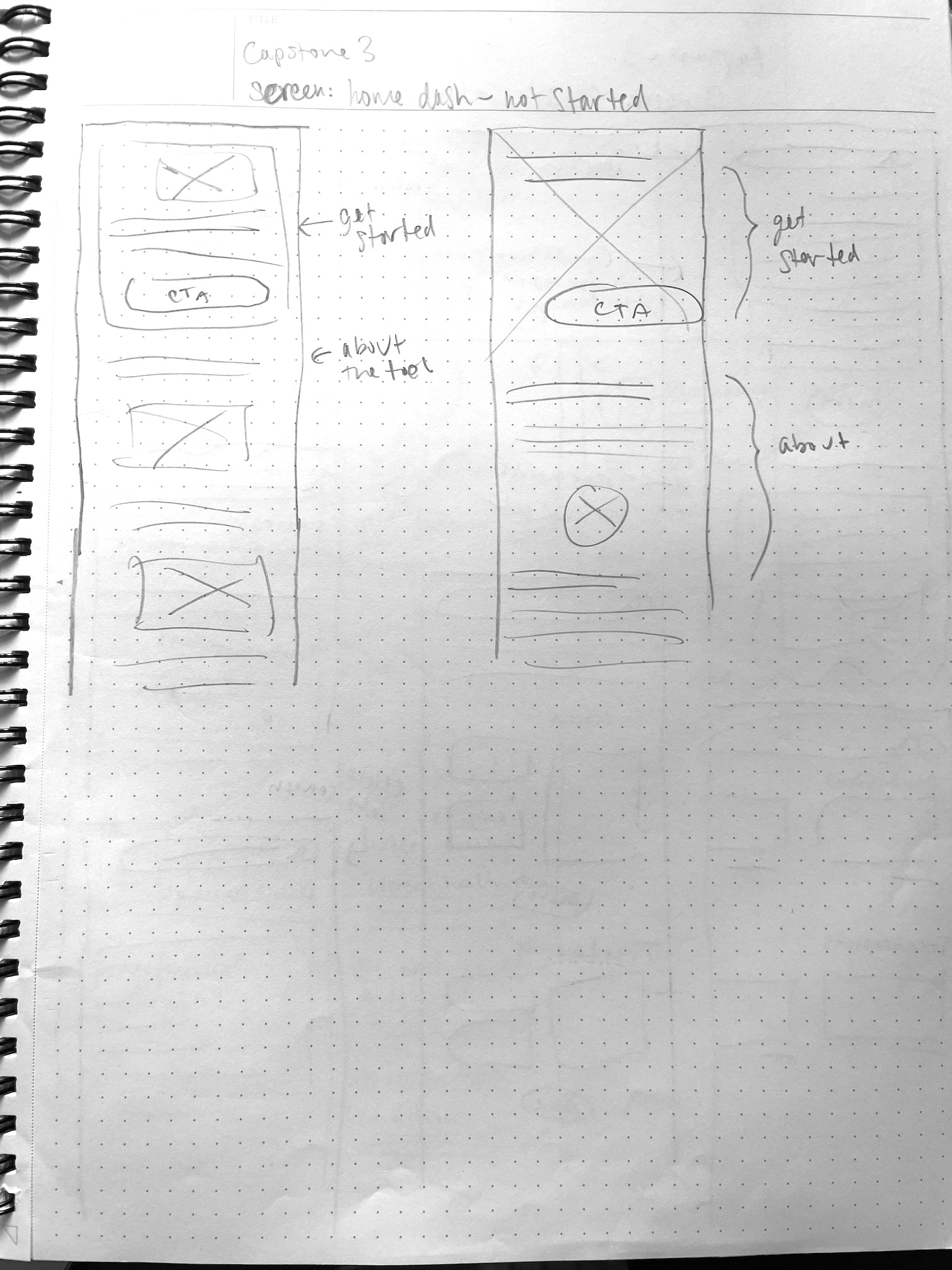
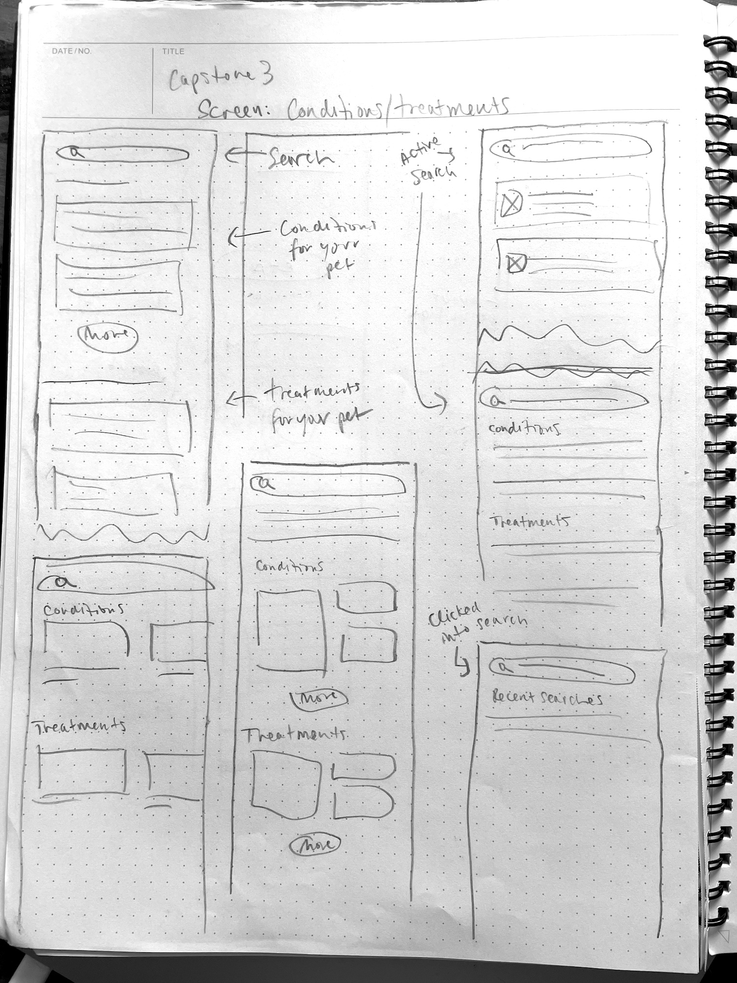
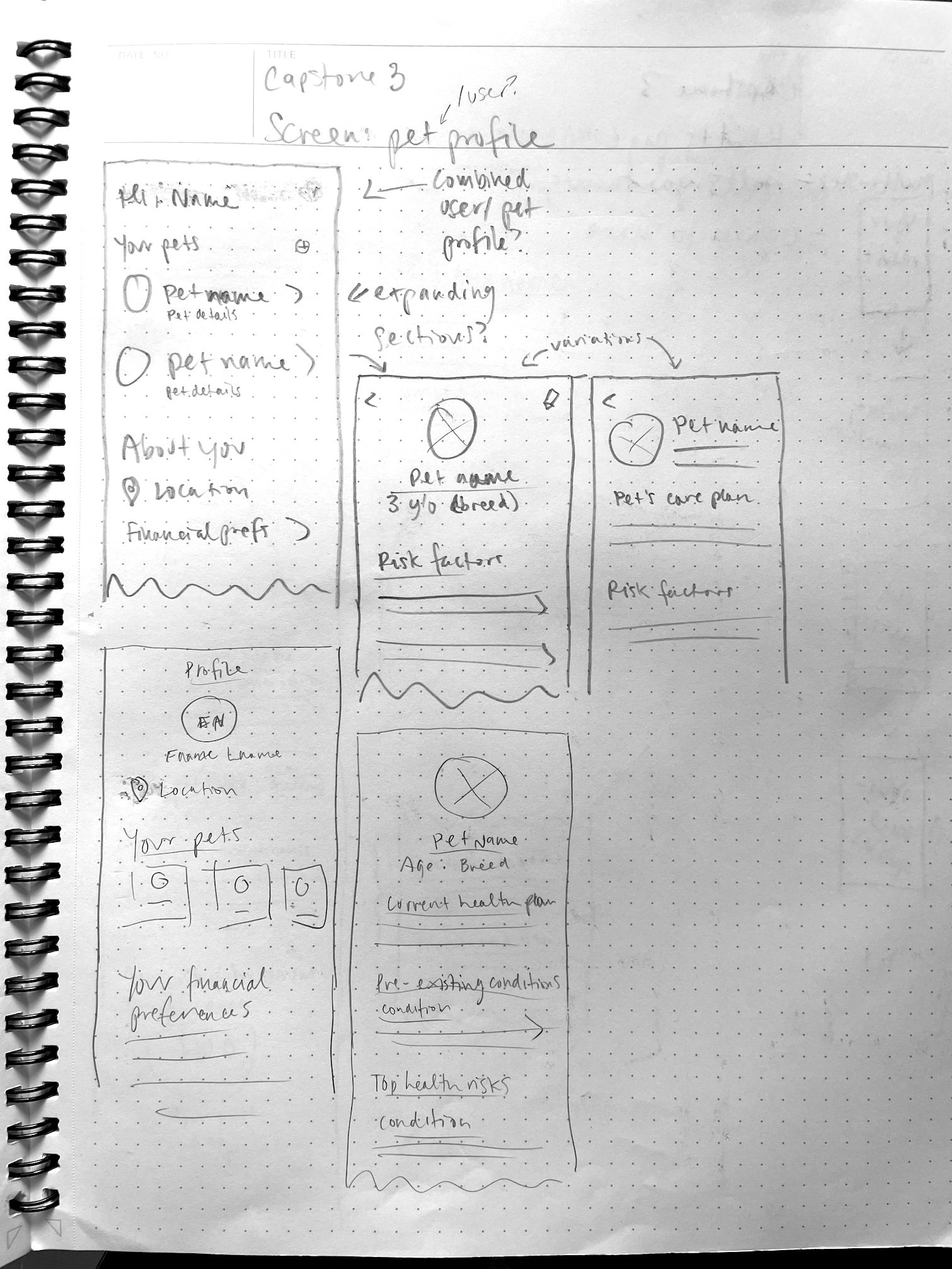
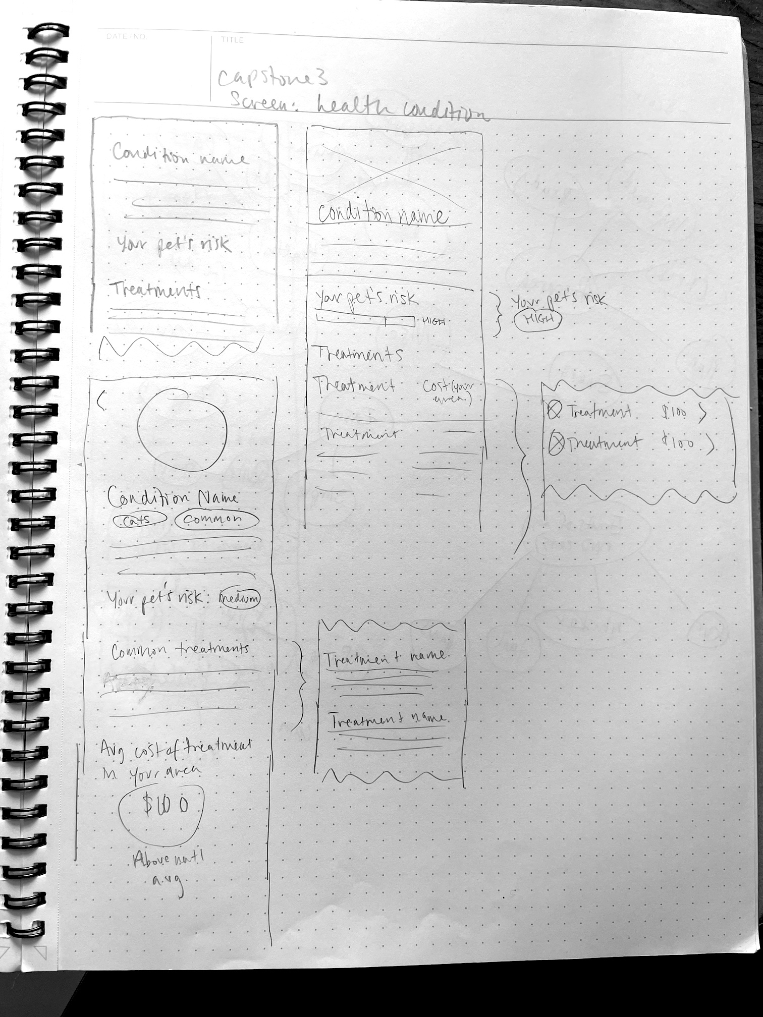
Putting pen to paper
I started by sketching on paper to quickly experiment with and iterate on potential design solutions.
Click an image to expand
Next, I reworked the strongest ideas into an initial set of mid-fidelity wireframes.
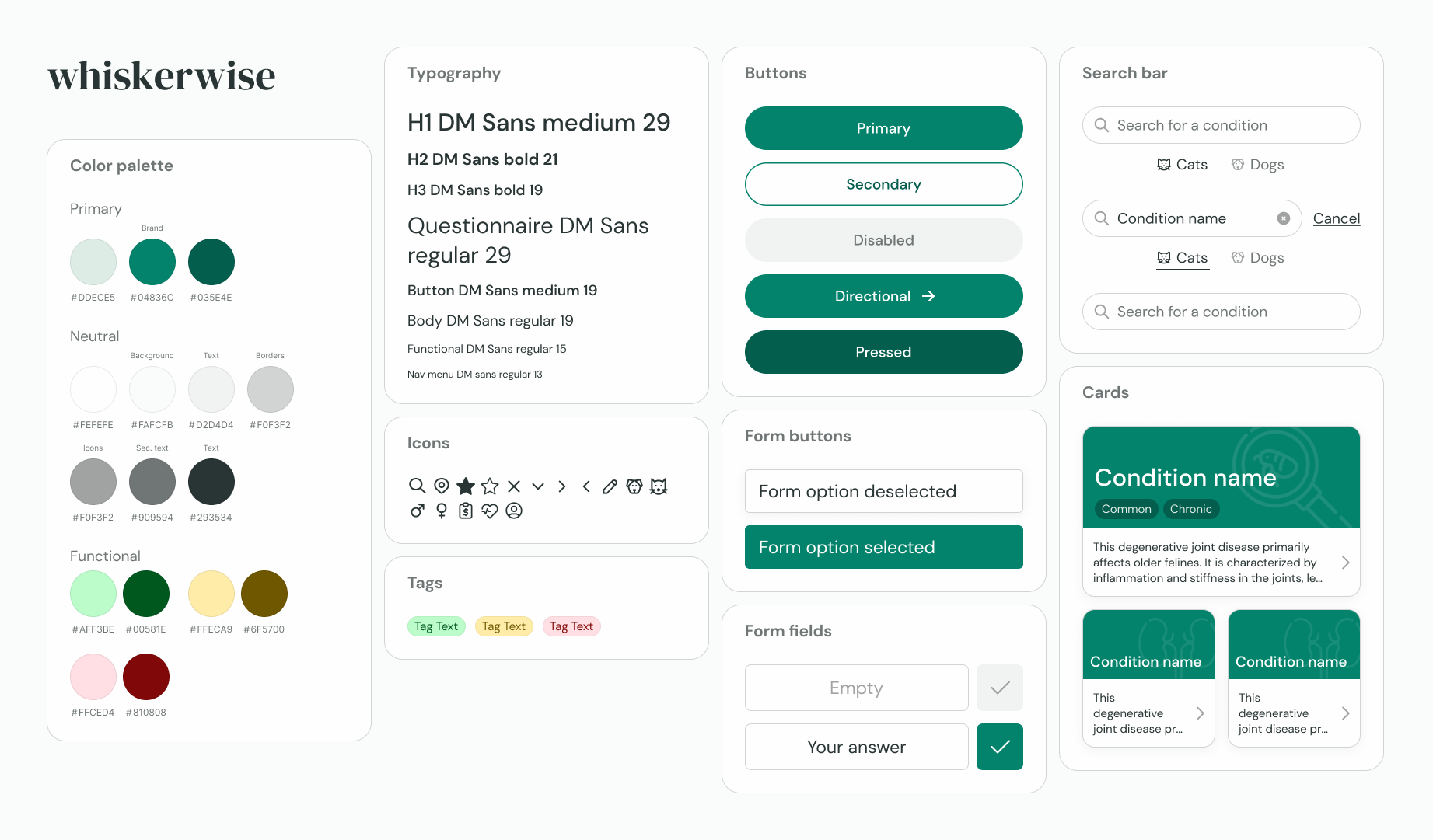
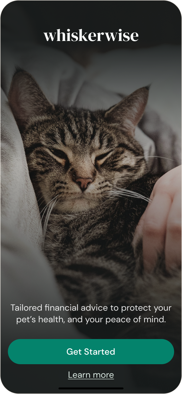
Before tackling brand design, I developed a set of business values to guide my decision-making. I selected a brand name, logo, color scheme, typography, and iconography to create a unified look embodying these values.
Learn whether the product helps the user understand the options around paying for vet care and feel more empowered to handle unexpected vet bills.
Identify pain points and successful aspects of the design.
Research questions
Does the user feel that the product could be useful to them, save them money, and/or empower them to handle unexpected vet bills?
What is the user’s emotional experience while using the product?
How does the design compare to their expectations?
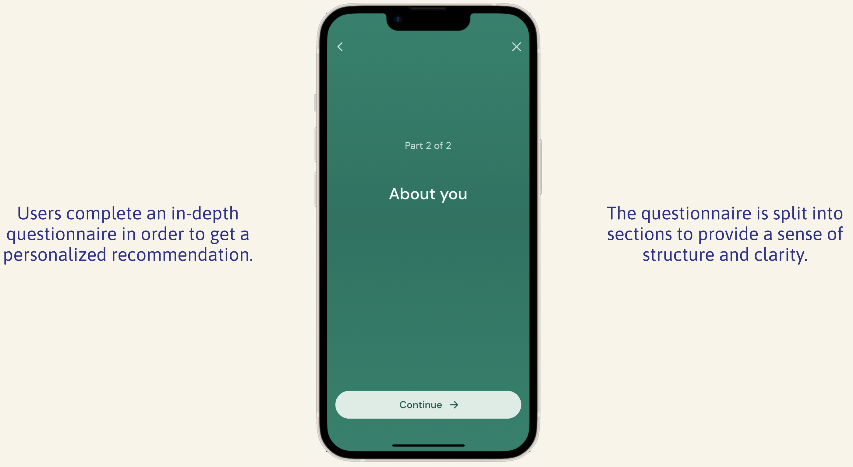
I planned to test the following flows:
Questionnaire and recommendation: User provides information about themself and their pet and then navigates through their recommendation.
Main app interface: User shows how they would learn about a condition their pet may be at risk for, update their pet’s age, and search for information about eye conditions.
Synthesizing test results
I held live online usability tests with 5 people who owned dogs and/or cats. Then, I created an affinity map to pull out patterns.
I reviewed the results through the lens of success metrics like completion of the flow, comprehension, satisfaction, and utility of the product.
I was able to pinpoint several issues having to do with navigation, comprehension, and more.
Iterating based on usability testing
I prioritized the issues uncovered in usability testing, then designed solutions.
How do I continue the recommendation?
(4/5 participants)
Ver. 1
Ver. 2
Users got stuck on the first screen of the recommendation, not realizing they needed to scroll down. This confusing navigation pattern has been broken into two screens to be consistent with the rest of the app.
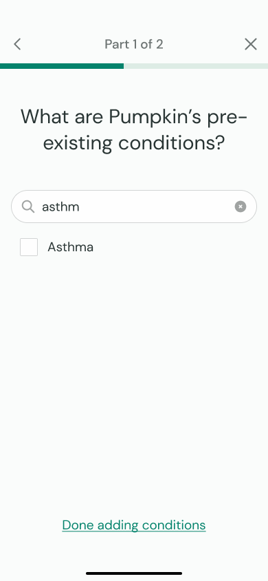
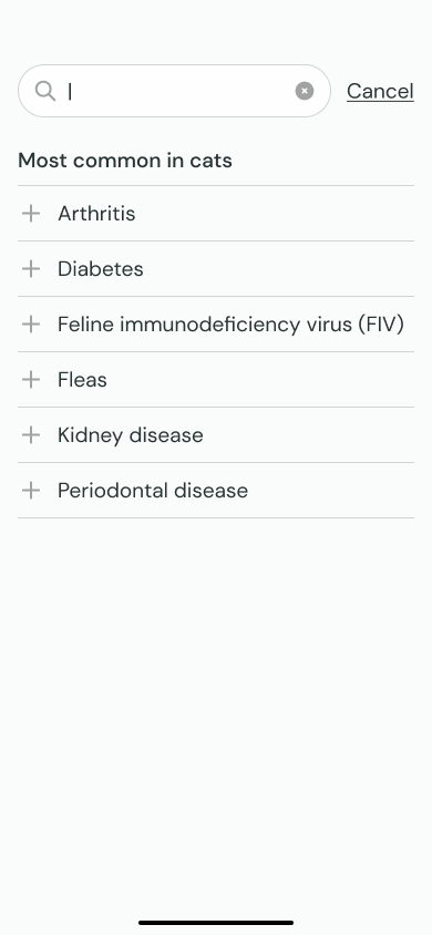
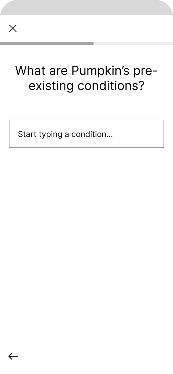
How do I add a pre-existing condition?
(3/5 participants)
Ver. 1
Ver. 2
Some users found the process of adding a pet’s pre-existing condition unintuitive, expecting a drop-down or list. The design has been updated to a search overlay including a list of suggested options.
What does this question mean?
(3/5 participants)
Ver. 1
Ver. 2
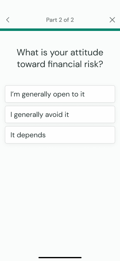
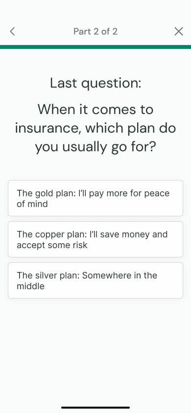
The questionnaire asks two questions about users’ financial preferences. Some were unsure how to answer these questions, and wished for more specificity. Both questions have now been rewritten to be more specific.
Why is the back button down here?
(2/5 participants)
Ver. 1
Ver. 2
The placement of the back button in the recommendation was unexpected and didn’t match the questionnaire. Now, it’s at the top left for both flows.
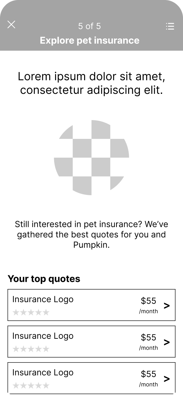
What does pet insurance cover?
(2/5 participants)
Users may have interpreted the recommendation differently depending on how much they knew about pet insurance. I added a section in the recommendation about how pet insurance works, with a link to learn more. The word “premium” has also been changed to the more accessible “rate.”
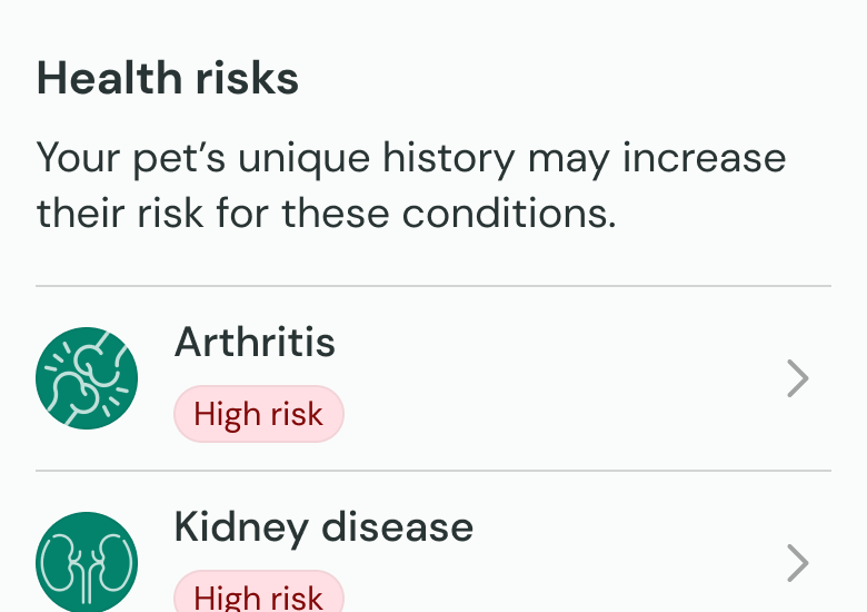
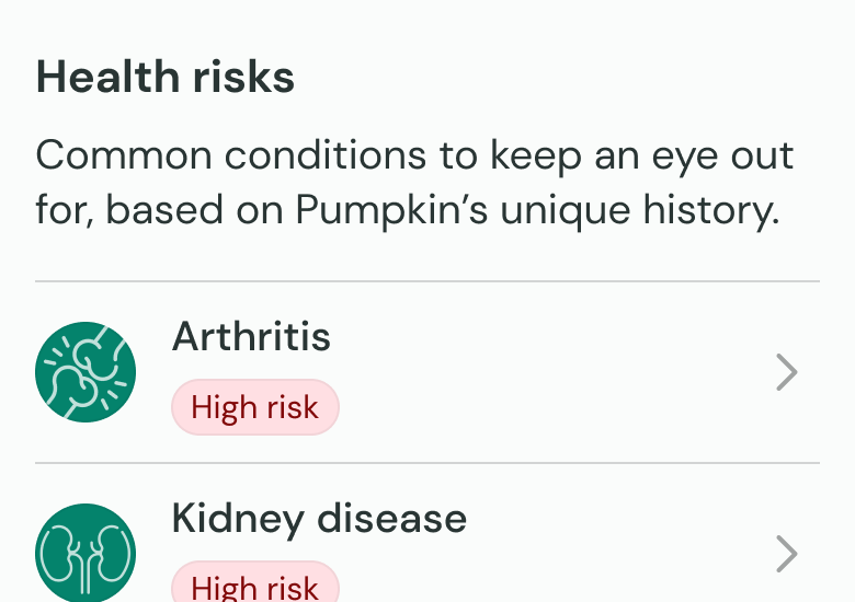
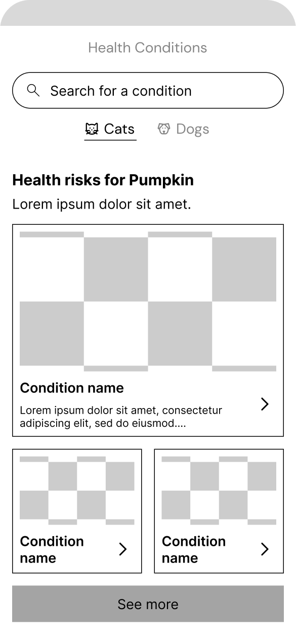
Health risks—oh no!
(2/5 participants)
Ver. 1
Ver. 2
The app’s health risks feature brought up anxiety for two users. The copy around health risks has been rewritten to shift the tone toward prevention/education rather than suggesting the pet is “at risk”.
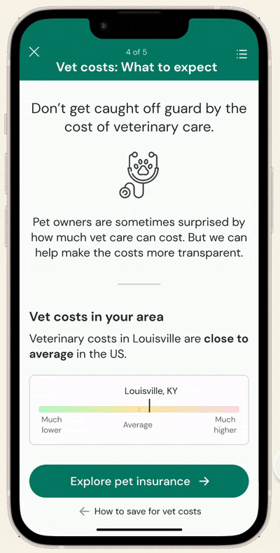
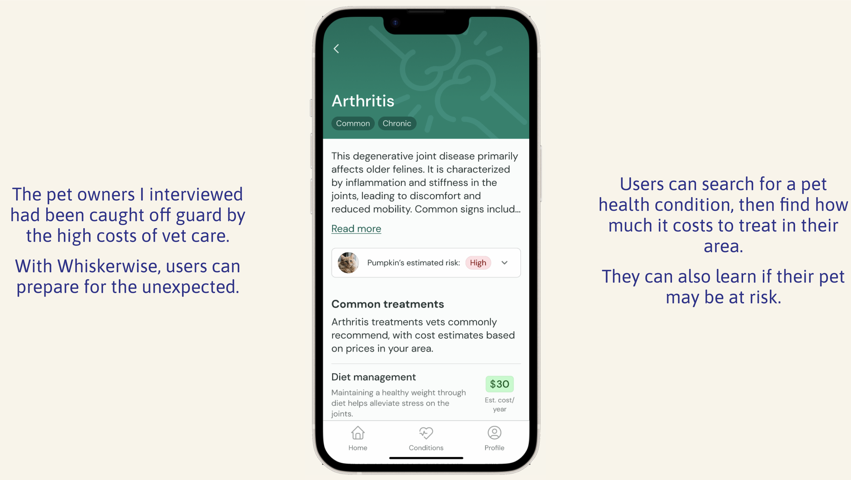
Final prototype
This prototype incorporates the changes made based on my usability test findings.
If I were to continue pursuing this project, I would:
Test prototypes based on other personas such as “Nina,” the dog owner who would be recommended pet insurance. This would help ensure that the tool works for everyone in the intended user base.
Improve long-term usefulness. 2/5 people in my usability tests struggled to picture returning to the app over a long period of time—a possible business issue. I would approach this as its own design challenge, confirming the existence of the problem, then exploring potential solutions before selecting one to pursue.
What I learned
Consistency is key: Usability testing revealed navigation inconsistencies that tripped up users. I realized that even across different flows, navigation patterns must be as consistent as possible for a smooth user experience.
Don't assume baseline knowledge: Not everyone in my usability tests had prior knowledge of how pet insurance works. My initial design was influenced by my own bias as someone who already has pet insurance, when I should have considered other possible perspectives.
