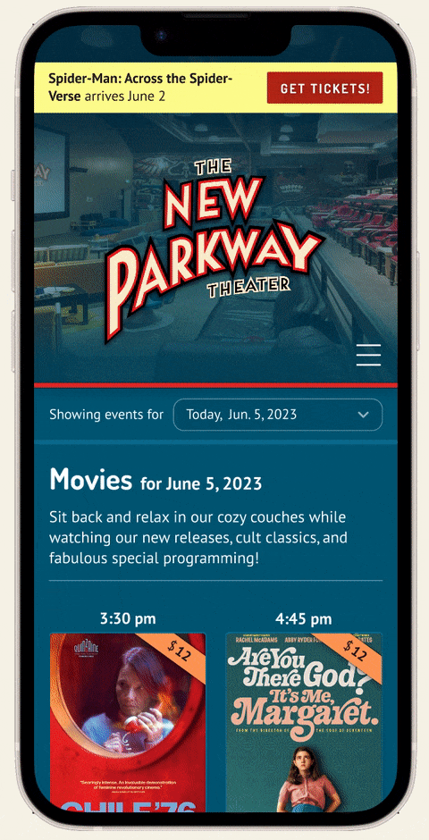
The New Parkway is an independent movie theater in Oakland, California, known for its quirky, welcoming theatergoing experience, community orientation, and locally-sourced café fare. As a fan of the New Parkway, I reached out and offered to redesign their website.
Project info
My role
Sole designer, independent project
Tools
Figma, Figjam, OptimalSort
Goals
Understand the New Parkway’s business and customer needs
Assess the usability of the New Parkway’s current website
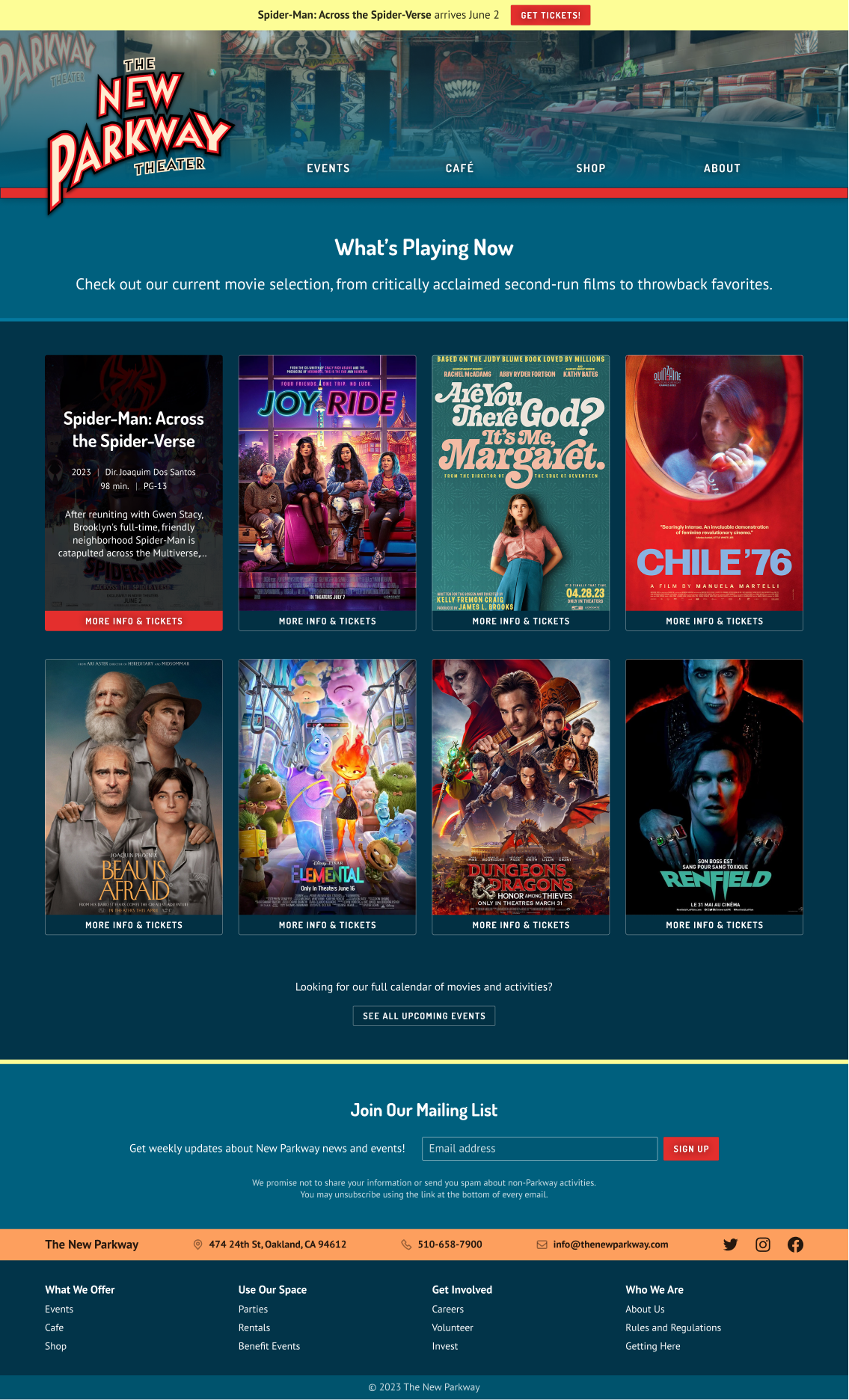
Design an improved website showcasing all that the New Parkway has to offer
Connecting with the client
I met with a member of the New Parkway’s team to learn about their organizational processes and goals, and how their existing website was meeting their needs.
I learned that they didn’t have any specific issues on their radar, but wanted to understand the experience of site visitors. They were interested in receiving a proposal for an improved design.
Phase 1
Discovering the problem
Assessing the existing website
To start out the project, I wanted to deepen my understanding of the New Parkway’s current site. I conducted a UX audit through the lens of established best practices.
Key results
My heuristic analysis revealed several areas for improvement. I planned to look into how these issues impacted users.
Disorganized navigation, hard to return to main site from checkout
Ticket purchase link not prioritized
Poor text contrast
Text-heavy pages lacking hierarchy
Inconsistent use of color
Poor scaling for screen size
Interviewing theatergoers
Next, I conducted an open-ended user interview paired with a brief usability test of the New Parkway’s current website.
My goals for this research were:
Learn how people buy movie tickets online from independent theaters
Understand users’ experience of the New Parkway’s existing website
Findings from the interview and usability test
I held 20-40 minute video calls with 5 people who enjoy going to local movie theaters. The initial interview portion of the call revealed a lot about people’s ticket-buying habits.
How people approach buying movie tickets
What people want to know about a theater
Comfortable seats (4/5 users)
Convenient location (4/5 users)
Affordability, quality for price (4/5 users)
Concessions/food (3/5 users)
Assigned seating (3/5 users)
Quality/specs of audio/visuals (3/5 users)
How people buy tickets
Online in advance (generally within a week of the showing) (4/5 users)
Often on mobile (4/5 users), but may use a computer for an easier-to-see interface (2/5 users)
They choose a movie before choosing a theater (3/5 users)
For the usability test portion of the study, I asked users:
To locate information they’d want to know before buying a movie ticket
To go through the ticket-buying process
To share subjective impressions of the site and the New Parkway itself
This process uncovered multiple points of friction for potential customers on the site.
Potential usability issues
Ticket purchase process is confusing (4/5 users)
Navigation difficulties, particularly with returning to main site from ticket checkout (3/5 users)
Want to know more about what space looks like (3/5 users)
Too much text on the site and they are unlikely to read it (3/5 users)
Unsure of the difference between movies and activities and how to register for each (2/5 users)
Low contrast makes important text hard to read (2/5 users)
Despite these concerns, users successfully identified several of the New Parkway’s main values (community-oriented, casual and comfy, fun, placing values above profit) from the site. I wanted to maintain this in my redesigned site.
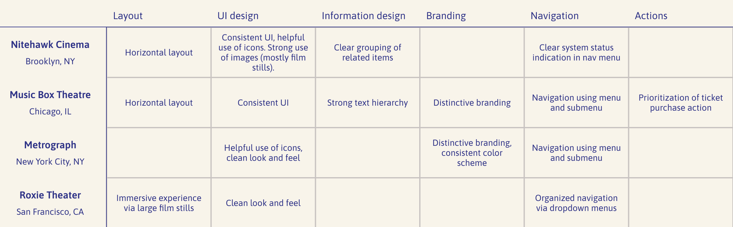
Scoping out competitors
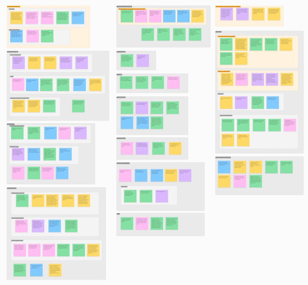
To understand the landscape of independent movie theater websites, I identified 11 interesting theater sites, then assessed the strongest points of each across several factors.
Excerpt of competitor analysis
Competitor analysis as a reference tool
I referred back to the competitor analysis throughout the project, particularly in the design phase. This helped me envision how the New Parkway’s new website might meet, exceed, or transform users’ expectations for a theater website.
Phase 2
Defining the problem
Articulating user perspectives
Reflecting on the results of my research, I developed three point of view (POV) statements. Each expresses one of the most important problems I surfaced.
I paired each POV statement with a “how might we” question to guide my thinking about potential solutions.
POV
Potential New Parkway patrons need to immediately understand where to go to buy tickets. Currently, this action is hard to find, causing frustration.
How might we
…help people who want to attend movie screenings quickly locate and complete the ticket purchase process?
POV
Users need to be able to consistently navigate the entire website and understand where they are at any time. Currently, they’re experiencing navigation “dead ends” and becoming confused and frustrated when trying to return to where they were before.
How might we
…help users consistently navigate the entire site while being aware of their current location and without hitting any dead ends?
POV
Users need to quickly and easily access important information about the theater (e.g. offerings available and the space itself) in order to decide whether to buy tickets.
How might we
…help users quickly and easily access the information they are seeking about the theater?
POV
People who want to attend movie screenings at the New Parkway need to immediately understand where on the site to navigate in order to buy tickets. Currently, this action is difficult to find and complete, causing frustration.
How might we
…help people who want to attend movie screenings quickly locate and complete the ticket purchase process?
POV
Users need to be able to consistently navigate the entire website and understand where they are at any time. Currently, users are experiencing navigation “dead ends” and becoming confused and frustrated when trying to return to where they were previously.
How might we
…help users consistently navigate the entire site while being aware of their current location and without hitting any dead ends?
POV
Users need to quickly and easily access important information about the theater (such as specific offerings available and the space itself), because they rely on this information in order to decide whether or not to attend the theater.
How might we
…help users quickly and easily access the information they are seeking about the theater?
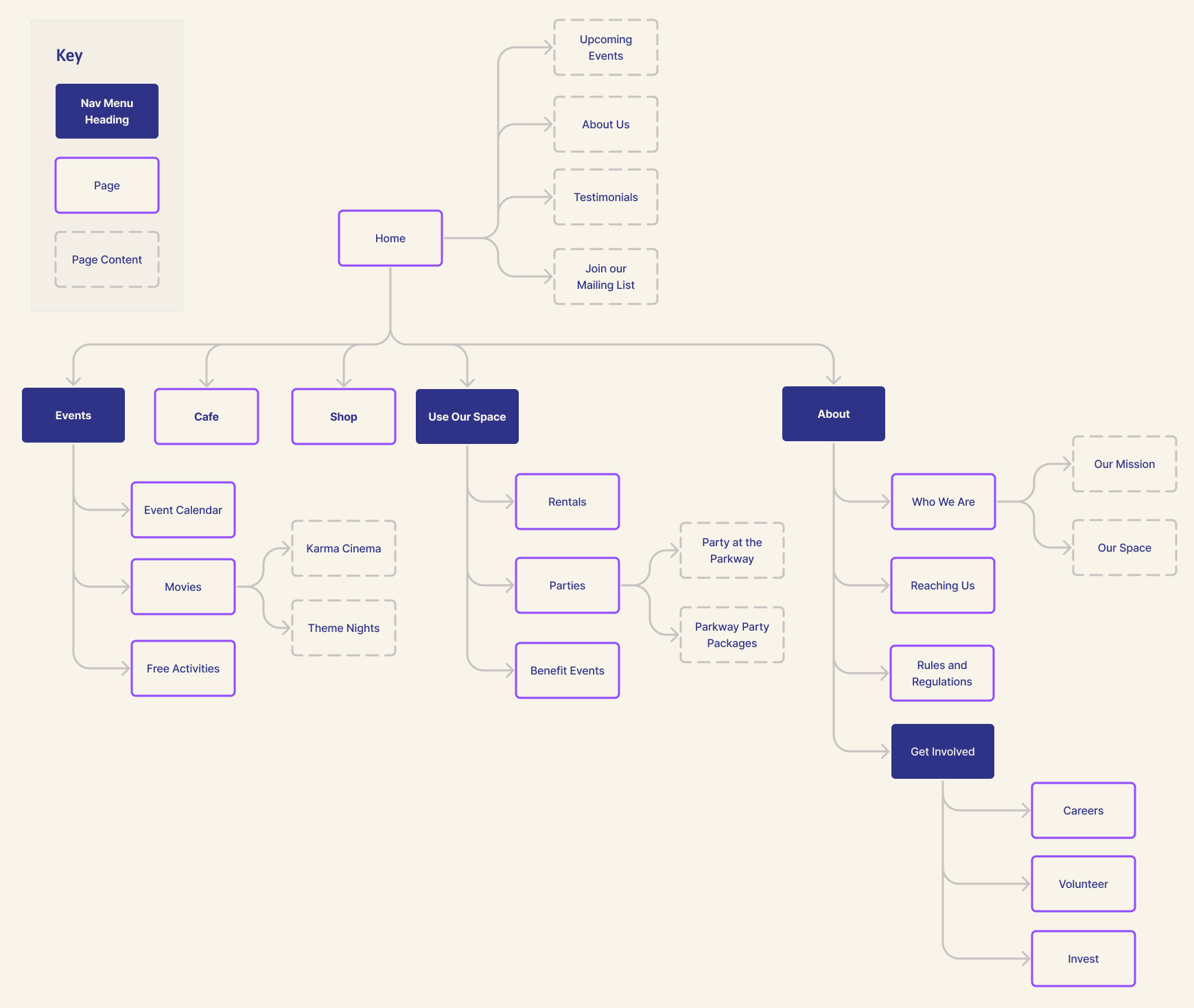
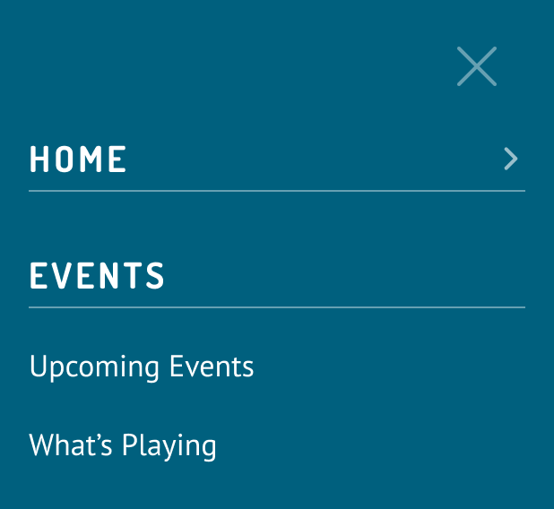
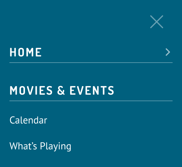
Building a site structure
My UX audit and user interviews suggested that the New Parkway’s site navigation could be improved. I conducted a card sort exercise to learn how users would expect the content to be organized.
Card sort method
Open card sort
Online using Optimal Sort, unmoderated
16 participants
Patterns of association
Optimal Sort offers a helpful big-picture visualization of the results in “clusters.” The tool grouped the cards into four main clusters:
Cluster 1: “About”
10 cards
General info about the theater itself:
Reaching Us
Our Mission
Rules & Regulations
Cluster 2: “Events”
8 cards
Most offerings, including events and specific rental options.
Cluster 3: “Home"
3 cards
Perhaps items that users expect to see immediately upon navigating to the site:
Home
Buy Tickets
Now Playing
Cluster 4
3 cards
Secondary or less traditional movie theater offerings:
Shop
Café
Rentals
Creating a site map
My card sort results guided a first draft of an improved site map, which I would work from when fleshing out the site navigation.
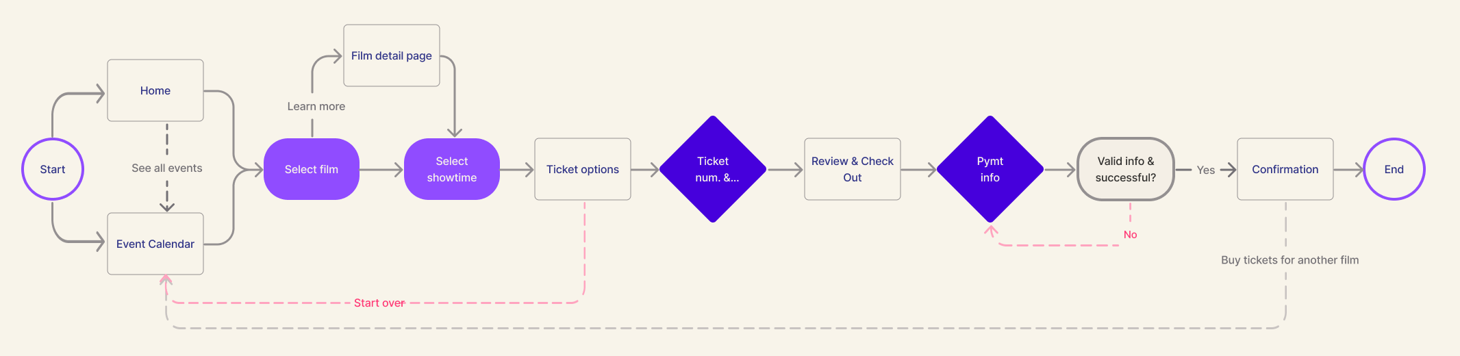
Exploring user interactions
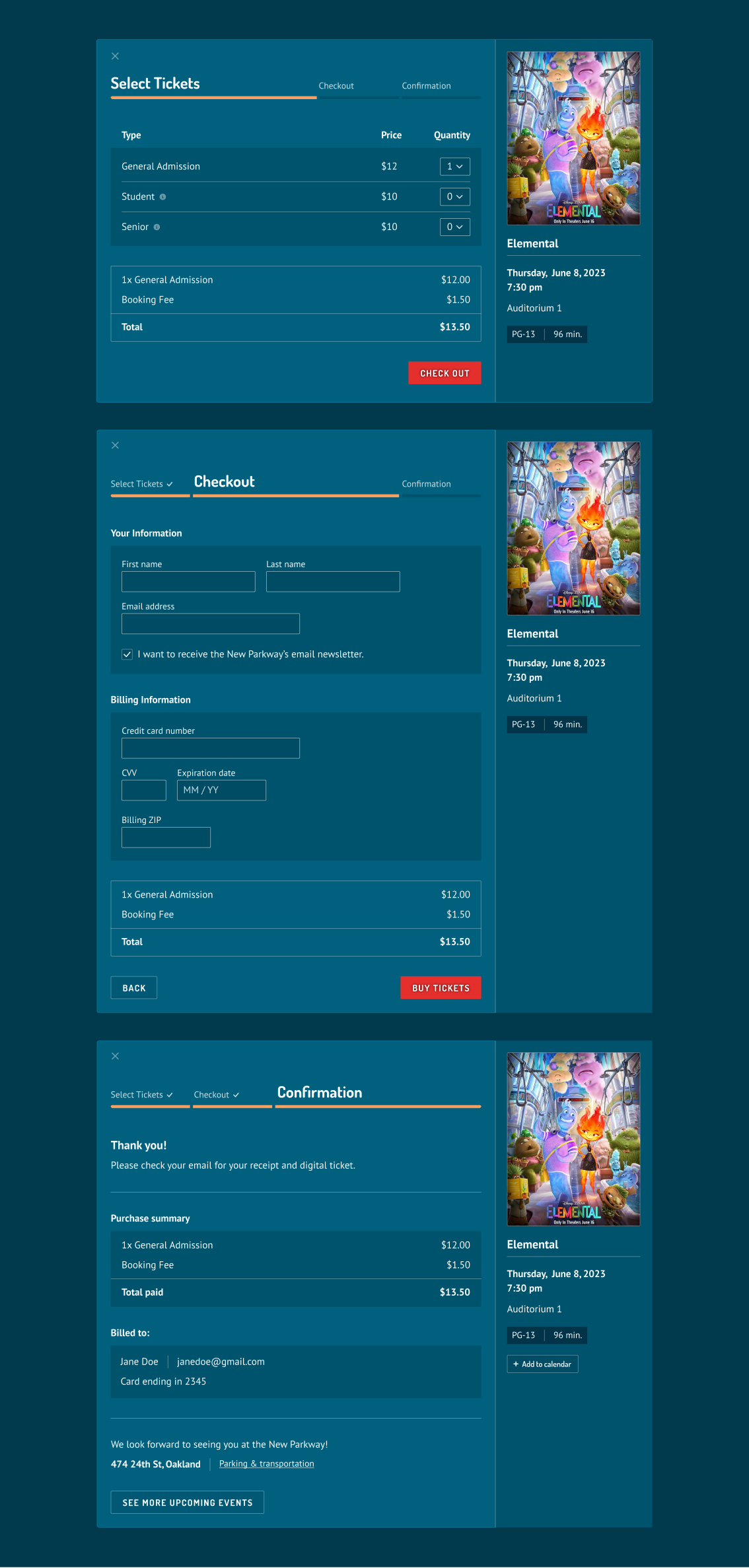
From a business perspective, buying tickets is the theater’s top-priority action. The ticket purchase flow on the existing website needed improvement, so I created a diagram of an efficient ticket purchase flow to guide my design.
Phase 3
Developing the solution
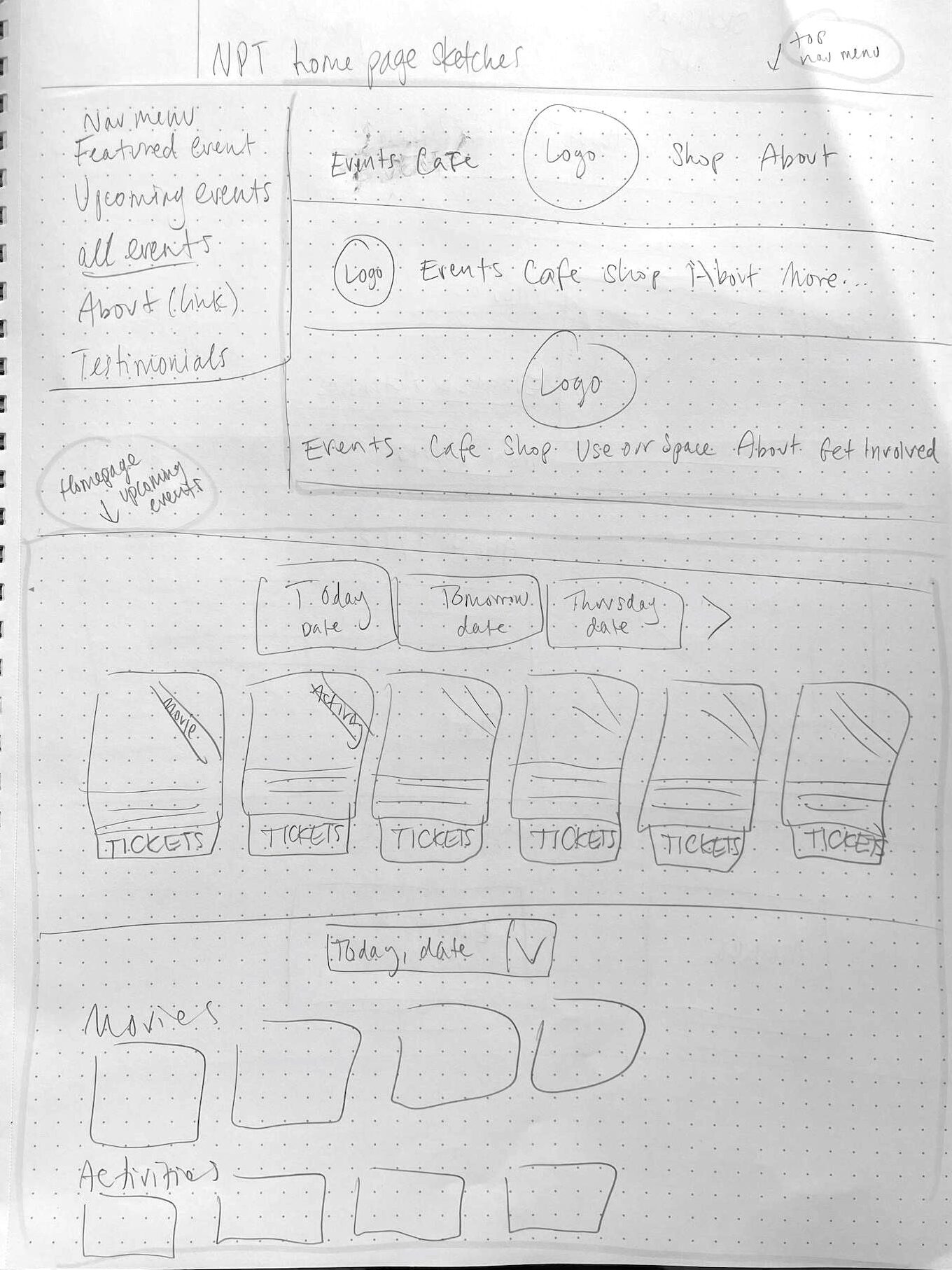
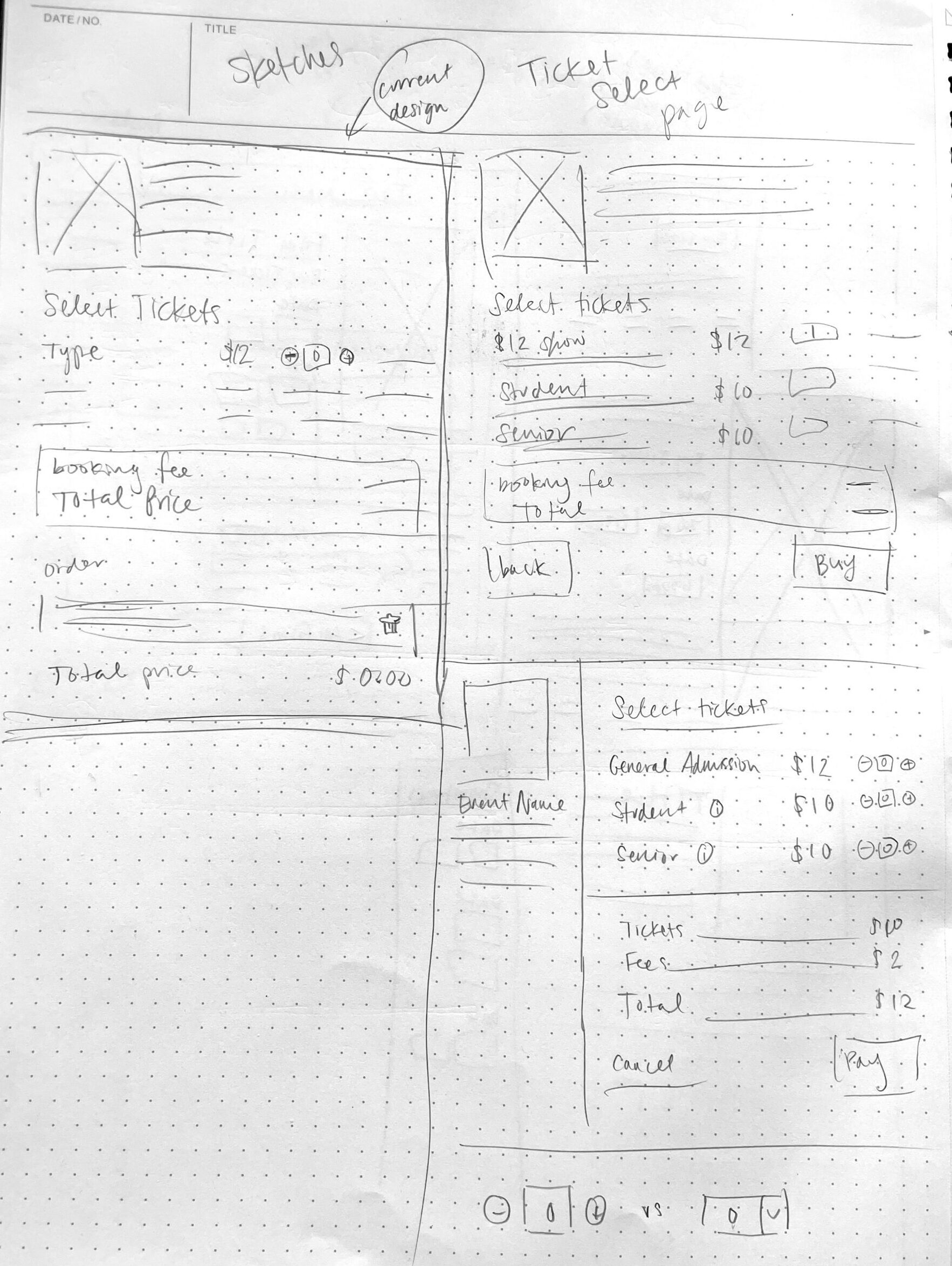
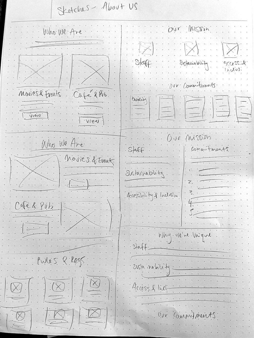
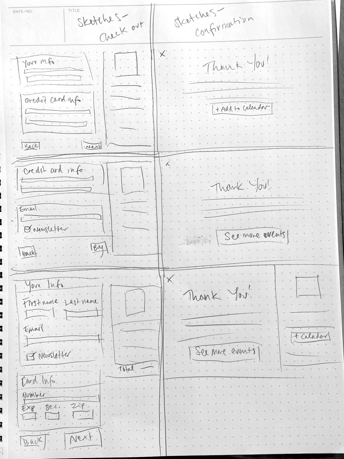
Sketching ideas
In addition to the pages required for the ticket purchase flow, I planned to design several more pages providing information that either users would want to know (based on user interviews), or the New Parkway team would want to promote.
With all this in mind, I started generating ideas through rough sketches.
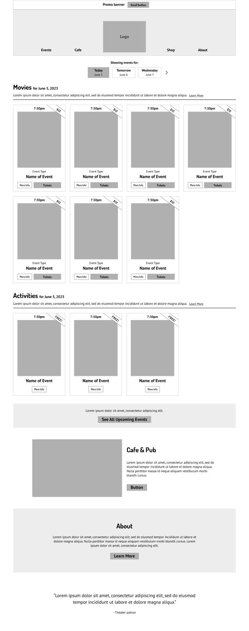
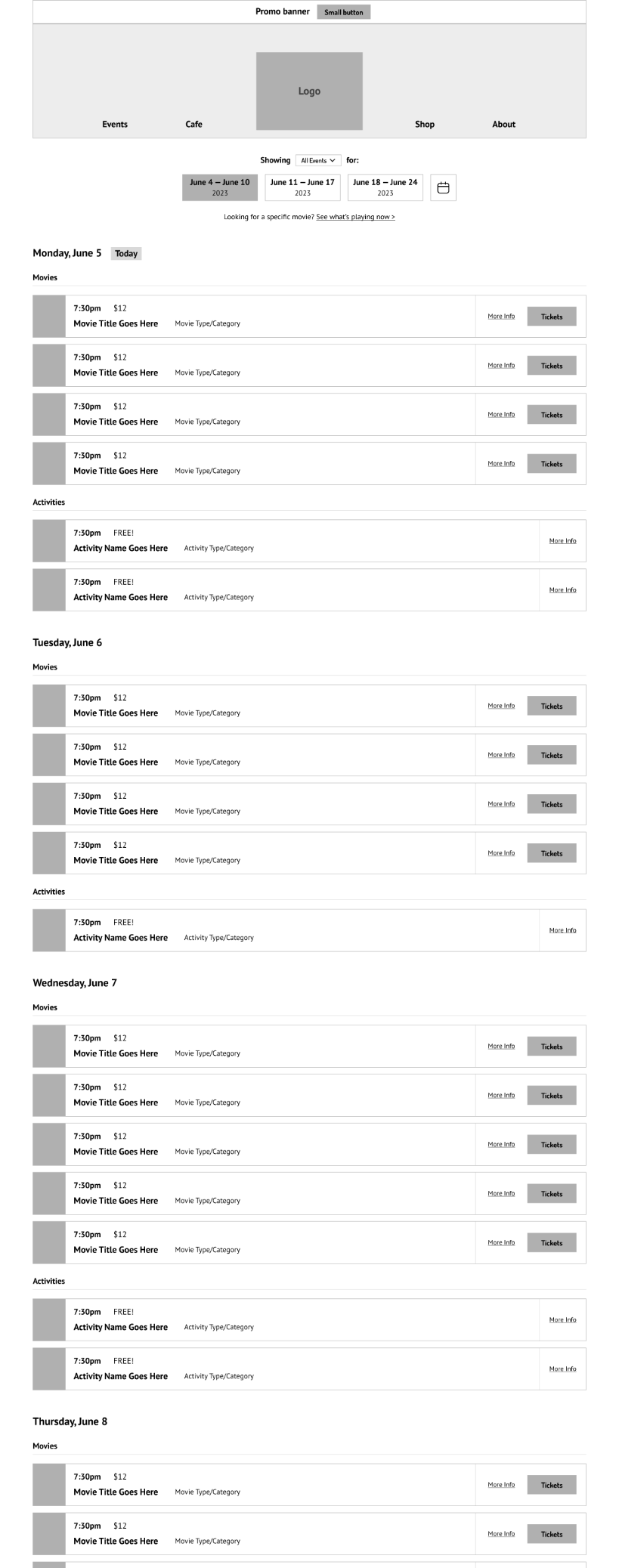
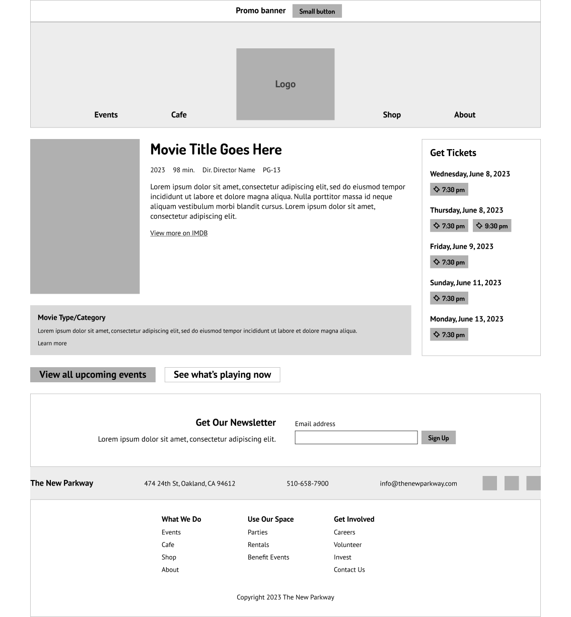
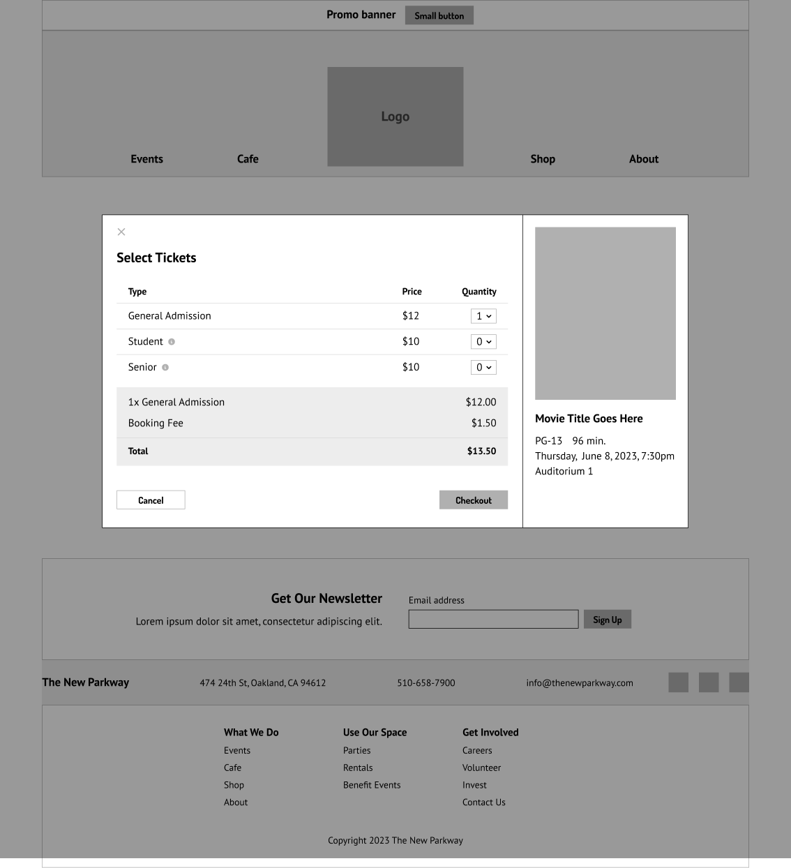
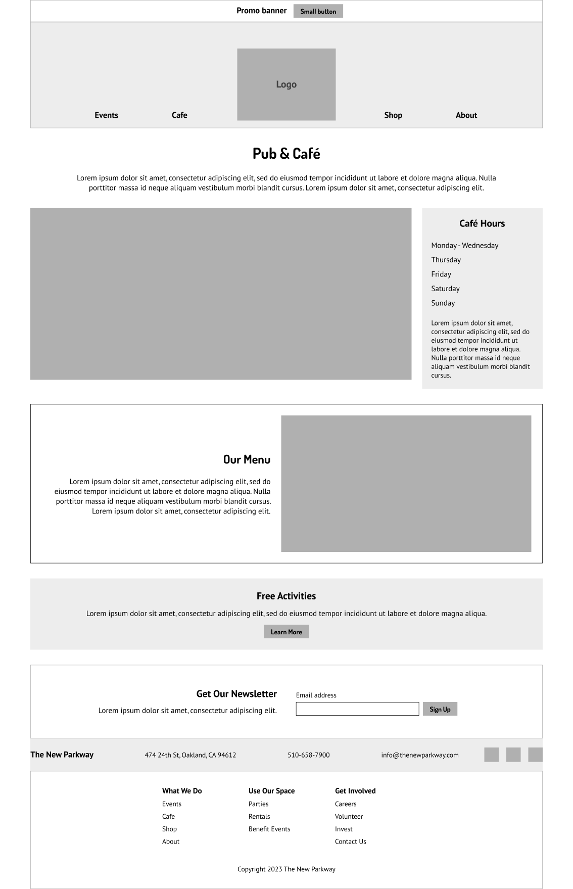
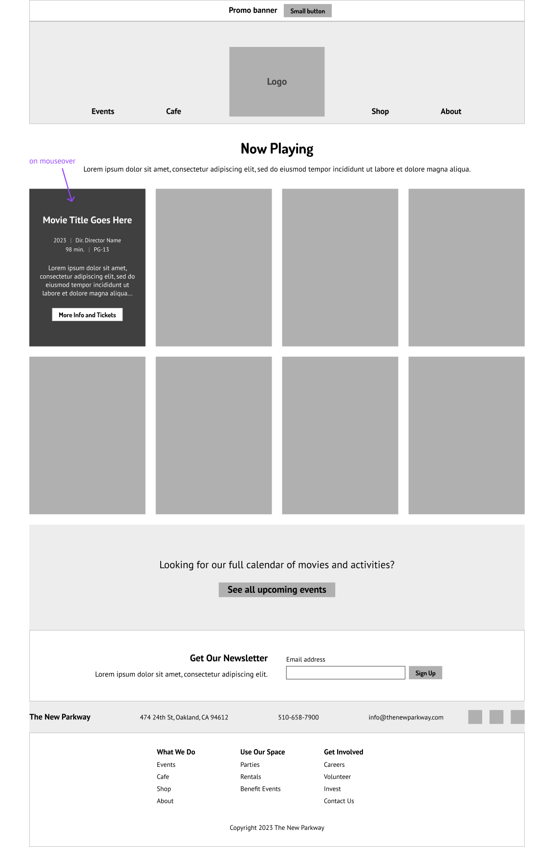
Digital wireframing
I developed the strongest ideas from my sketches into an initial set of digital wireframes for the desktop site.
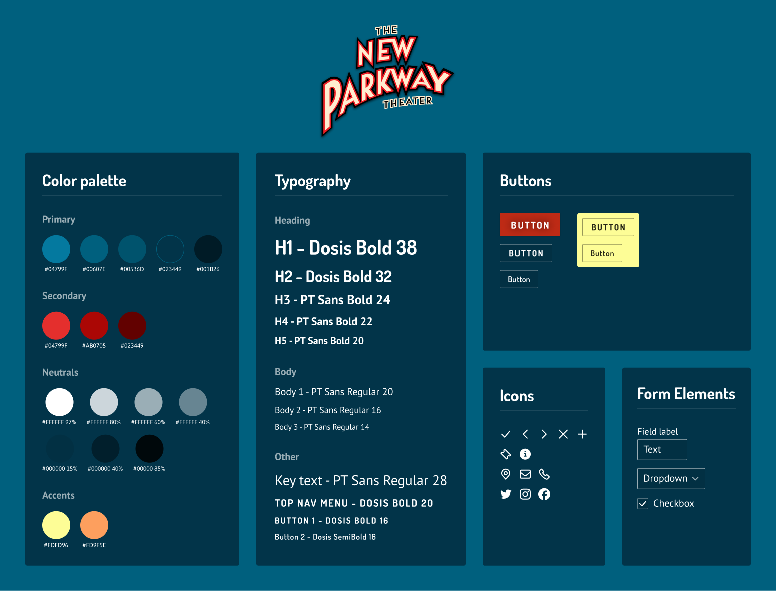
The New Parkway team were happy with their existing brand design, but open to changes in its implementation.
The color scheme on their existing site was distinctive and fun, like the theater itself. But it posed some usability issues, which I needed to resolve.
Assessing the existing color scheme
On the existing website, users needed to navigate:
Poor readability due to low text contrast
Competing, highly saturated colors with similar value, making visual hierarchy difficult to achieve
Overall lack of visual accessibility
My goal was to adjust the existing color scheme to improve usability, maintaining brand recognition and a playful mood.
Assembling a new visual style
My style tile incorporates the new color scheme, typography (which has not been changed from the existing site), and some UI elements.
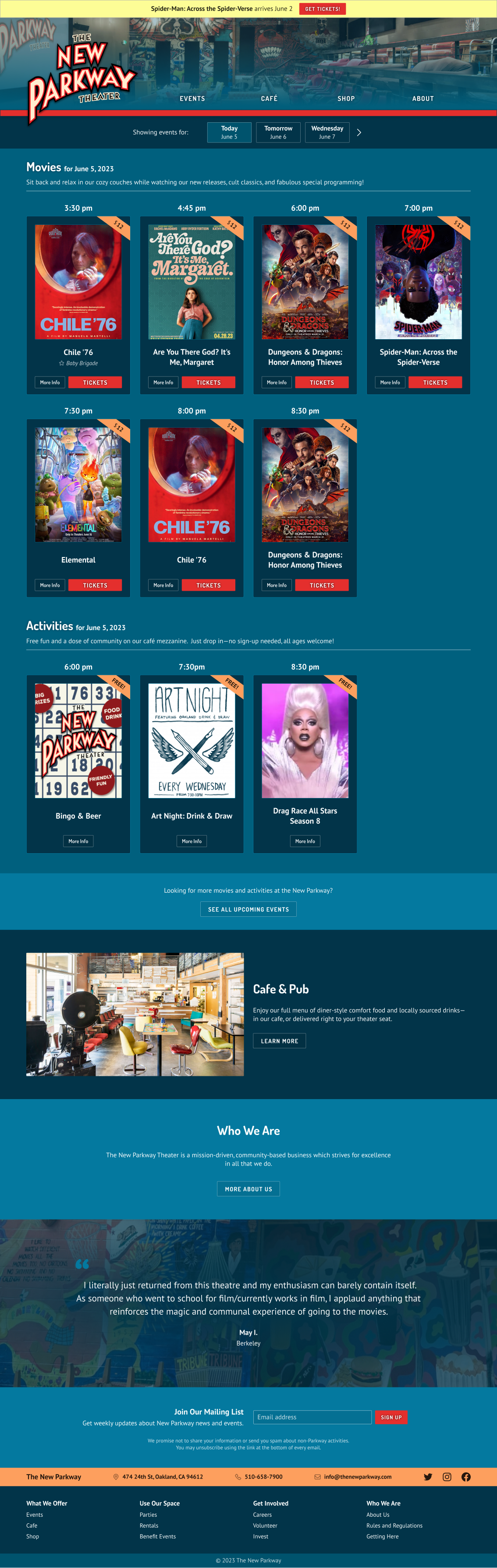
High-fidelity wireframes
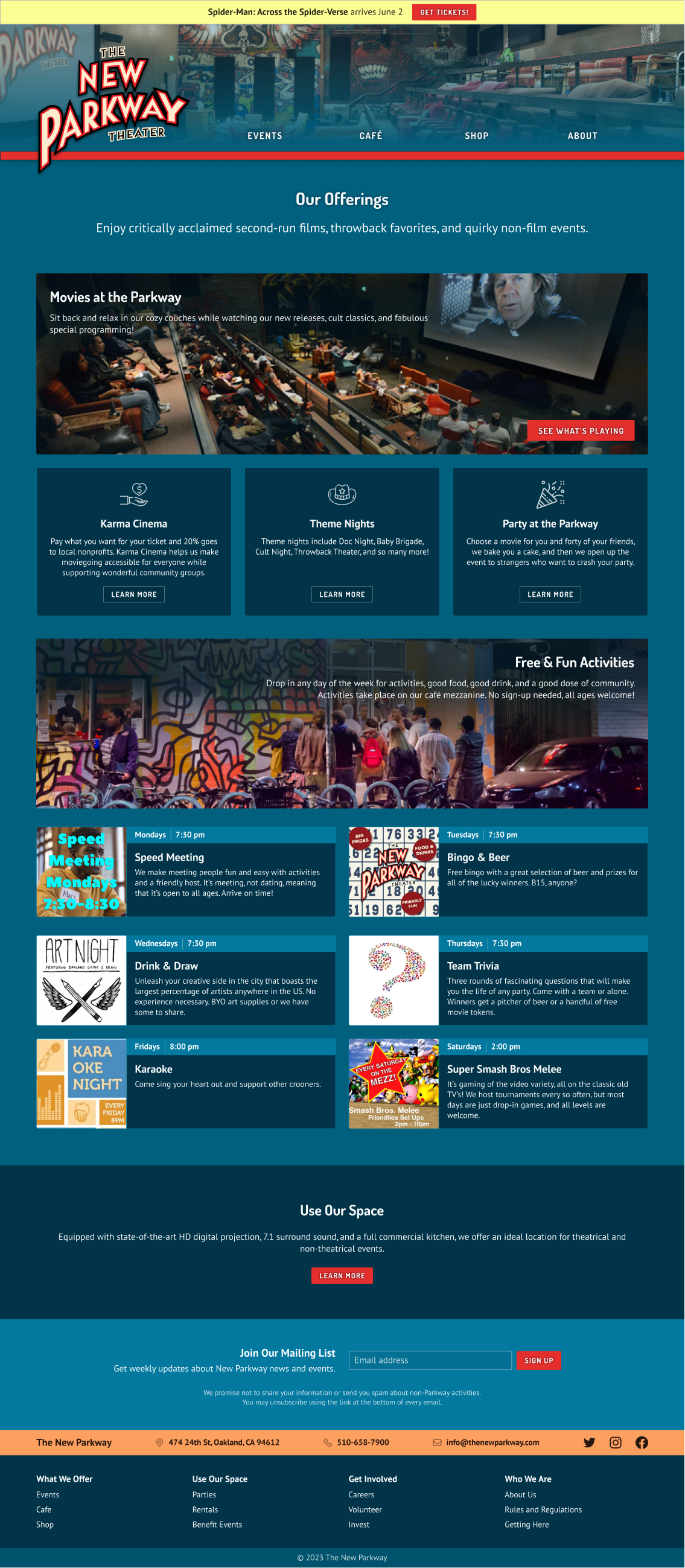
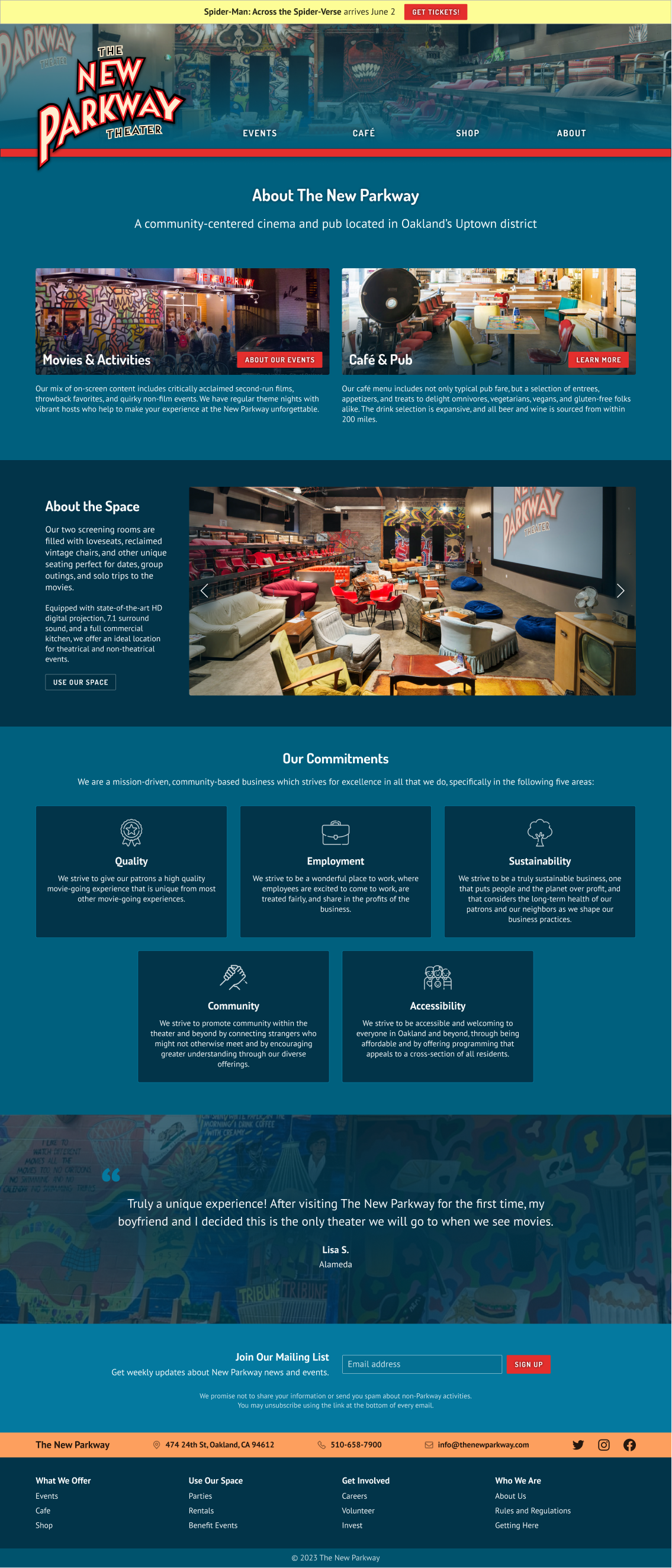
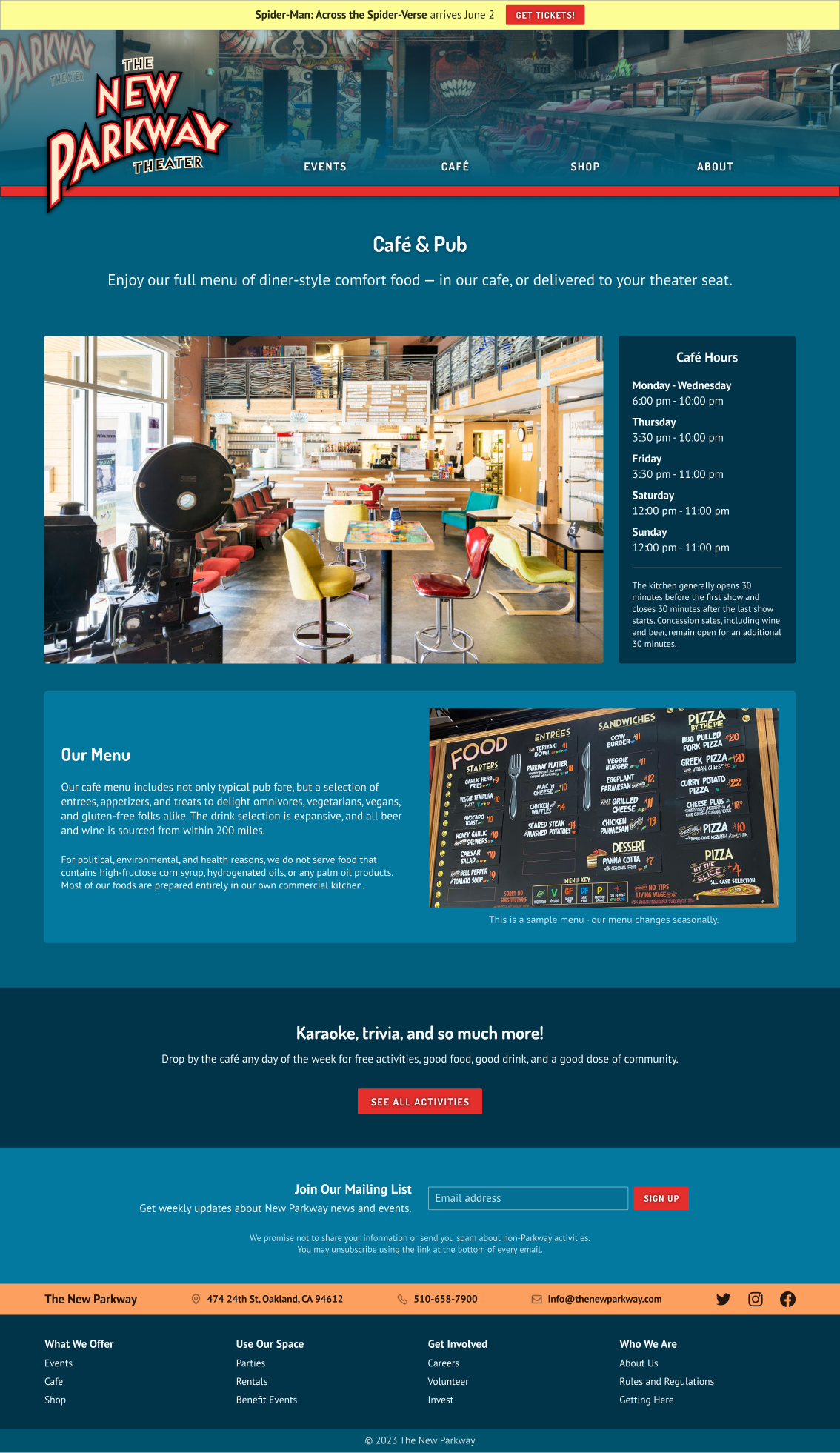
I united the new visual design with my wireframes, reworking some of my earlier design ideas as I implemented the site content.
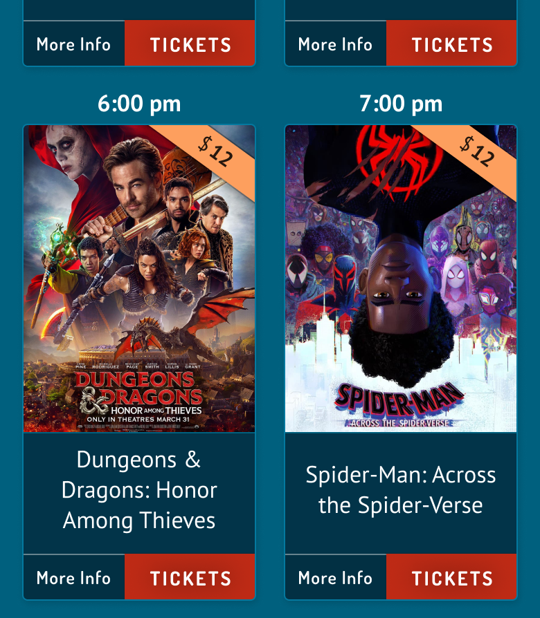
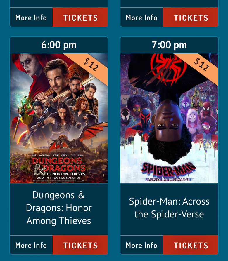
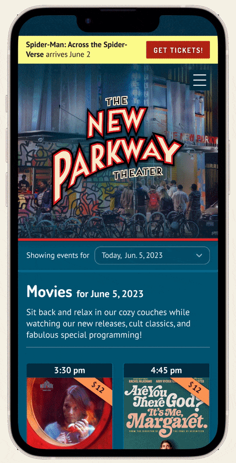
Next, I adapted the desktop wireframes for mobile.
Because my research suggested that users are likely to purchase movie tickets on a phone, I created a mobile prototype to prepare for usability testing.
I considered three key success metrics to determine the types of issues I would need to address in my iterations.
Errors
Generally speaking, participants did not make errors, though there were limited opportunities for this kind of issue in the prototype.
Comprehension
There were a few notable comprehension issues around navigation as well as interpreting page content.
Subjective experience
Participants expressed a positive overall experience. Feedback included that the site felt “straightforward,” met expectations, and provided desired information in a clean, organized way.
Addressing usability issues
I redesigned various aspects of the site in order to resolve the issues that users had encountered.
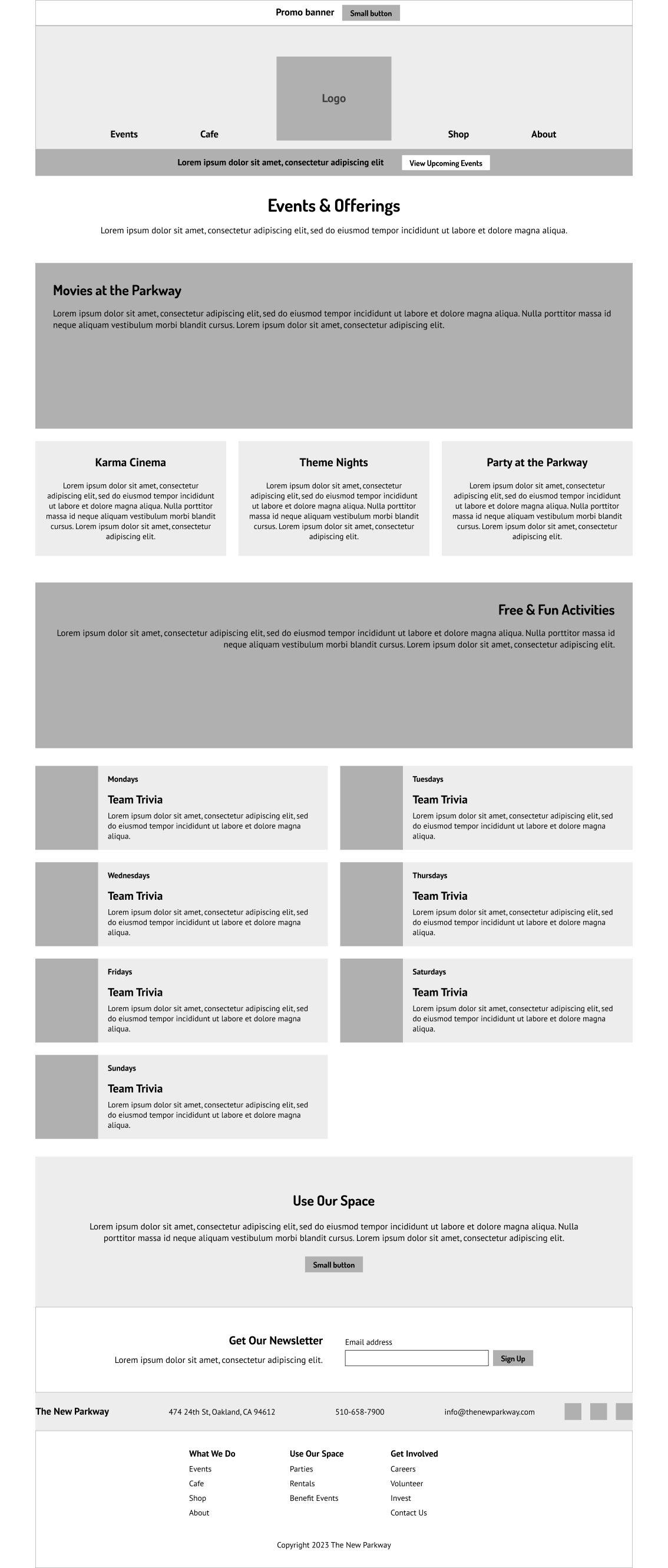
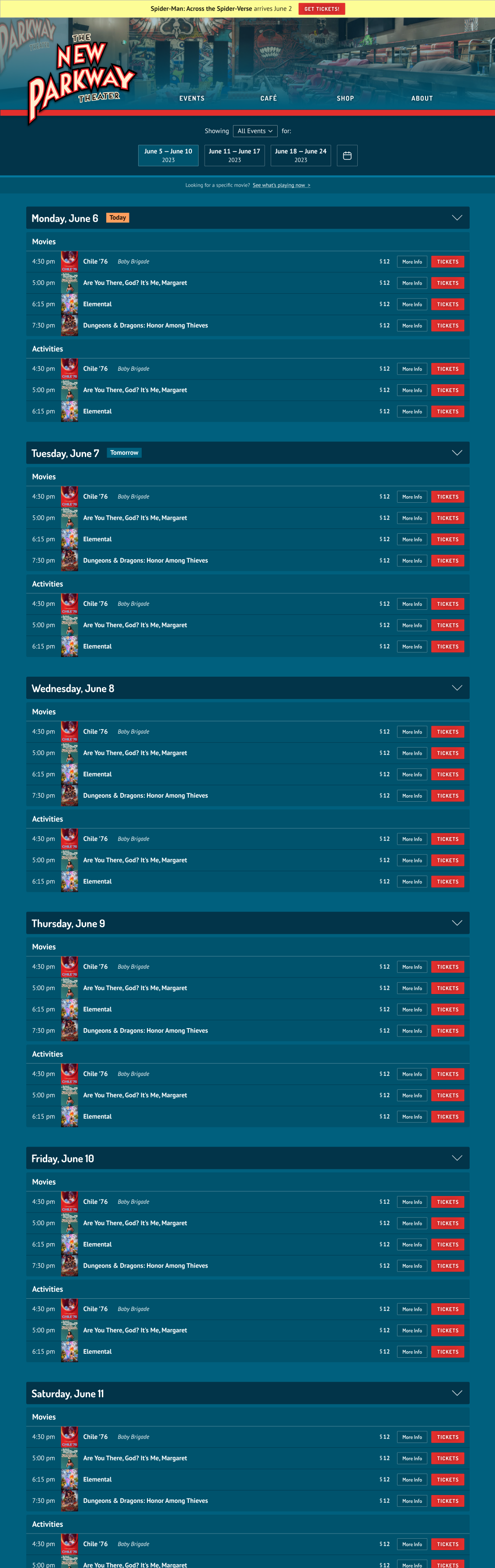
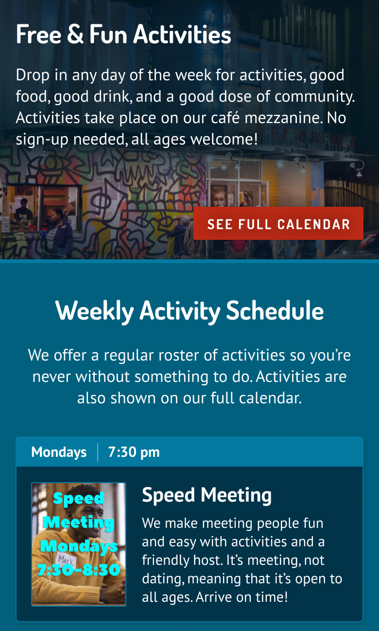
Users interested in movies didn’t click “Upcoming Events,” assuming it would take them to a promotional page for activities. I renamed the page “Calendar,” and changed its menu heading from “Events” to “Movies and Activities.”
Does this time go with the event above or below it?
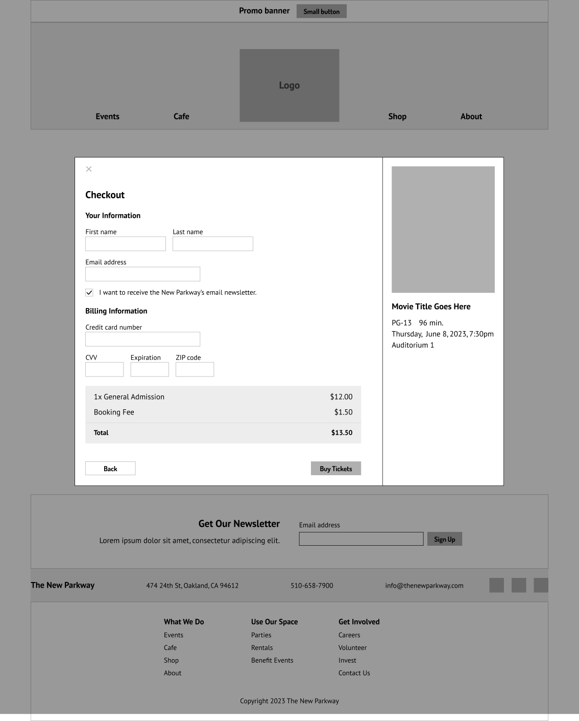
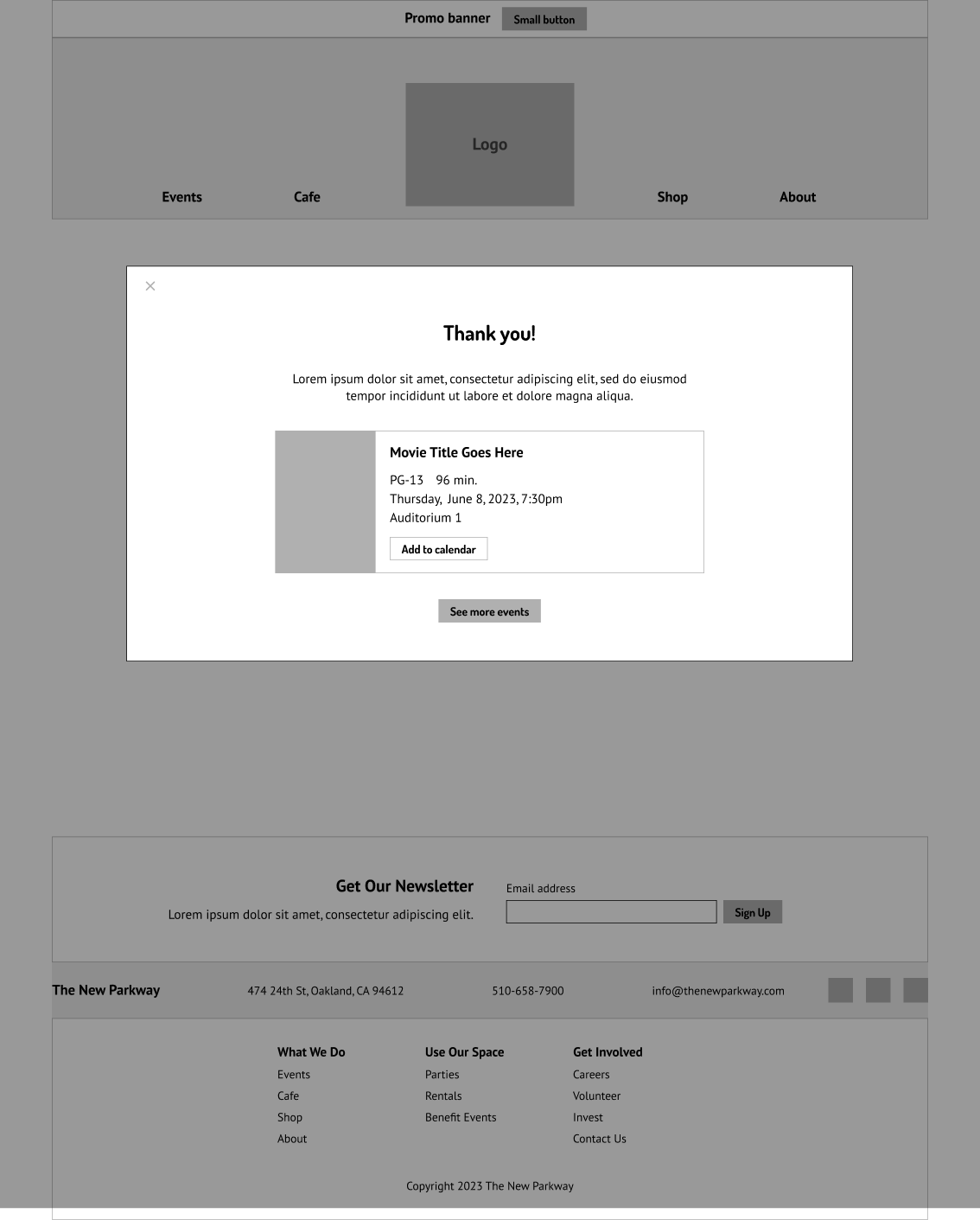
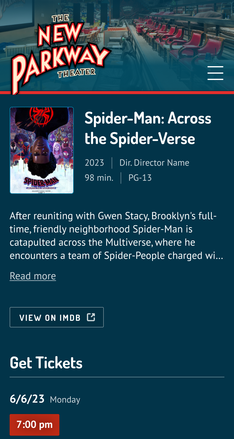
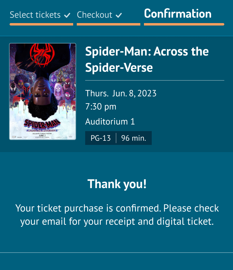
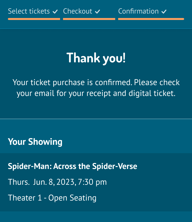
Users were surprised to be taken directly to checkout when clicking the “ticket” button. I added a button to go back to the movie detail page, which I converted into an overlay flowing smoothly into the checkout form.
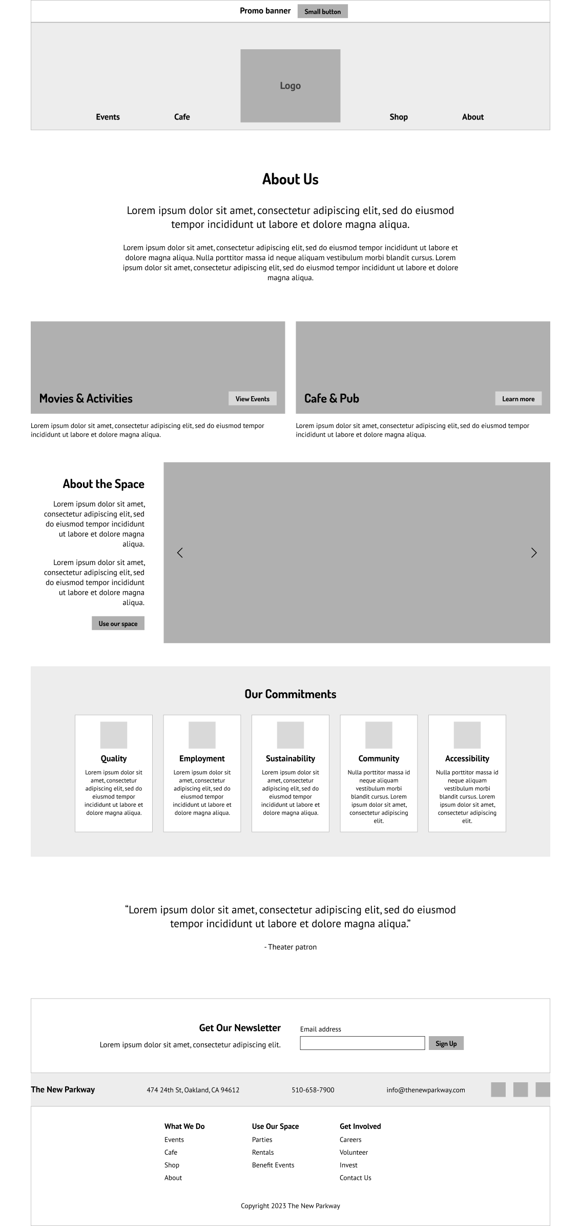
I want to know more about the theater from the home page.
Users wondered why activities were shown on both the “Offerings” and “Upcoming Events” pages. I added clarifying headings to “Offerings” and made sure that the activity schedule matched in both places.
If I wanted to pursue this project further, I would:
Present my design process and prototype to the New Parkway team. Discuss how the design meets their needs, and whether iterations are required.
When they’re ready to move forward, I would continue the design process for the rest of the site content, or explore alternatives such as creating templates that the team could populate independently.
A developer would be brought into the conversation about how the new design fits with the theater’s existing business processes and digital platforms.
Once we have a plan, I would hand off the design to the developer to complete the implementation.
What I learned
Words matter
“Upcoming Events” meant something different to users than I expected. In retrospect, this impacted my card sort results, a÷.nd thus the site map. I’ve learned to critically assess language, even at an early stage.
The magic of visual hierarchy
Common feedback on the original website: “There’s too much text, I won’t read it.” I found that with minimal edits, wordy pages could be transformed by applying hierarchy and structure.
Balancing fresh design with brand continuity
I approached this project with a mindset of improving the existing design. Next time, I might start from more of a blank slate to inspire creative solutions.